Accessibility Audit of Checkout Flow for Senior Shoppers

An accessibility audit of checkout flow for senior shoppers looks at every step a customer takes from cart to confirmation and asks where an older adult might struggle to read, tap, understand or finish. Older shoppers often use smaller screens, rely on larger text, have reduced dexterity or vision, and may be less comfortable with unfamiliar payment steps, so small friction points that go unnoticed by younger testers can cause abandoned orders. This guide walks you through a repeatable audit, a checklist you can reuse, and how to draft fixed screens quickly.
Why checkout is the place to start
Checkout is where a shopper must complete the most tasks in the shortest time: read prices, enter personal details, choose delivery, pay and confirm. Every extra second of confusion or every small target that is hard to tap adds up. Auditing this flow first gives you the biggest return on accessibility work.
Senior shoppers are not a single group. Some are highly digitally fluent, others are new to online buying. Design for the range, not one persona.
Set the scope before you test
Before testing, define what you are auditing:
- The exact path: cart, sign-in or guest checkout, shipping, delivery options, payment, review, confirmation.
- Devices: phone (small and large), tablet, desktop.
- Input methods: touch, keyboard only, screen reader, voice control.
- Settings: default text size, enlarged text (200% zoom), high contrast, reduced motion.
Write these down so the audit can be repeated after each release.
Run the audit step by step
1. Walk the flow with real settings
Complete a full purchase with a test account on each device. Turn on the system's largest text size and check whether labels wrap cleanly or get cut off. Zoom the browser to 200% and confirm nothing overlaps.
2. Check text, contrast and layout
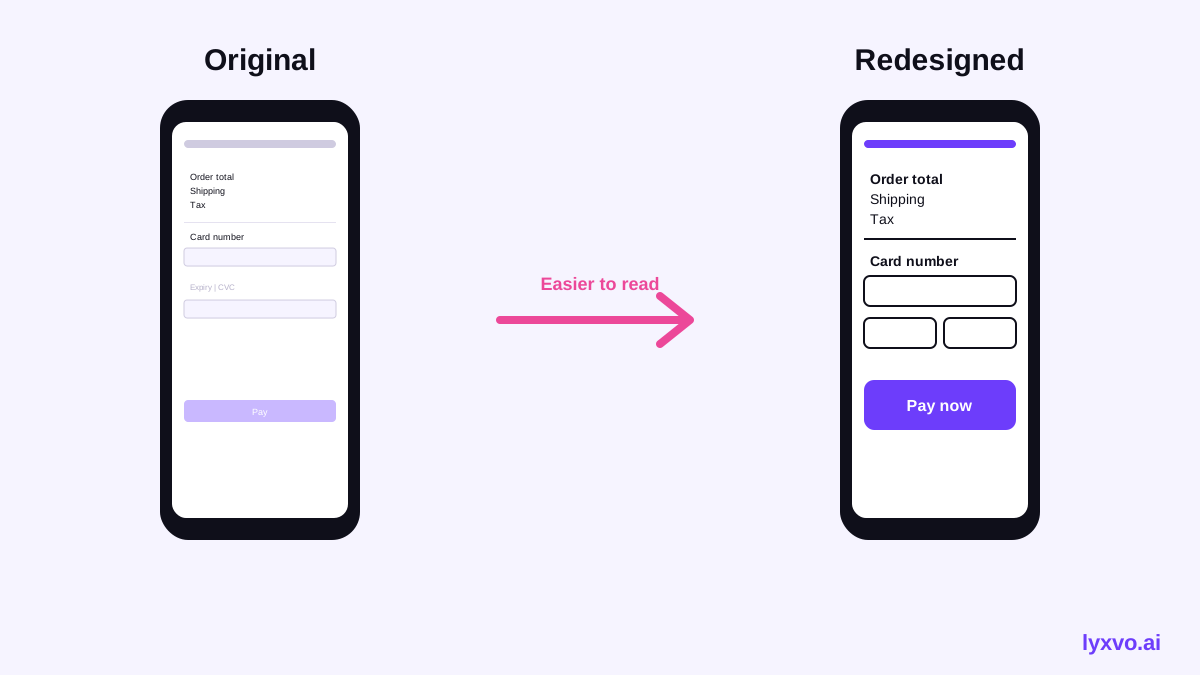
- Body text should be easy to read at a comfortable size, with generous line spacing.
- Text and its background need strong contrast. Check every state: placeholder text, disabled buttons, error messages.
- Do not rely on color alone to show errors or selected options. Pair color with an icon and a written message.
3. Check tap targets and spacing
Buttons, radio options and checkboxes should be large enough to tap without precision, with space between neighbours so a wrong tap is unlikely. Quantity steppers and small "remove" links are common failures.
4. Check forms and error handling
- Every field has a visible label, not only a placeholder that disappears.
- Required fields are marked clearly.
- Errors appear next to the field, explain what is wrong and how to fix it, and keep the entered data.
- The address and card fields accept common formats instead of rejecting them.
5. Check keyboard and screen reader use
Use only the keyboard to move through the whole flow. Focus must be visible and in a logical order. Test with a screen reader to confirm that labels, prices, totals and error announcements are read aloud correctly.
6. Check time and attention
Avoid countdown timers and automatic session timeouts that end without warning. If a session must expire, warn the shopper and let them extend it.
7. Check trust and reassurance
Seniors often worry about security and hidden charges. Show the total with all fees before the payment step, make the return policy easy to find, and show a clear confirmation with an order number and a way to get help.
Checklist for your audit
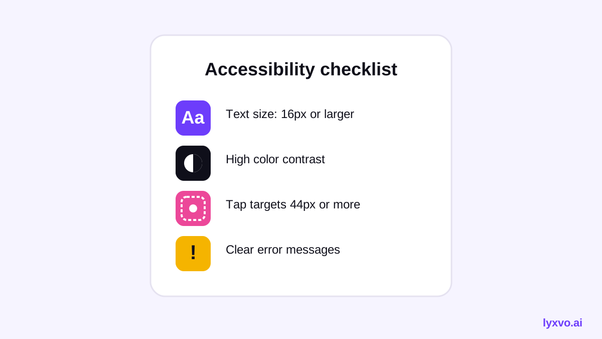
- Text readable at 200% zoom with no clipped content
- Contrast passes for all text and key icons
- Tap targets large and well spaced
- Every form field has a persistent visible label
- Errors are specific, near the field and not color-only
- Full flow completable by keyboard
- Screen reader announces totals and errors
- No silent timeouts
- Total cost visible before payment
- Help and contact easy to reach at every step
Record findings in a table
| Step | Issue found | Severity | Fix | Owner |
|---|---|---|---|---|
| Shipping | Address labels disappear when typing | High | Keep labels visible above fields | Design |
| Payment | Card error is red text only | High | Add icon and message beside field | Design |
| Cart | Quantity buttons 24 px | Medium | Enlarge to comfortable tap size | Design |
| Review | Total shown in small grey text | Medium | Larger type and stronger contrast | Design |
Rank issues by how often they block a purchase, then fix the high-severity ones first.
Prototype the fixes in Lyxvo AI
Once you know what to change, you can draft corrected screens quickly. Lyxvo AI's design agent can plan and produce complete app and web screens for iOS, Android and web, and the Canva-style editor lets you adjust text size, labels, colors and spacing directly.
A practical workflow:
- Open the AI app design or AI UI design generator page and describe the checkout step, your brand and the accessibility requirements you found.
- Review the generated screens, then edit labels, enlarge buttons and fix contrast in the editor.
- Use Magic Resize to check the same layout on other screen sizes.
- Export a PNG at real size for stakeholder review, or export to Figma with SVG and tokens so developers can build from the same specs.
Lyxvo AI produces design screens, not a certified accessibility report. Use the checklist above and real testing with older shoppers before release.
For a simple visual checkout mockup, you can start in the web design studio or the app design studio. Plans and daily limits are listed on the pricing page.
Test with real senior shoppers
Automated tools catch some problems, but they cannot tell you whether a shopper feels confident. Invite a small group of older adults with varied vision, dexterity and digital experience to complete a purchase while you observe. Ask them to think aloud and note where they hesitate. Retest after each fix.
Build the audit into your release process
Run the checklist on every change to payment, shipping or cart screens. Keep the findings table, track fixes and repeat the walkthrough at least each quarter. Accessibility stays good only when it is part of normal design review.
Summary
An accessibility audit of checkout flow for senior shoppers should cover the full purchase path, real device settings, forms, keyboard and screen reader use, timing and trust. Record findings clearly, fix the high-impact issues first, prototype the new screens, and confirm them with real users. Use the AI UI design generator to speed up the design work, and keep testing with the people who will use the checkout.
Try it in Lyxvo AI
Describe it in your own words and the design agent starts on the right flow. Free to start.
Related tool: Free design templates you can edit in minutes