AI Accessibility Checklist for a Banking Login Screen
An AI accessibility checklist for a banking login screen helps your team catch the barriers that block people from signing in, such as unlabeled fields, low-contrast text and time limits that cannot be extended. A login screen is the front door of a bank app or website, so small accessibility gaps there lock out real customers. This guide walks through the checks one by one, gives you a table to track them, and shows how to produce and review a compliant login layout in Lyxvo AI.
Banking login screens carry more accessibility risk than most screens. They handle credentials, one-time codes, biometric prompts and error recovery, and each step can stop a user who relies on a screen reader, a magnifier, voice control or a keyboard. The goal of this checklist is to make those steps work for everyone before development starts.
Why login screens need a dedicated checklist
A login screen is often the first and only point where a customer must complete a task. If a visually impaired user cannot tell which field is the password field, or a motor-impaired user cannot reach the sign-in button, they cannot reach the rest of the product. Designing the login screen accessibly is therefore a prerequisite for the whole banking experience.
Most accessibility work in the industry is guided by the Web Content Accessibility Guidelines (WCAG). Use the current published WCAG version your organization follows and your local regulations as the reference. This checklist maps to common WCAG success criteria, but it is a design aid, not legal advice or a full audit.
Step 1: Check text contrast and visual clarity
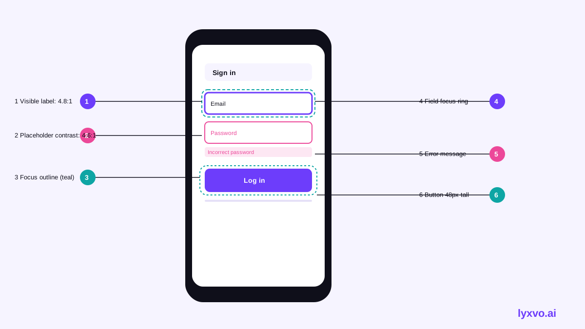
Low-contrast text is one of the most frequent barriers on login screens, especially on the grey placeholder text and light borders that modern designs favor.
- Body text and labels meet a contrast ratio of at least 4.5:1 against their background.
- Large text (for example a 24px-plus title) meets at least 3:1.
- Input borders and the sign-in button edge meet at least 3:1 against the background, so the field is visible.
- Placeholder text is never the only label. It can add guidance, but it must not replace a visible label.
- Color is never the only way to show an error or a required field. Pair red borders with an icon and a written message.
Step 2: Label every field and control
Screen reader users rely on programmatic labels. Each input needs a name that is announced when the field gains focus.
- Give the username field a visible label such as "Username or customer ID", not only an icon.
- Label the password field "Password" and provide a show/hide toggle with an accessible name such as "Show password".
- Name the one-time code field "Verification code" and state how many digits are expected.
- Make the sign-in button describe its action, for example "Sign in to your account", not just "Go".
- Ensure icon-only controls, such as a fingerprint or help icon, have text alternatives.
Step 3: Set a logical focus order and keyboard path
Users who navigate with a keyboard or switch device need to move through the form in a predictable order.
- Focus moves top to bottom: username, password, optional remember-me, sign-in, then help links.
- Every interactive element is reachable with Tab and shows a clearly visible focus indicator.
- Pressing Enter in the password field submits the form.
- Focus is never trapped inside a modal or cookie banner.
- After an error, focus moves to the error summary or the first invalid field.
Step 4: Write error messages that help recovery
Errors on a banking login must be specific but must never reveal whether a username exists.
- Use one consistent message for a failed sign-in, such as "The details you entered are not correct", which does not confirm which field was wrong.
- Announce errors to screen readers using a live region or an error summary that receives focus.
- Explain how to recover: link to password reset or account support.
- Avoid timed-out, vanishing error messages. Keep them visible until corrected.
Step 5: Handle timeouts, codes and biometrics fairly
Security features can create accessibility barriers if they are rigid.
- Warn users before a session expires and offer to extend it, giving enough time to read and respond.
- Let users request a new one-time code and show a clear resend timer.
- Offer more than one sign-in method where possible, such as passkey, one-time code or device biometrics, so users are not forced into a single input method.
- Do not require users to memorize or type complex patterns that block people with cognitive or motor disabilities. Support password managers and paste into the password field.
Step 6: Size touch targets and support zoom
- Make buttons and links at least 44 by 44 CSS pixels on mobile, or follow your platform minimum.
- Keep enough space between adjacent controls to avoid accidental taps.
- The layout must work at 200% browser zoom or large system text sizes without horizontal scrolling or hidden buttons.
- Avoid fixed-height containers that clip translated or enlarged text.
Step 7: Support language, motion and screen readers
- Set the page language so screen readers pronounce text correctly.
- Avoid auto-playing animations; respect the reduced-motion setting.
- Provide a page title such as "Sign in | Bank name" so users know where they are.
- Use real headings and landmarks so users can jump to the form.
Quick reference checklist
| Area | Check | Status |
|---|---|---|
| Contrast | Text 4.5:1, large text 3:1, input borders 3:1 | |
| Labels | Visible, programmatic labels on all fields | |
| Focus | Logical order, visible indicator, Enter submits | |
| Errors | Specific-but-safe message, announced, recoverable | |
| Timeouts | Warning, extend option, no data loss | |
| Sign-in methods | At least two options, paste allowed | |
| Touch targets | 44px minimum, spacing between controls | |
| Zoom | Works at 200% and large text | |
| Language and title | Page language and unique title set |
How to build and check this in Lyxvo AI
You can draft and review a login screen in Lyxvo AI's design agent. Open the app design tool or the UI design generator, choose the platform, and start a studio project for mobile apps or web.
Describe the screen in plain language, for example: "Banking sign-in screen with visible labels for customer ID and password, show-password toggle, passkey option, high-contrast primary button and a plain error message." The design agent plans the screen and produces the layout, which you can then adjust.
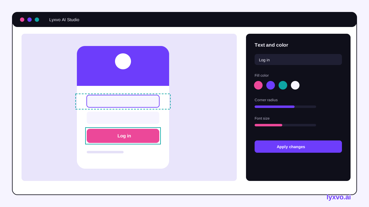
Use the Canva-style editor to change text, colors and spacing directly. Check the contrast of your text and borders against the checklist above, and edit any color that fails. When the layout is final, export it as PNG at real size for review or as HTML, Flutter or Kotlin Jetpack Compose code so developers can implement the same structure. Export to Figma (SVG and tokens) lets the design system team keep color and spacing tokens consistent.
Lyxvo AI helps you produce and iterate on the design. It does not certify accessibility or replace testing. Run a screen reader pass, keyboard testing and user testing with people who use assistive technology before release.
For design system basics, see the Lyxvo AI docs, and compare plans on the pricing page if your team needs more usage.
Final review before release
- Test the whole sign-in flow with only a keyboard.
- Run a screen reader on iOS and Android and on the web.
- Check contrast with a tool on every color pair.
- Test at 200% zoom and largest system text.
- Trigger each error state and confirm the message is announced.
- Confirm the session timeout warning and extension work.
- Record the results and fix blockers before launch.
Repeat this checklist whenever the login flow changes, including new security steps, since each new step can add a barrier.
Try it in Lyxvo AI
Describe it in your own words and the design agent starts on the right flow. Free to start.
Related tool: Free design templates you can edit in minutes