AI App Icon for Dental Clinic Patient Portal: A Practical Guide
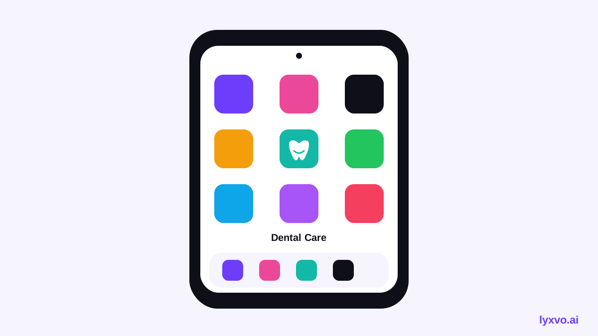
An AI app icon for a dental clinic patient portal should be clear, calm and instantly recognisable on a crowded phone home screen. This guide shows how to plan that icon, what sizes and rules to follow, and how to produce every size in Lyxvo AI.
Why the icon matters for a patient portal
A patient portal icon sits next to banking, messaging and shopping apps. Patients often open it only a few times a year, so they need to recognise it at a glance. A good icon signals three things: this is a healthcare tool, it belongs to *your* clinic, and it is safe to open.
Plan the icon before you design it
Write down the answers to these questions first:
- Clinic name: Is the clinic name short enough to read at small sizes, or will you use a symbol only?
- Core symbol: A tooth, a smile, a shield with a tooth, or a simple monogram. Choose one idea, not three.
- Tone: Reassuring and friendly suits most families; more clinical suits specialist or implant practices.
- Colors: Use one or two brand colors. Blues, teals and greens are common in healthcare, but match your existing clinic brand where possible.
- Accessibility: Keep strong contrast so the icon is readable in light and dark mode.
Follow the size and platform rules
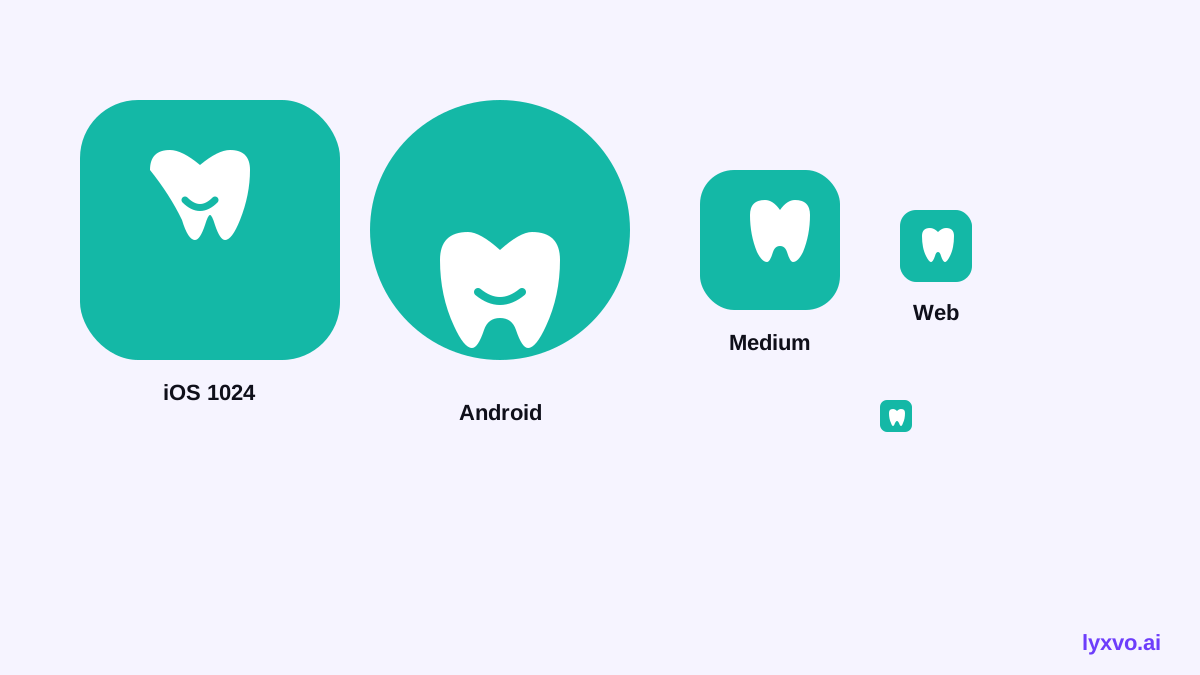
You need every size, not one large file. Sizes below are the common ones used by iOS, Android and web; check the current platform guidelines before you publish because requirements can change.
| Platform | Typical sizes | Notes |
|---|---|---|
| iOS | 1024 x 1024 (App Store), plus home screen sizes | No transparency; the system applies corner rounding |
| Android | 512 x 512 (Play Store), adaptive launcher layers | Keep the key symbol inside the safe zone |
| Web | 192 x 192 and 512 x 512 PWA icons, favicon | Provide PNG at both sizes |
Keep important details away from the edges, because launchers crop and round the icon differently.
Design rules that work for healthcare
- Simplify. One symbol, bold shapes, no tiny text. Names under icons already appear on the phone.
- Avoid alarming imagery. Skip drills, needles or x-rays. A smile or a tooth shape reads as friendly.
- Use a recognisable shape. A rounded square base with a single centred mark works on every platform.
- Test small. View the icon at 40 px. If the symbol blurs, make it bigger or simpler.
- Match the clinic brand. Use the same colors and mark as the website and signage so patients connect the app to the practice.
Checklist before you export
- [ ] One clear symbol that matches the clinic
- [ ] Readable at 40 px and at full size
- [ ] Strong contrast in light and dark backgrounds
- [ ] No text inside the icon beyond a short monogram
- [ ] All required iOS, Android and web sizes exported
- [ ] Safe zone respected for rounded and adaptive masks
- [ ] Colors and mark consistent with the website
How to make it in Lyxvo AI
Lyxvo AI's design agent can plan and produce a full set of app icons. Describe your clinic, the symbol you want and the tone you need, then let the agent build the icon concept. You can refine it in the Canva-style editor, where you edit colors and shapes directly. When the icon is final, export the full set of sizes for iOS, Android and web.
For the broader app look, you can also start from the AI app design tool and the app icon generator. To create the brand mark first, try the AI logo generator, then use the same colors in the Studio for app screens.
Common mistakes to avoid
- Using a generic medical cross that looks like a pharmacy, not a dental clinic
- Putting the full clinic name inside the icon and making it unreadable
- Choosing a trendy gradient that looks different on each platform
- Exporting only one size and assuming the stores will scale it
- Ignoring dark mode, where a dark symbol can vanish
Final thought
A strong dental patient portal icon is simple, friendly and consistent with the clinic's brand. Plan the symbol and colors first, follow the platform sizes, test it small, and export the full set. Lyxvo AI can handle the concept and the export work so your team can focus on patient care.
Try it in Lyxvo AI
Describe it in your own words and the design agent starts on the right flow. Free to start.
Related tool: AI app icon generator with every size in one zip