AI App Icon for an Ebook Reader for Seniors
An AI app icon for an ebook reader for seniors should read at a glance: one large, high-contrast symbol that says "books" without any small detail. This guide walks through what makes an icon easy for older readers to find and tap, the sizes you need, and how to create the set in Lyxvo AI.
Why icons for senior readers need a different approach
Most app icons are designed to look good on a big screen in a crowded store. An icon for older readers has a different job: it must be found quickly, recognised instantly and tapped without mistakes. Small text, thin lines and subtle gradients all work against that goal.
The good news is that the rules are simple. Focus on one clear object, use strong contrast and keep the shape uncluttered. Reading apps already use a book or open-page symbol for a reason, so a clear version of that idea is usually the best starting point.
Design rules for a readable ebook icon
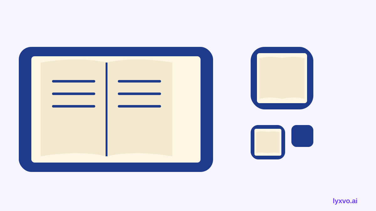
- One central symbol. An open book, a page with a bookmark or a stack of books is enough. Avoid scenes with many objects.
- High contrast. Use a dark symbol on a light background or a light symbol on a deep colour. Aim for a strong difference in brightness so the icon stands out on any home screen wallpaper.
- Thick, simple shapes. Strokes should be bold and filled areas should be solid. Hairlines disappear at small sizes.
- No text in the icon. Words like "Read" or a title are unreadable when the icon is shrunk. The app name under the icon does that job.
- Familiar colours. Deep blue, forest green or warm brown on cream feel calm and easy to read. Avoid colour pairs that are hard to tell apart, such as red and green.
- Generous padding. Leave a margin around the symbol so it never looks cramped when the operating system rounds the corners.
Tip: squint at your icon or view it at a tiny size. If you can still name the object in a second, it will work for most people.
The sizes you need
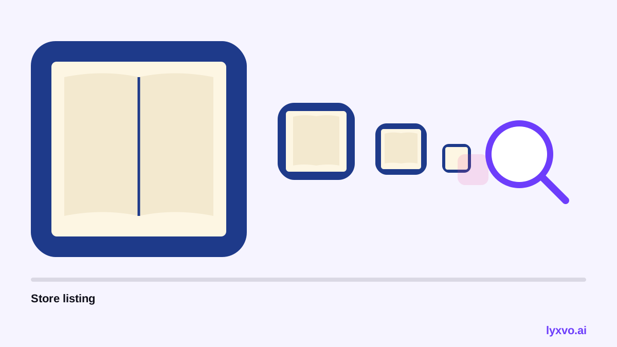
You will need a full icon set, not one image. The table below lists the common sizes for mobile and web. Sizes can change with platform updates, so check the current guidelines of each store before you publish.
| Use | Typical size | Format |
|---|---|---|
| iOS App Store | 1024 x 1024 px | PNG, no transparency |
| iOS home screen | multiple sizes, e.g. 60 to 180 px | PNG |
| Android Play Store | 512 x 512 px | PNG |
| Android launcher | several densities, e.g. 48 to 192 px | PNG |
| Web favicon | 16, 32 and 180 px | PNG / ICO |
A practical workflow is to design one master icon at the largest size, then generate the smaller versions from it so the proportions stay identical.
Step-by-step: create the icon
- Write the brief. Note the audience (seniors), the mood (calm, trustworthy), the colours you want and the one symbol that represents reading.
- Sketch two or three options. Compare an open book, a single page and a book with a bookmark. Pick the one that reads fastest.
- Choose colours with contrast. Test your choice against both a light and a dark wallpaper.
- Generate the full set. Make sure every platform size is produced from the same master file.
- Test at small size. Place the icon among other apps on a phone and ask someone to find it. Adjust the size or contrast if they hesitate.
- Check the store rules. Confirm the app store requirements for format, transparency and corner handling.
How to make it in Lyxvo AI
Lyxvo AI can design the icon and the full set of sizes for you. Open the app icon generator or start in the AI app design tool. In the studio you can also start from the logo format and then export the square version.
A workable sequence in Lyxvo AI:
- Describe the brief in plain language: "large open book, high contrast, calm blue, for an ebook reader for older adults, no text."
- Review the generated options and keep the one with the clearest silhouette.
- Use the Canva-style editor to adjust colours or thicken the outline directly.
- Export the icon at its real size as PNG, and use the icon-size outputs for iOS and Android.
- For a brand-wide look, build a logo and brand kit so the icon matches your app's website and marketing.
If you also need promotional images for the store listing, a social media post or a YouTube thumbnail can reuse the same colours and symbol.
Test with real users
Seniors vary widely in eyesight and familiarity with phones. Before launch:
- Show the icon to at least a few older readers and ask them to point to the app.
- Check the icon in both light and dark mode wallpapers.
- Make sure the name under the icon is also large and readable in your app's settings.
- Keep the icon consistent across the app, website and store so the user recognises it everywhere.
Common mistakes to avoid
- Adding a tiny title or badge inside the icon.
- Using pale grey symbols on white, which vanish on bright screens.
- Creating a detailed illustration of a library that becomes a blur when small.
- Forgetting to export every size, so the icon looks blurry on some devices.
- Changing the design between platforms, which confuses returning users.
Checklist before you publish
- One clear, central symbol
- Strong contrast on light and dark backgrounds
- No text inside the icon
- Bold shapes that still work at small size
- Full set of platform sizes generated from one master
- Tested with older users if possible
Note: store and platform icon requirements change over time. Check the current guidelines of the App Store, Google Play and any web standard you target before submitting.
With a single clear symbol, strong contrast and a complete set of sizes, your ebook reader icon will be easy for seniors to find and trust.
Try it in Lyxvo AI
Describe it in your own words and the design agent starts on the right flow. Free to start.
Related tool: AI app icon generator with every size in one zip