AI App Icon for a Mental Health Journaling App: A Practical Guide
An AI app icon for a mental health journaling app has to do a lot in one small square: signal calm, privacy and care while still standing out on a crowded home screen. This guide walks you through the choices that matter, the sizes you need, and how to build the icon in Lyxvo AI.
Why the icon matters more for a journaling app
People open a journaling app when they are tired, anxious or private about what they are feeling. The icon is often the first thing they see, so it should feel safe rather than loud. Bright red alarm colors and busy clip-art tend to work against that feeling. Soft, grounded palettes and simple shapes usually do better.
A good icon for this category typically does three things:
- Suggests reflection through a familiar symbol such as a leaf, a page, a sunrise, a pen line or a soft circle.
- Feels private and gentle through muted colors and generous space around the mark.
- Reads clearly at small size so it is recognizable next to banking, music and messaging apps.
Choose a concept that fits the feeling
Before you open any tool, write down three words that describe how your app should feel, for example "quiet, honest, kind". Then match each word to a visual idea:
| Feeling | Visual idea | Palette direction |
|---|---|---|
| Quiet | Single open page or blank notebook | Off-white, warm grey |
| Growth | Sprout, leaf or rising line | Sage green, soft teal |
| Warmth | Sunrise, soft circle or glow | Peach, amber, muted gold |
| Privacy | Closed book, lock-free shield shape | Deep navy, dusty blue |
Keep the symbol simple. Two or three shapes is usually enough. Avoid literal depictions of mental health symbols such as brains or hearts in pain; they can feel clinical or heavy.
Check the sizes before you design
An app icon is delivered in several sizes, and each platform has its own rules. Plan for the full set so you do not have to redo the work later:
- iOS: App Store marketing icon at 1024 x 1024 px, plus the smaller sizes Xcode generates on the device.
- Android: Adaptive icon with a foreground and background layer, plus legacy launcher sizes from 48 to 192 px.
- Web: Favicon and touch icons, including 180 px and 512 px versions for installable web apps.
Keep the important shape inside the central safe area. Android launchers crop icons into circles, squares or rounded squares, so anything near the edges can be cut off.
Step-by-step: make the icon in Lyxvo AI
Lyxvo AI can generate app icons and full brand kits, including every Android, iOS and web icon size, so you can produce a consistent set from one design.
- Open the icon tool. Start from the AI app icon generator or the AI logo generator if you also want a wordmark for your brand.
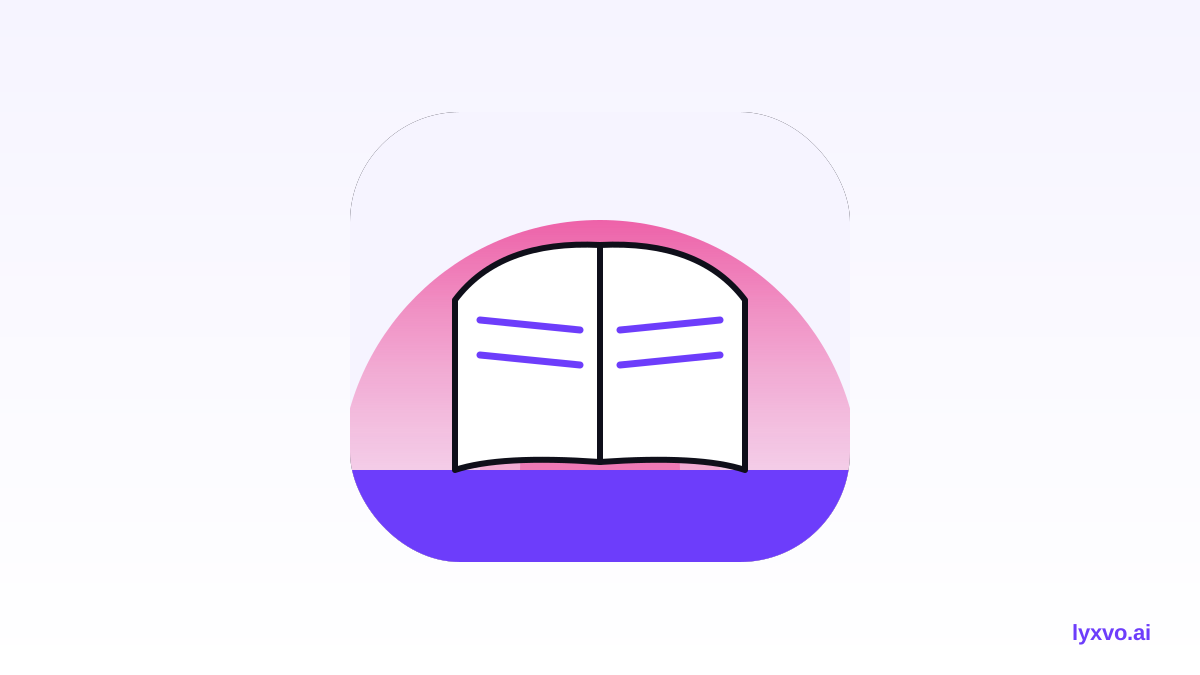
- Describe the concept in plain language. For example: "minimal app icon for a private mental health journal, open notebook with a soft sunrise, sage and cream palette, calm, no text".
- Review the options and refine. Use the Canva-style editor to adjust colors, shift the symbol, or simplify shapes. Edit colors directly rather than regenerating from scratch each time.
- Export the full size set. Export PNG at real size for every platform, or export SVG and tokens to Figma if your team already works there.
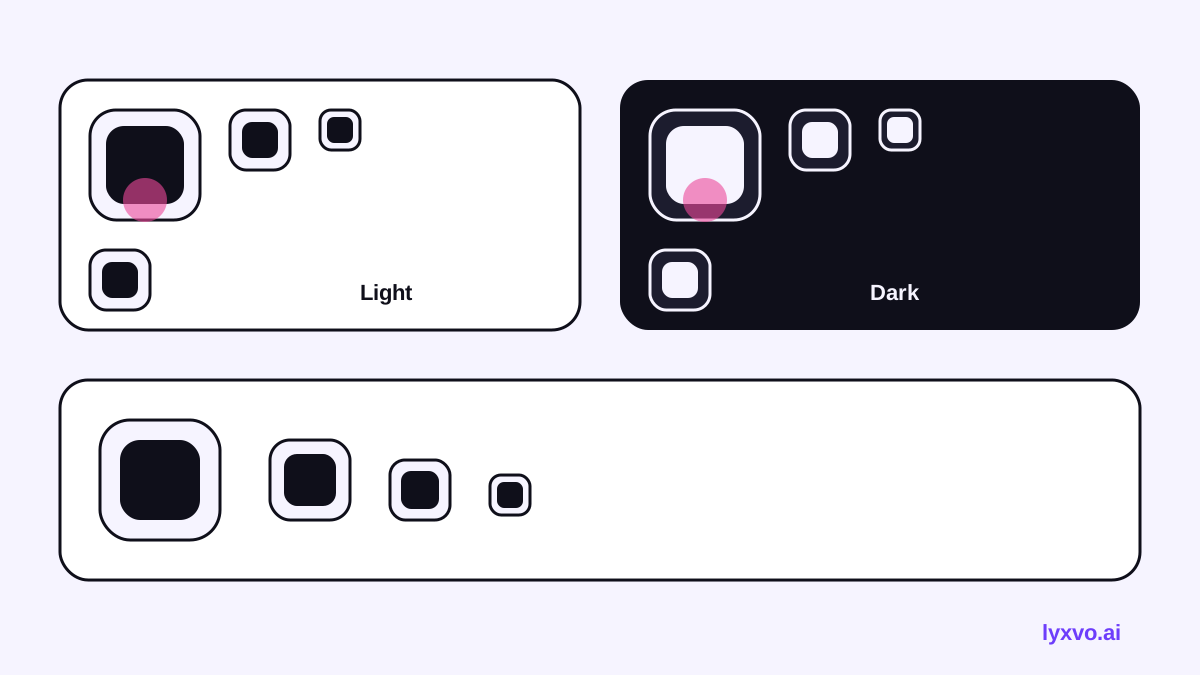
- Test on a real screen. Place the icon on a mock home screen, in dark mode and light mode, next to other apps.
Test the icon with real people
Show the icon to five or six people from your target audience without explaining the app. Ask them what they think it does and how it makes them feel. If several people guess "notes" or "calm", you are on track. If they guess "fitness" or "productivity", adjust the symbol. Keep a short list of what to change:
- Is the symbol recognizable at 60 px?
- Does it still read in dark mode?
- Does it look too similar to an existing popular app?
- Does the color feel calming rather than clinical?
Common mistakes to avoid
- Too much detail. Fine lines disappear at small sizes.
- Text in the icon. App names inside icons are hard to read and often rejected by store guidelines.
- Alarming imagery. Storm clouds, sharp red and crying faces can undermine trust.
- Ignoring the background layer on Android. An adaptive icon needs a clean foreground that works on any background shape.
- Forgetting the marketing icon. The 1024 px version is what appears in the store, so design it first and scale down.
Pair the icon with the rest of your brand
Once the icon works, reuse its colors and shapes for your splash screen, store screenshots and social posts. A consistent look helps users recognize you across channels. You can create matching visuals with the AI app design tool for screens, or the AI social media post generator for announcements at exact sizes.
Quick checklist before you publish
- [ ] Concept matches three chosen feeling words
- [ ] No text or thin lines inside the icon
- [ ] Readable at 60 px and in dark mode
- [ ] Full set exported: iOS marketing icon, Android adaptive layers, web icons
- [ ] Tested with real people from your audience
- [ ] Colors and shapes reused across screens and store assets
With a clear concept, the right sizes and a few rounds of testing, your icon can feel as thoughtful as the journaling experience it introduces. If you want to start from a blank canvas, you can try the studio for logos and build from there.
Try it in Lyxvo AI
Describe it in your own words and the design agent starts on the right flow. Free to start.
Related tool: AI app icon generator with every size in one zip