AI Dark Mode UI Variants for a Music Player

AI dark mode UI variants for a music player let you explore several moody, readable interfaces in the time it used to take to design one. This guide shows how to plan the variants, check contrast, and produce screens you can hand off to a developer.
Why dark mode suits a music player
Music apps are often used in dim rooms, at night, or with album art that is already rich in color. A dark interface lets the artwork stand out, reduces glare, and feels at home beside the content. Dark mode is also a good place to start because Android, for example, has supported a system-wide dark theme for years, so users expect it.
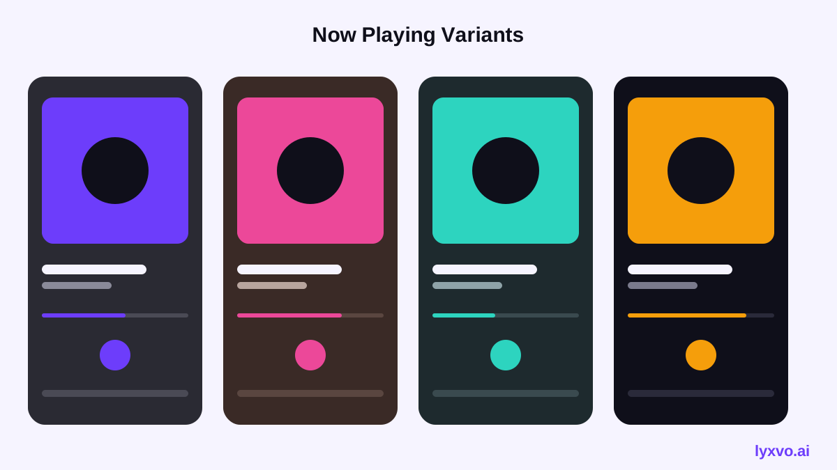
But dark mode is not just an inverted light screen. Shadows, surface levels, accent colors and text contrast all need deliberate choices. A good approach is to generate several variants, compare them side by side, and keep the one that balances mood and legibility.
Define the variants before you generate
Before asking any tool for designs, decide what each variant is meant to explore. Vague prompts produce vague results. Useful directions for a music player include:
- Neutral graphite: near-black surfaces with a single cool accent, closest to a classic player.
- Album-driven: the palette shifts subtly to match the current cover art.
- Warm dusk: deep brown or plum surfaces with amber highlights, suited to a relaxed brand.
- High contrast: pure black base with bright, bold controls for accessibility-first users.
Write one sentence per variant describing the mood, the accent color, and the main screen (now playing, library, or search).
Step-by-step: building the variants
1. Set the surface scale
Dark interfaces work best with a clear surface scale, for example a base background, a raised card, and an elevated sheet, each slightly lighter than the last. Avoid pure black cards on pure black backgrounds, because elevation disappears. Keep text and icons on a consistent scale of lighter tones.
2. Choose one accent and one secondary
Use a single primary accent for play, progress and selection, and a quieter secondary for metadata. Too many accents make a player look busy. Test the accent on both the base and the raised surface.
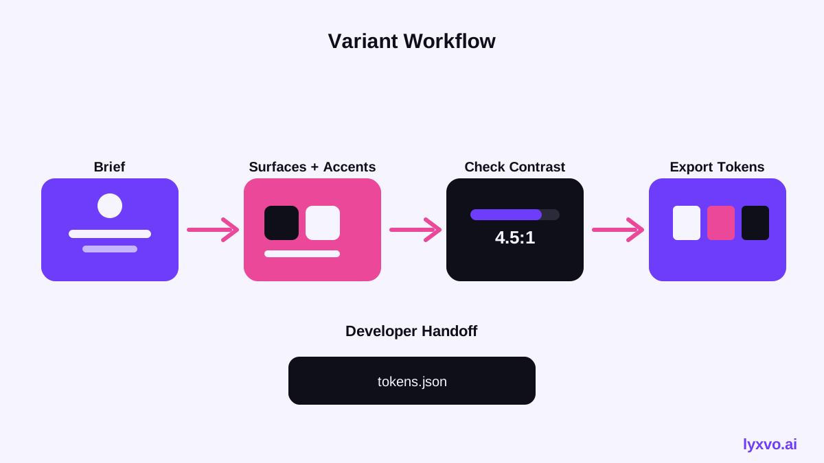
3. Check contrast
Body text and key controls should meet at least the commonly used 4.5:1 contrast ratio against their background, and large text or icons should be comfortably legible at a glance. Check your play button, progress bar, and secondary labels separately, because these are the most likely to fail.
4. Design the core screens
For each variant, produce at least three screens: the now-playing view, a library or album list, and a mini player or bottom bar. Keep the layout identical across variants so you compare color and mood, not structure.
5. Test with real album art
Dark UIs can look excellent with placeholder art and muddy with a bright or pale cover. Try at least three covers with different brightness: a near-black cover, a pastel cover, and a saturated one.
Comparing variants at a glance
| Variant | Surface feel | Accent approach | Best for |
|---|---|---|---|
| Neutral graphite | Cool, minimal | One bright cool accent | Broad audiences |
| Album-driven | Adapts per track | Pulls from cover art | Discovery-led apps |
| Warm dusk | Soft, cozy | Amber or coral | Relaxed or lifestyle brands |
| High contrast | Pure black, crisp | Bold, saturated | Accessibility-first users |
Tip: when presenting variants to stakeholders, show each one on the same cover art so the comparison is fair.
Creating these variants in Lyxvo AI
Lyxvo AI's design agent can generate complete app screens for iOS, Android and web, so you can produce dark mode player variants in one workflow. A practical sequence:
- Open the AI UI design generator or the AI app design page and choose the mobile platform.
- Describe one variant at a time, including the mood, accent color, and the screens you need (now playing, library, mini player).
- Review the generated screens and use the Canva-style editor to adjust text, photos and colors directly, for example to tune the accent or surface tone.
- Duplicate a finished variant and change only the palette, so the layout stays constant for a fair comparison.
- Export the chosen direction, for example to Figma (SVG and tokens) or as HTML, Flutter or Kotlin Jetpack Compose code, to pass to your developers.
You can start with Lyxvo Lite on the free plan, which has a daily limit. Plan details are on the pricing page. For a quick visual check of a single screen, the Studio lets you begin on an app layout directly.
Handing off to developers
A good handoff makes your variants usable beyond the mockup. Document these items for each variant:
- Surface colors for base, raised and elevated levels, as named tokens.
- The accent and secondary colors, with the contrast ratio for each text role.
- Corner radii, spacing, and icon sizes for the play controls.
- The behavior when album art is very light or very dark.
- Light-mode fallback, if the app supports system switching.
Exporting tokens alongside the screens saves time and keeps the implementation consistent with the design.
Common mistakes to avoid
- Pure black everywhere: removes depth and makes elevation unreadable.
- Low-contrast secondary text: grey captions on dark grey often fail the contrast check.
- Bright controls that glare: a pure white play button can dominate the screen.
- Ignoring the artwork: a palette that clashes with covers makes the player feel disconnected.
- Too many variants: three to five strong directions are easier to judge than twelve similar ones.
Checklist before you share
- [ ] Each variant has at least three screens with an identical layout.
- [ ] Text and key controls pass a 4.5:1 contrast check on their surfaces.
- [ ] The accent is distinct from the surfaces in every variant.
- [ ] Tested with light, dark and saturated album covers.
- [ ] Tokens and specs are documented for the developer handoff.
- [ ] One recommended variant is marked, with reasons.
Summary
AI dark mode UI variants for a music player work best when you define each direction first, build a consistent surface scale, check contrast, and test with real artwork. Generate the variants with the same layout, compare them fairly, and hand off tokens with the screens. You can explore the workflow starting with the AI UI design generator.
Try it in Lyxvo AI
Describe it in your own words and the design agent starts on the right flow. Free to start.
Related tool: AI UI design generator for apps and websites
Whole apps and websites are designed with the Lyxvo Engine, rented separately from the design plans; every account can try 2 pages free.