AI Empty State Illustrations for a Project Management Tool
AI empty state illustrations for a project management tool help a new user understand what to do next, instead of staring at a blank board. This guide shows how to plan, write and design them so they feel on-brand and genuinely useful.
An empty state is the screen a user sees when there is nothing to show yet: no projects, no tasks, no comments, no files. In a project management tool, these moments are frequent and important. They are often the first thing a new team member sees after signing up, so a good empty state turns a blank page into a clear next step.
Why empty states matter in project management tools
Project tools are built around lists, boards and timelines. Without data, those views look broken or abandoned. A well-designed empty state does three jobs at once:
- It explains what the section is for.
- It tells the user the single most useful action to take.
- It sets a friendly, confident tone that makes the product feel finished.
Illustration helps here because it signals "this is intentional" rather than "something failed to load". The image should support the message, not compete with it.
Plan each empty state before you draw it
Before generating or drawing anything, write a short brief for every empty state in your tool. Keep it to one row per screen.
| Screen | Empty reason | Primary action | Illustration concept |
|---|---|---|---|
| Projects list | No projects yet | Create project | Open folder with a first card |
| Task board | No tasks in this project | Add first task | Sticky notes waiting on a board |
| Timeline | No dates set | Set a milestone | Calendar with a flag |
| Search results | Nothing matched | Clear filters | Magnifier over an empty page |
| Files | No uploads | Upload a file | Stack of documents and an arrow |
Ask three questions for each row: What is the user trying to do here? What single action unlocks this view? What would a calm, helpful illustration look like? Writing these answers first keeps the illustrations focused.
Write the copy first
The illustration is secondary to the words. Use a simple three-part pattern:
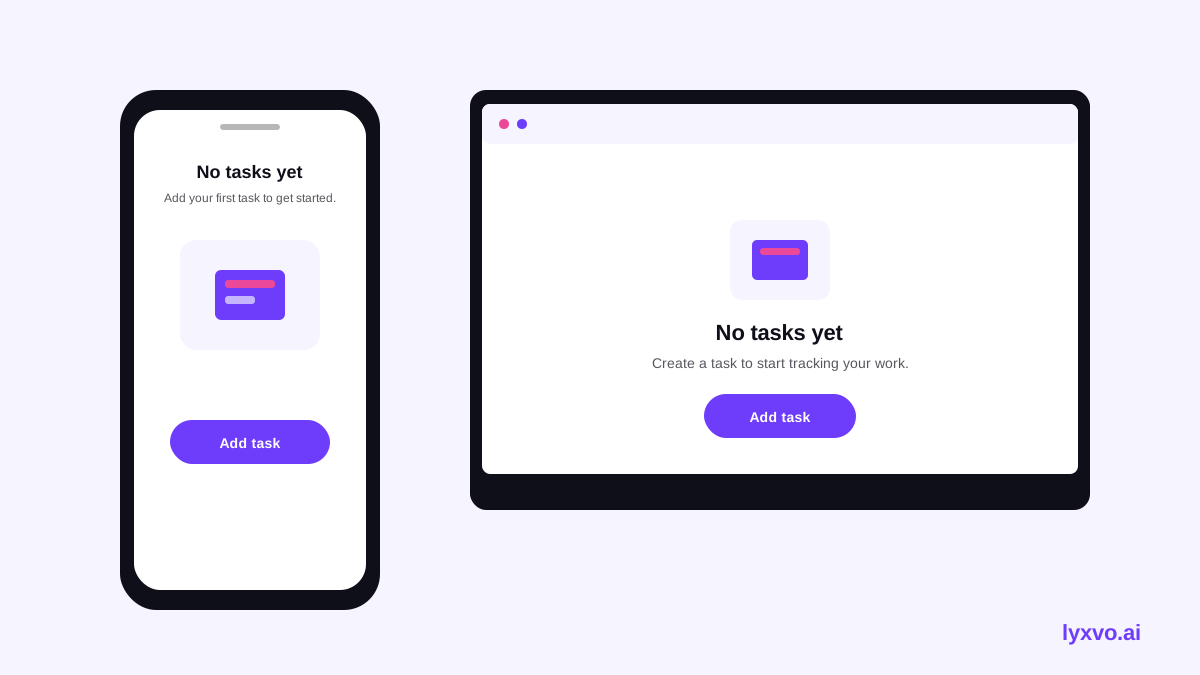
- Headline (what this place is): "No tasks yet"
- One sentence (why it helps): "Tasks keep your team moving. Add the first one to start tracking progress."
- One button (the action): "Add task"
Avoid jokes about being lonely or empty, and avoid blame such as "You haven't done anything". Speak to the next step, not the absence.
Design a consistent illustration system
A set of empty state illustrations should look like one family. Agree on these rules and apply them to every screen:
- Style: flat, outline, or soft 3D. Pick one.
- Palette: two to three brand colors plus neutrals.
- Size and position: same canvas size and centered placement on every screen.
- Scale of objects: keep objects roughly the same size across illustrations so the set feels balanced.
- Stroke and corner radius: use the same values everywhere.
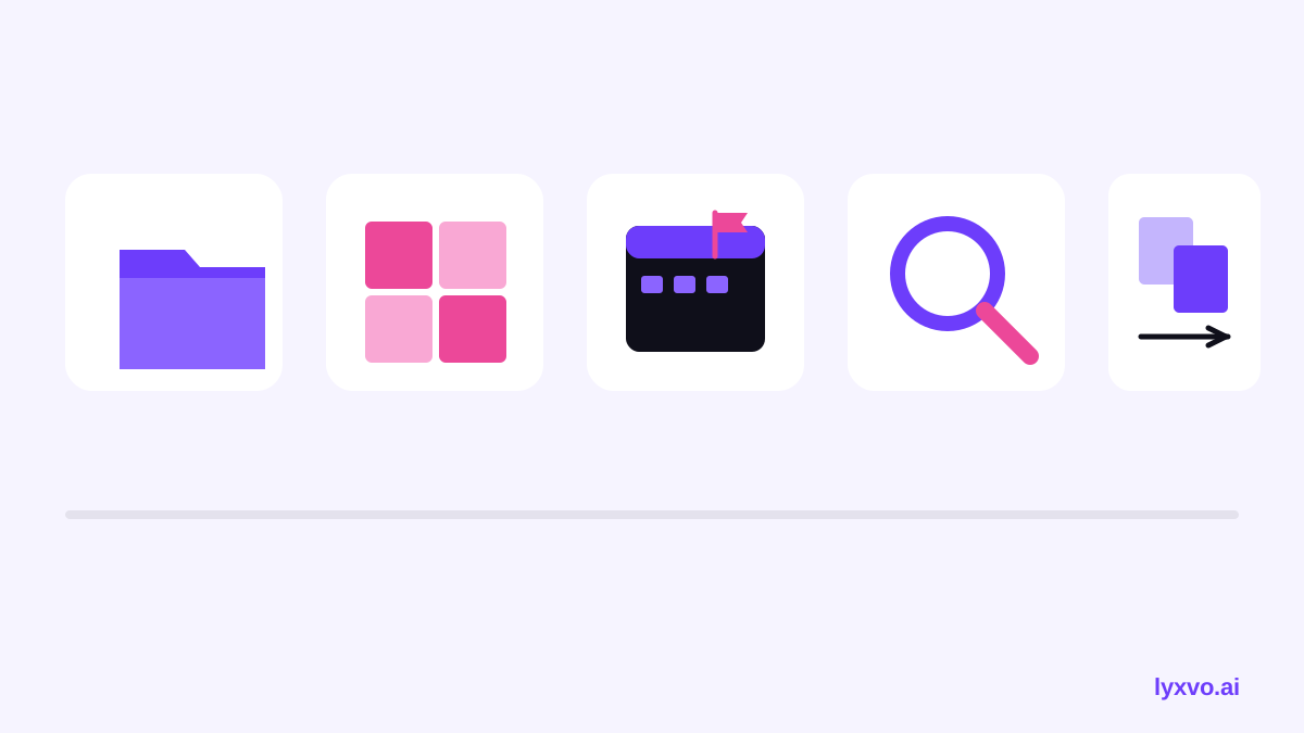
Tip: Show each illustration at the size it will appear in the product, on both desktop and mobile, before you finalize it. Details that look good large can disappear at small sizes.
Build the empty states step by step
Here is a practical workflow that works for a small team or a solo designer:
- List every empty state from your product, including search, filters and permission-restricted views.
- Write the headline, sentence and button for each one.
- Define the illustration style sheet (style, palette, size, stroke).
- Create one illustration, review it in context, and adjust the style sheet if needed.
- Create the remaining illustrations against the same rules.
- Check accessibility: the illustration should be decorative, with the headline carrying the meaning. Confirm text contrast on the background.
- Test with a few new users and ask what they think they should do next.
- Ship, then review analytics for drop-off on those screens.
Design AI empty state illustrations in Lyxvo AI
Lyxvo AI is an agentic design tool that plans and then designs app and web screens, so you can produce empty state screens inside a full interface rather than as isolated images. A practical approach:
- Open the AI UI design generator or the app design tool and describe your project management product, including the empty state you want to show.
- Ask for the empty state on a complete screen so headline, illustration and button are placed together.
- Use the Canva-style editor to change the text, swap colors to match your brand, and adjust the illustration placement directly.
- Export the screen as PNG at real size for review, or as HTML or Flutter and Kotlin Jetpack Compose code if your developers will build it.
- If you want your illustrations to match a full brand, start from the logo generator so the color palette and style carry across.
You can start on Lyxvo Lite, which has a daily limit, and move to a paid plan from pricing when you need more capacity. Check the docs for the current export options.
Common mistakes to avoid
- Too many illustrations. Not every empty state needs its own art. Reserve custom illustrations for first-use moments such as the first project or first task.
- Vague headlines. "Nothing here" tells users nothing. Name the object: "No files in this project".
- No action. An empty state without a button leaves the user stuck.
- Mismatched styles. Mixing a flat illustration with a 3D one breaks trust.
- Ignoring dark mode. Test every illustration on both light and dark backgrounds.
- Decorative overload. Keep the illustration simple so the message stays readable.
Checklist before you ship
- Every empty state has a headline, a one-line explanation and one clear action.
- All illustrations share one style sheet.
- Each illustration works at mobile and desktop sizes.
- Contrast passes for text on the background, in light and dark modes.
- Copy uses plain language and avoids blame.
- New users have tested the flow and understand the next step.
With a clear plan, consistent illustrations and simple copy, an empty state becomes one of the most helpful screens in your project management tool.
Try it in Lyxvo AI
Describe it in your own words and the design agent starts on the right flow. Free to start.
Related tool: Free design templates you can edit in minutes