AI Facebook Cover Photo for a Local Bike Shop: A Practical Guide
An AI Facebook cover photo for a local bike shop can be designed in minutes, as long as you start with the right size, a clear message and a layout that still reads well on phones. This guide walks you through planning, designing and checking your cover so it works for riders who find you on mobile.
Why your cover photo matters for a bike shop
Your Facebook cover is the first thing people see on your page, usually above the fold on a desktop and at the top of the screen on a phone. For a local bike shop it does three jobs at once: it shows what you do (sales, repairs, rentals, group rides), it tells people where you are, and it gives them a reason to call or visit.
A good cover is simple. One strong image, one short line of text, and your logo or name. Anything more gets cramped on a phone.
Know the sizes before you design
Facebook cover photos are displayed in a wide banner, but the exact display size changes between desktop and mobile, and Facebook may update its rules over time. Check the current recommended dimensions in Facebook's help pages before you publish, because the figures below are a general guide, not a fixed specification.
| Element | What to aim for |
|---|---|
| Cover photo | Wide banner, roughly 2.7:1 ratio |
| Safe text zone | Centre area, away from the edges |
| Profile picture | Sits over the bottom-left of the cover, so keep key content away from it |
| Image format | PNG or high-quality JPG |
Tip: keep your logo, name and any words in the middle third. Edges get covered by the profile picture on some screens.
Step 1: Decide the one message
Before you open a design tool, write the single message the cover should communicate. Examples for a local bike shop:
- "Spring tune-ups now booking"
- "Your local bike shop, open 7 days"
- "E-bike rentals on the riverside trail"
- "New season, new gear"
Pick one. A cover that tries to promote three services confuses everyone.
Step 2: Choose a visual that fits your shop
AI image tools work best when you give specific direction. Useful ingredients to describe:
- The setting: a city street at dawn, a forest trail, a workshop bench
- The subject: a road bike, a family cargo bike, a mountain bike mid-jump
- The mood: energetic, friendly, premium, rugged
- The colours: match your shop's logo and brand
If you have real photos of your bikes, staff or customers, use them where possible. Authentic photos build trust with local riders, and AI can help you arrange them into a banner instead of replacing them entirely.
Step 3: Design the layout
Use this layout checklist:
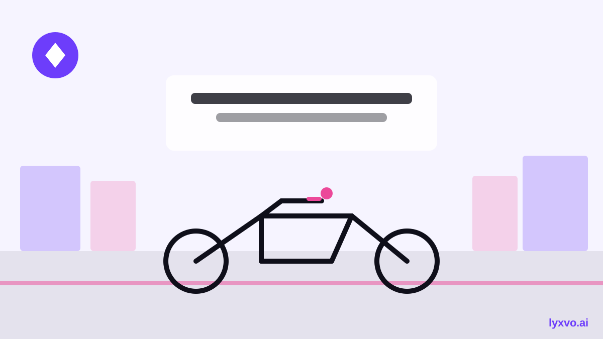
- Put the main subject on the right or centre, leaving clean space in the middle for text.
- Write the headline in large, readable type, no more than six or seven words.
- Add one supporting line, such as your town or opening hours.
- Place your logo where it will not be hidden by the profile picture.
- Keep contrast high so the text is readable over the photo.
- Check that nothing important sits in the outer edges.
Keep it readable on phones
Most people will see your cover on a small screen. Preview it at phone width, and ask yourself: can I read the headline in two seconds? If not, make the text bigger or cut words.
Step 4: Create it in Lyxvo AI
Lyxvo AI has a design agent that can plan and produce complete layouts, including cover-style banners, and a Canva-style editor where you can change text, photos and colours directly. You can also use the ready-made templates as a starting point.
A practical workflow:
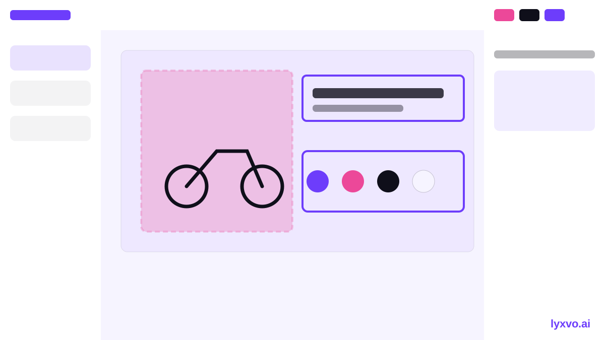
- Open the design studio for social graphics and describe your shop, the message and the mood.
- Review the layout the agent proposes, then edit the headline, photo and colours in the editor.
- Use the logo from your brand kit so the cover matches your shop's other materials.
- Export a PNG at its real size for upload.
If you later need the same design for Instagram or a flyer, Magic Resize can adapt the layout to other formats so your branding stays consistent.
Step 5: Check it before you publish
Run through this final checklist:
- [ ] Message is clear in under three seconds
- [ ] Logo and text avoid the profile picture area
- [ ] Text is readable on a phone
- [ ] Phone number, town or opening hours are correct
- [ ] Image is sharp, not stretched or pixelated
- [ ] Colours match your logo
Common mistakes to avoid
- Too much text. One headline and one line beats a poster.
- Stock-looking imagery that does not show your actual shop. Local riders trust what looks real.
- Forgetting the update cycle. Change the cover for seasons, sales or events so the page feels current.
- Ignoring the profile picture overlap. Your logo can end up hidden.
Keep it fresh
A bike shop's needs change through the year: spring servicing, summer rentals, autumn sales, winter maintenance. Plan a few covers in advance and rotate them. Once you have a layout that works, saving it as a template makes each new season quick to produce.
If you also want a logo or matching post graphics, you can explore AI logo generator, AI social media post generator and free design templates. For a fast start, open the Facebook-ready design studio or browse pricing to choose a plan. Lyxvo Lite gives you a daily allowance to begin for free.
Try it in Lyxvo AI
Describe it in your own words and the design agent starts on the right flow. Free to start.
Related tool: Free design templates you can edit in minutes