AI LinkedIn Post Graphic for B2B Consultants: A Practical Guide
An AI LinkedIn post graphic for a B2B consultant should do one job: stop a busy decision-maker mid-scroll and make the idea behind your post instantly clear. This guide shows you how to plan, design and publish those graphics quickly, using AI to handle the layout so you can focus on the insight.
Why a graphic still matters on LinkedIn
Most consulting posts are text-heavy by nature. A well-built graphic turns a framework, a checklist or a client lesson into something a reader can absorb in two seconds. It also makes your feed presence look consistent, which matters when prospects check your profile before a first call.
For B2B consultants, the best graphics usually fall into a few types:
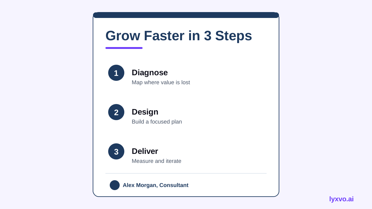
- Frameworks: a 3-step or 4-quadrant model you use with clients
- Checklists: "5 signs your pricing needs a review"
- Quote cards: one sharp line from a client conversation, anonymised
- Carousel-style slides: a sequence of connected points (use a document-style post)
- Before/after diagrams: how a process looked and how it runs now
Plan the graphic before you open a design tool
Ask three questions first:
- What is the single takeaway? If you cannot state it in one sentence, the graphic will be cluttered.
- Who is the reader? A CFO, an operations lead and a founder read the same post differently. Name the role in the headline when it helps.
- What action do you want? Comment, save, book a call or read the full article. Keep the call to action small and specific.
A simple content structure
| Element | Purpose | Example |
|---|---|---|
| Headline | State the takeaway | "Three signs your sales process is leaking" |
| Body (3 to 5 points) | Give the reasoning | Short labels, one idea each |
| Proof line | Build credibility | "Based on 40+ operations reviews" (only if true) |
| Name and role | Attach the post to you | Name, title, firm |
Only use numbers, client counts and results you can stand behind. Invented proof damages trust faster than a plain graphic helps it.
Design rules that work on LinkedIn
- Use one message per graphic. Two ideas split attention.
- Keep text large. On mobile, small text disappears. Aim for headlines readable at phone width.
- Limit colours to two or three. Use your brand's primary colour for emphasis and neutrals for everything else.
- Leave white space. Dense slides look like documents people skip.
- Keep your photo or logo consistent. Repetition across posts builds recognition.
- Export at a size that suits LinkedIn. A square or 4:5 portrait format usually takes up more of the feed than a wide landscape image.
How to make it in Lyxvo AI
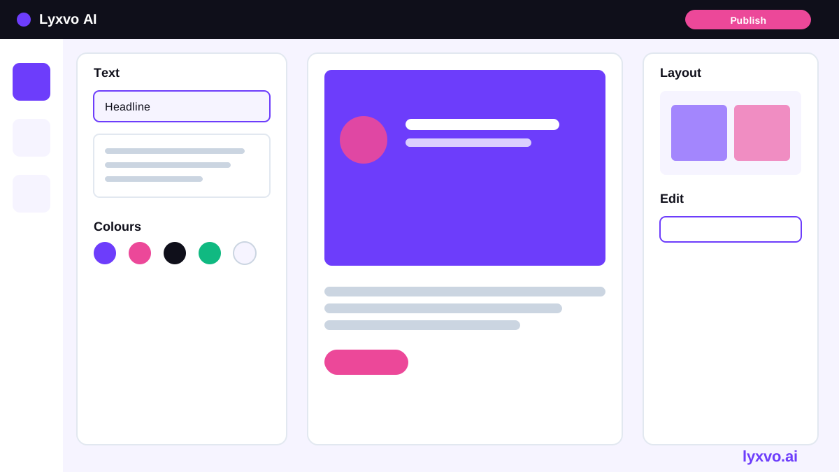
Lyxvo AI's design agent can plan and create social media posts at exact platform sizes, including LinkedIn. You describe the post, and it builds the layout that you then edit in the Canva-style editor.
- Open the social media generator. Start at the AI social media post generator or go straight to the studio.
- Describe the post clearly. For example: "LinkedIn graphic for a B2B operations consultant. Headline: Three signs your sales process is leaking. Three numbered points. Calm navy and white palette. My name and title in the footer."
- Review the layout. Check that the headline is the first thing you read and that the three points are short.
- Edit directly. Change text, swap photos and adjust colours in the editor. You can also use ready-made templates as a starting point.
- Resize if needed. Magic Resize lets you adapt the same design to other formats, such as a slide or a second feed version, without starting over.
- Export. Download a PNG at real size for LinkedIn. Use the same design for a presentation if you want to reuse the framework in a client deck.
Plans and daily usage limits are listed on the pricing page. Lyxvo Lite lets you start for free, subject to a daily limit.
Copy that pairs well with the graphic
The image gets attention; the caption earns the read. A simple pattern:
- Hook (first line): a claim or question, visible before "see more"
- Context (2 to 3 lines): why this matters for your reader
- Graphic reference: "The framework in the image is one I use in every diagnostic."
- Question or call to action: "Which of these three do you see most often?"
Keep the caption shorter than you think. Consultants often over-explain what the graphic already shows.
A repeatable weekly workflow
- Pick one framework, lesson or checklist from your client work each week.
- Write the single takeaway in one sentence.
- Generate the graphic from that sentence, then edit for clarity.
- Draft a three-line caption and one question.
- Schedule the post and note which format gets comments.
- Reuse the best-performing layout for the next topic.
Pre-publish checklist
- [ ] One clear takeaway, stated in the headline
- [ ] Text readable on a phone screen
- [ ] No client names or confidential numbers
- [ ] Every claim and figure is accurate and approved
- [ ] Brand colours and your name or logo are consistent
- [ ] Caption hook works without "see more"
- [ ] One clear call to action
Common mistakes to avoid
- Overloaded slides: cut a point rather than shrink the text.
- Generic stock imagery: a plain background with strong typography usually works better for consulting content.
- No point of view: a graphic that only lists facts gets ignored. Say what you think.
- Inconsistent posting style: pick two or three templates and reuse them.
For more tools, see the AI design overview and the AI presentation maker if you want to turn your best framework into a longer piece of content.
Try it in Lyxvo AI
Describe it in your own words and the design agent starts on the right flow. Free to start.
Related tool: AI social media post generator for every network