AI Poster for Running Club Race Day Signup: A Practical Guide
An AI poster for running club race day signup can turn a quiet noticeboard into a steady stream of registrations, if it tells people the right things at a glance. This guide shows you what to include, how to lay it out, and how to produce print-ready versions.
Why a race day signup poster still works
Most runners see club posters at the start line, at the local track, in cafes and outside running shops. A poster does not need to be clever. It needs to answer three questions in under five seconds: what is happening, when and where it is, and how to sign up.
A good signup poster also works as a reminder. People who meant to register often forget, so a clear poster with a QR code or short link helps them act while they are still standing in front of it.
What every race day poster needs
Before you design anything, collect the facts. Missing details are the top reason posters fail.
- Event name and race distance options (5K, 10K, half marathon, and so on)
- Date and start time, including the registration cut-off
- Venue and start point, with a short landmark description
- Entry fee and what it includes (bib, timing chip, finisher medal, refreshments)
- How to sign up: a short URL, QR code, or the name of your signup page
- Your club name and logo, so people know who to trust
- Contact for questions, such as an email or social handle
Keep the call to action to one line, such as "Sign up by Sunday 15 March at club-name.com". Two or more competing calls to action split attention.
Copy that gets people to sign up
Write the headline as the promise, not the description. "Race Day: Riverside 10K" is accurate. "Run the Riverside 10K on 15 March, all paces welcome" is more persuasive.
Use short lines. Good examples:
- Headline: Riverside 10K. Sunday 15 March.
- Subline: All paces welcome. Chip timing and finisher medal included.
- Call to action: Register now at riversideclub.run
- Footer: Hosted by Riverside Running Club. Questions? hello@riversideclub.run
Avoid jargon that only experienced runners understand, and make the distance and difficulty obvious, so beginners know it is for them.
Layout and visual hierarchy
Arrange the poster in three zones:
- Top: headline and a strong image (runners, a route map, or a bold graphic)
- Middle: date, time, venue and distances in large, scannable type
- Bottom: the call to action, QR code and club logo
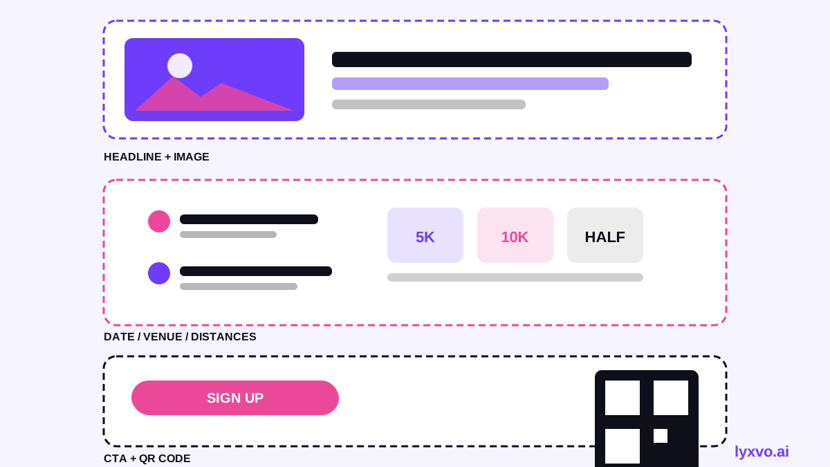
Use high contrast between text and background, and keep at least one large element readable from several metres away. A QR code should be at least 3 cm square on an A3 print so phones can scan it reliably; test it before printing.
Sizes and print settings
Choose the format before you design, so the layout fits the final use:
| Use | Size | Notes |
|---|---|---|
| Noticeboard, café window | A3 (297 × 420 mm) | Readable from a short distance |
| Lamp-post or shop door | A2 (420 × 594 mm) | Headline readable from further away |
| Social share | 1080 × 1350 px | Portrait suits feeds |
| Story or reel cover | 1080 × 1920 px | Keep key text away from the top and bottom edges |
For print, use 300 dpi and export with a small bleed if your printer requires it. Check with your print shop what file format they prefer.
How to make it in Lyxvo AI
Lyxvo AI's design agent can plan and build a poster from your brief, then you refine it in the Canva-style editor. A typical workflow:
- Open the AI flyer and poster maker and choose a poster format, or start in the Studio poster and flyer format.
- Describe the event in plain language: the race name, distance options, date, venue, fee, and signup link. Include your club name and colours.
- Let the agent produce layout options. Pick the one with the clearest headline and call to action.
- Edit text, photos and colours directly in the editor. Swap in your own race photo or route map.
- Export at real size as a print-ready file at 300 dpi, or export a PNG for social sharing.
- For social versions, use Magic Resize to adapt the design to other sizes, and translate the copy if you have international runners.
You can also start from free design templates if you want a head start on structure. Check the current plan limits on the pricing page, as the daily allowance depends on your plan.
Adding a QR code and tracking sign-ups
A QR code makes signup effortless, but only if it points to a working page. Before printing:
- Test the link on a phone with mobile data, not only on your office Wi-Fi.
- Use a short, memorable URL that matches your club name.
- If you print several posters for different locations, use a separate link or parameter for each so you can see which location brings sign-ups.
- Keep the fee and cut-off date on the signup page identical to the poster.
A quick checklist before you print
- [ ] Event name, date, time and venue are correct and spelled consistently
- [ ] Distances and entry fee match the signup page
- [ ] Registration cut-off date is visible
- [ ] Call to action appears once, clearly
- [ ] QR code tested on a phone and links to the right page
- [ ] Text is readable at the intended viewing distance
- [ ] Club logo and contact details included
- [ ] File exported at 300 dpi for print, or correct social size
Make the poster work beyond the noticeboard
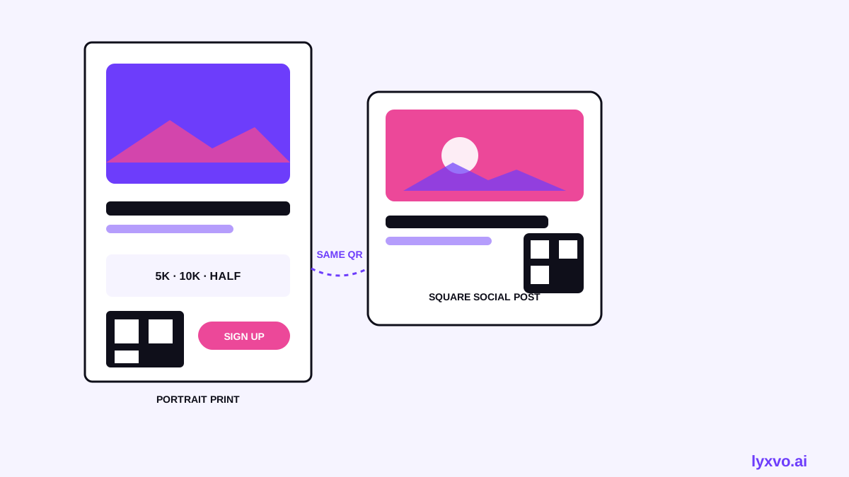
Use the same design across channels so runners recognise it. Post the square version to your club's social accounts, the story version to stories, and the print version to shops and the track. If you want a bolder thumbnail for a race recap or training video, the YouTube thumbnail maker can reuse your key visual.
A clear poster, a simple signup link and a tested QR code will do more for your race day than a complicated design. Start with the facts, keep the message to one call to action, and let the layout do the rest.
Try it in Lyxvo AI
Describe it in your own words and the design agent starts on the right flow. Free to start.
Related tool: AI poster maker for events, promos and concerts