AI UI Design for a Ride-Sharing Driver Earnings Screen
AI UI design for a ride-sharing driver earnings screen means using an AI design agent to plan and draw the screens that show drivers how much they made, when it will be paid, and why. A good earnings screen answers three questions in seconds: how much did I earn today, what is pending, and what can I do next.
Why the earnings screen matters
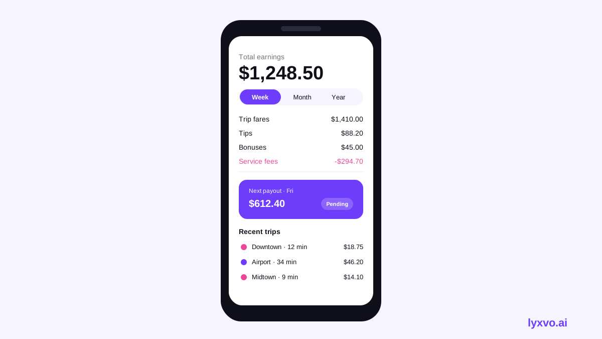
Drivers open the earnings screen many times a day, often between trips and sometimes while parked. That means the screen has to be scannable at a glance, readable in bright sunlight, and calm enough that a driver is not anxious about small variations. A strong screen does three things well: it puts the total first, it explains the breakdown without clutter, and it makes the next payout date unmistakable.
Before designing, write down the questions your users actually ask. Typical ones are "What did I make today?", "Why is this trip lower than I expected?", "When do I get paid?" and "Where do I see my tips?" Every element on the screen should answer one of these.
Planning the information hierarchy
Use a simple order from top to bottom:
- Headline total for the selected period (today, this week, custom range).
- Period switcher so the driver can change the timeframe quickly.
- Breakdown by fares, tips, bonuses, and deductions or fees.
- Payout status with the amount pending and the expected date.
- Trip list with each completed trip, its earnings, and a tap target for details.
- Help or dispute link placed low but always reachable.
Keep the number of colors small. Use one accent color for the headline total, one neutral for labels, and a muted color for fees. Avoid red for normal deductions, since it can read as an error.
Component checklist
- Large, bold total with a clear currency and period label
- Period tabs that show the active state clearly
- Breakdown rows with icons and right-aligned amounts
- A payout card with status (pending, scheduled, paid)
- Trip rows with time, distance or route summary, and amount
- Empty state for a day with no trips, with a helpful message
- Loading and error states that keep the last known total visible
Designing the data display
Numbers are the core of this screen, so formatting matters. Align amounts to the right so drivers can compare them vertically. Use the same decimal format everywhere. Show totals before details, and let drivers expand a breakdown instead of forcing them to read everything at once.
Write labels in plain language. "Platform service fee" is clearer than an internal code. If a fee was applied, add a short line of explanation behind an info icon instead of a long paragraph on the main screen.
Accessibility and trust
Drivers may use the app outdoors, at night, or with one hand. Keep text at a comfortable size, give tap targets at least the standard minimum size, and never rely on color alone to show a change. Pair an up arrow with a plus sign, for example, so meaning survives for color-blind users.
Trust grows when the screen is honest about timing. If a payout is pending, say when it will be evaluated. If data is delayed, show a timestamp such as "Updated 5 minutes ago" so drivers know how fresh the number is.
Step-by-step: designing the screen in Lyxvo AI
Lyxvo AI's design agent plans the layout first, then produces complete app screens for iOS, Android or web. A practical workflow looks like this:
- Open the AI UI design generator or start from the AI app design page, then choose the mobile platform for the driver app.
- Describe the screen in plain language: the headline total, the period switcher, the breakdown rows, the payout card and the trip list. Mention the audience (drivers using the app on the road) and the tone (calm, clear, trustworthy).
- Review the generated layout and check the hierarchy against the list above. Move the total to the top if it is not first.
- Use the Canva-style editor to change text labels, colors and photos directly, so the wording matches your product.
- Test the number formatting by replacing sample values with realistic long amounts, including tips and fees, to confirm nothing overflows.
- Export the screen as PNG at real size for review, or as Flutter or Kotlin Jetpack Compose code if your team builds natively.
If you also need marketing visuals for the same feature, the AI social media post generator can create posts at exact platform sizes, and the free design templates library can speed up slides for driver onboarding.
Note: the Lyxvo AI studio also supports design for web (/design/?platform=web), so a driver dashboard on the web can reuse the same hierarchy.
Common mistakes to avoid
- Burying the total below a long trip list
- Using red for every deduction, which makes normal fees look like errors
- Showing payout dates without saying whether they are estimates
- Forgetting the empty state for drivers who just went online
- Using tiny text in the breakdown, which is hard to read while driving or parked outdoors
- Hiding the dispute or help link so drivers cannot find it
Testing before launch
Run a short usability check with a few drivers. Ask them to find today's earnings, explain one deduction, and tell you when their next payment arrives. If they struggle, simplify the labels and move the answer higher on the screen. Repeat until those three tasks feel effortless.
Next steps
Start with one clear earnings screen, get feedback, then extend the same visual system to payouts, trip details and weekly summaries. For a quick start, you can open the AI UI design generator and describe your first screen today.
Try it in Lyxvo AI
Describe it in your own words and the design agent starts on the right flow. Free to start.
Related tool: AI UI design generator for apps and websites
Whole apps and websites are designed with the Lyxvo Engine, rented separately from the design plans; every account can try 2 pages free.