AI UI for Senior Citizen Telehealth Video Calls: A Practical Design Guide
An AI UI for senior citizen telehealth video calls is an interface built so an older patient can join, see and speak with a clinician without confusion. The best designs remove steps, use large readable text and make the one important action obvious on every screen. This guide walks through the design decisions, a simple checklist, and how to draft these screens in Lyxvo AI.
Why older users need a different telehealth interface
Many telehealth apps are built for younger users who are comfortable with small icons, nested menus and multiple permission prompts. Older patients often face extra challenges: reduced vision, hearing loss, tremor, lower familiarity with smartphones, and stress about being unwell. A call that starts with a confusing setup screen can mean a missed appointment.
The goal of an AI UI for senior citizen telehealth video calls is simple: one clear path from "I have an appointment" to "I can see my doctor." Every extra choice adds friction.
Core design principles
Make text large and high-contrast
- Use a base body size of at least 18 pt on mobile and 20 px on web.
- Keep buttons at least 48 x 48 pt so they are easy to tap.
- Use dark text on a light background, or a clearly contrasting dark mode. Avoid light grey text on white.
- Never rely on color alone. Pair a red "Leave call" button with a clear label.
Reduce steps before the call
A good flow looks like this:
- Home screen shows one large button: Join my appointment.
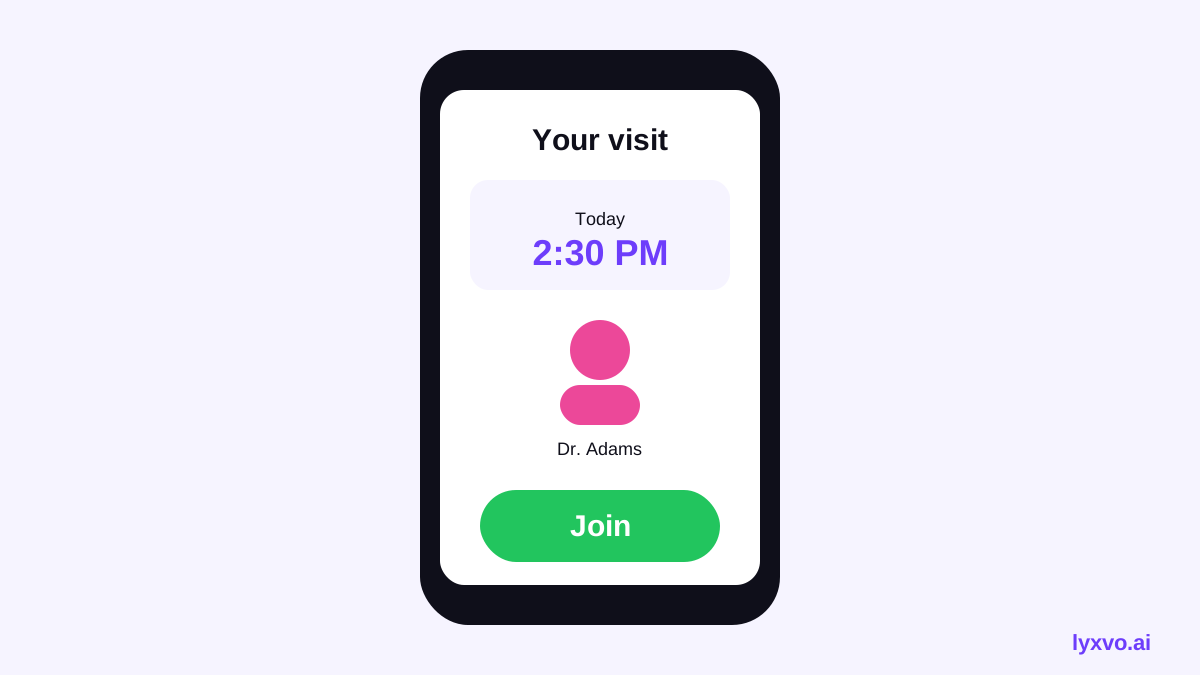
- Appointment card shows the doctor's name, time and a countdown.
- A single "Test my camera and sound" screen with a preview.
- A big green Join now button.
Avoid asking for passwords during the call itself. Where possible, use a link or a one-time code the family can help with in advance.
Keep call controls few and obvious
During a video call, show only four controls: mute, camera on/off, speaker volume, and a large red end-call button. Hide advanced options behind a single "More" button. Place controls at the bottom of the screen where thumbs naturally rest.
Plan for a helper in the room
Many older patients join with a family member or caregiver. Add a "Add a helper" option that shares a read-only view of the appointment details and join link.
Use plain language
- "Join your visit" instead of "Initiate teleconsultation."
- "Your doctor will be with you shortly" instead of "Awaiting provider admission."
- Show the time in words, for example "Today at 2:30 in the afternoon."
Sample screen checklist
| Screen | Must have | Avoid |
|---|---|---|
| Home | One primary action, appointment time | Many tabs and icons |
| Pre-call check | Camera preview, sound test, large Join button | Permission prompts without explanation |
| Waiting room | Doctor's name, "Please wait" message, helper button | Animated distractions |
| Live call | Four controls, large end button, self-view toggle | Small or hidden controls |
| After call | "Your visit is complete" and follow-up steps | Dead ends with no next step |
Accessibility basics to build in
- Support system text size settings so the layout grows with the user's preferred size.
- Add captions option during video calls.
- Use VoiceOver and TalkBack labels on every button.
- Test with a screen reader and with one hand.
- Keep animation minimal and allow reduced motion.
How to design this in Lyxvo AI
Lyxvo AI's design agent can draft app and web screens for iOS, Android and the web from a written plan. A practical workflow:
- Open the AI UI design generator or the AI app design tool.
- Describe the flow in plain words, for example: "Telehealth video call for patients aged 65+. Home screen with one large Join button, pre-call camera check, waiting room, live call with four controls, and after-call summary. Large text, high contrast, 48 pt buttons."
- Generate the screens for the platform you need, using the studio link for app screens or web screens.
- Edit text, colors and photos directly in the Canva-style editor to match your clinic's brand.
- Export PNG at real size for stakeholder review, or export to Figma or Flutter / Kotlin Jetpack Compose code when your developers are ready.
Before handing screens to developers, check them against the checklist above and run a short usability session with an older adult who is not a tech user.
Testing with real older users
Design assumptions are not enough. Recruit a small group of older patients and caregivers, give them a task such as "Join your 2:30 appointment," and watch without helping. Note every hesitation. Fix the most common stumbles first, then test again.
Note: Regulatory requirements for telehealth (such as privacy, consent and data-handling rules) vary by country and region and change over time. Confirm current requirements with your legal and compliance team before launch.
Example: a simple joining flow
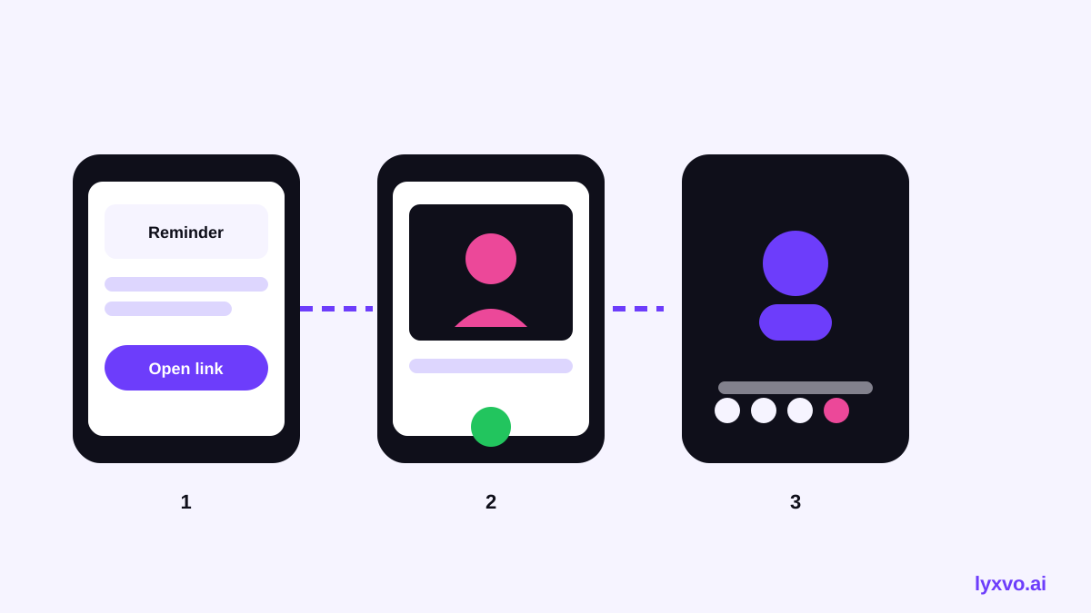
A clinic might use this minimal sequence:
- Text reminder with a link and the time.
- Tap the link, which opens the home screen with one button.
- Camera and microphone check, with a sentence explaining why access is needed.
- Tap Join now.
- The doctor appears. The patient sees four large controls.
- After the visit, a short summary says what happens next.
Each step has one job. That is the core of an accessible AI UI for senior citizen telehealth video calls.
Final checklist before launch
- Primary action is visible on every screen without scrolling.
- Body text is at least 18 pt and resizes with system settings.
- Buttons are at least 48 pt and have clear labels.
- Camera and sound check happens before the call starts.
- Helper or caregiver can join or view details.
- Screen reader labels are present on all controls.
- Usability tested with older adults.
- Privacy and consent wording reviewed for your region.
For more background on design tools and templates, see the Lyxvo AI blog and the free design templates library. You can also review plans on the pricing page if you want to design across multiple screens.
Try it in Lyxvo AI
Describe it in your own words and the design agent starts on the right flow. Free to start.
Related tool: AI UI design generator for apps and websites
Whole apps and websites are designed with the Lyxvo Engine, rented separately from the design plans; every account can try 2 pages free.