AI UI Generator for University Course Registration Portals

An AI UI generator for university course registration portal projects can turn a rough list of requirements into working screens in a fraction of the usual time. The real value comes from giving the tool clear rules about students, timetables, prerequisites and deadlines, then reviewing every screen against how registration actually works.
Why course registration portals are hard to design
A registration portal looks simple on the surface: search courses, pick a section, submit. In practice it has to handle waitlists, time conflicts, prerequisites, credit limits, holds on accounts and deadlines that change by student year. When the interface hides these rules, students lose seats and staff receive a flood of support emails.
A good starting point is to write down the core tasks before opening any design tool:
- Find courses by code, title, department, instructor or requirement area
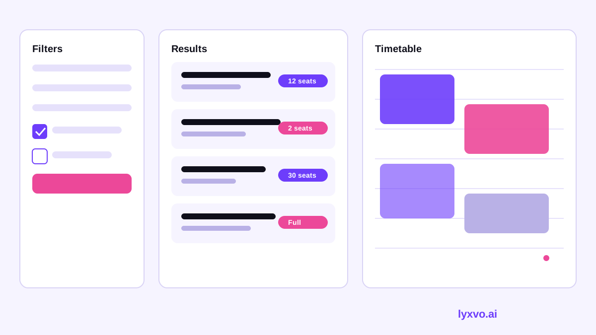
- See seats, meeting times and location at a glance
- Detect time conflicts before submitting
- Add to a cart, join a waitlist, or swap a section
- Check fees, credit totals and holds
- Confirm, print or export a schedule
What an AI UI generator should produce
An AI UI generator is most useful when you describe the flow, not just the look. Give it the student type, the steps, the states (open, full, waitlisted, closed) and the error messages you need. Ask for a set of screens rather than one page, so you can test the whole journey.
Inputs to prepare
- A list of user roles: undergraduate, graduate, advisor, registrar staff
- The registration calendar, including priority windows
- Rules for prerequisites, co-requisites and credit caps
- The brand colors, logo and university name
- Accessibility requirements (WCAG level, keyboard use, screen reader support)
Core screens for a registration portal
| Screen | Purpose | Key elements |
|---|---|---|
| Dashboard | Shows term status and deadlines | Countdown, holds, next steps |
| Course search | Finds sections | Filters, seat counts, results list |
| Course detail | Explains one section | Times, instructor, prerequisites, seats |
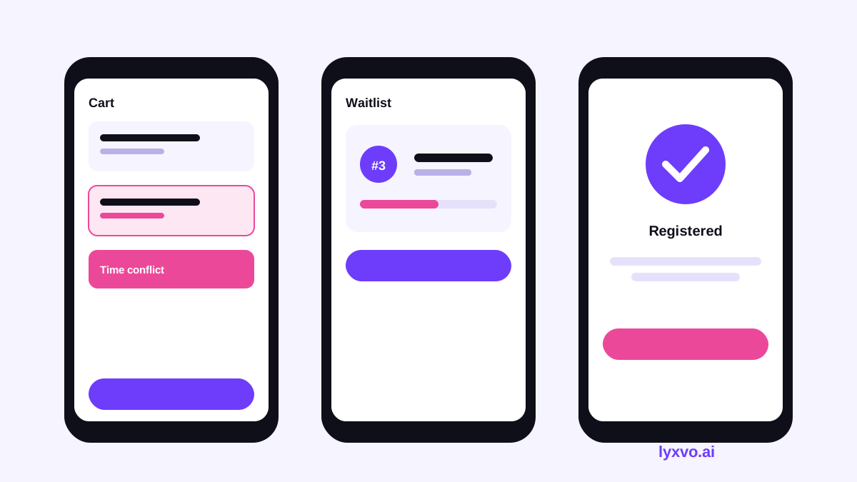
| Cart / plan | Compares options | Conflict warnings, credit total |
| Confirmation | Shows the final schedule | Export, print, add-to-calendar |
| Waitlist status | Tracks position | Position, expected outcome, withdraw |
Design patterns that reduce mistakes
- Show conflicts inline, next to the section, not after submission
- Use plain labels such as "Full - join waitlist" instead of codes
- Keep the credit total visible at all times
- Make the confirmation screen list every change, including dropped courses
Step-by-step: generating the portal with an AI UI generator
- Write the brief. Describe users, goals, the registration calendar and any hard rules such as the maximum credits per term.
- Generate the core screens. Start with search, detail, cart and confirmation. Ask for mobile and desktop layouts.
- Test the states. Request versions for full sections, waitlisted sections, holds and closed windows.
- Check the copy. Read every error message aloud. Make sure each one says what happened and what the student can do next.
- Review accessibility. Check color contrast, focus order, labels on form fields and text size.
- Walk through with staff. Ask a registrar and two students to complete a sample registration on the prototype.
- Hand off. Export the screens and design tokens so developers can build from the same source.
Accessibility and inclusive design checklist
- [ ] Text meets WCAG AA contrast
- [ ] Every control can be reached by keyboard
- [ ] Seat status is conveyed by text, not color alone
- [ ] Timetables have a text-based list version
- [ ] Error messages are announced to screen readers
- [ ] Layouts work at 200% zoom and on small phones
Common mistakes to avoid
- Designing only the happy path and forgetting waitlists and holds
- Hiding prerequisite rules until the final step
- Using calendar grids that do not work on phones
- Writing vague messages such as "Registration failed"
- Skipping testing with real students during peak registration
How to do this in Lyxvo AI
Lyxvo AI's design agent can plan and produce complete app and website screens for iOS, Android and web. For a registration portal, you can describe the student roles, the core flow and the states you need, then generate the screens. Use the AI UI design generator to create interface layouts, the AI app design tool for mobile versions, and the AI website design tool for the desktop portal. You can edit text, colors and images directly in the Canva-style editor, and export to Figma (SVG and tokens), HTML, Flutter or Kotlin Jetpack Compose. If you need a full multi-page portal built out, that runs on the Lyxvo Engine, which is rented separately; every account can try two pages free. Plans and prices are listed on the pricing page, and current limits may change, so check there before you commit.
Testing before launch
Before students see the portal, run a short usability test. Give five to eight students a realistic task, such as building a schedule with two conflicts to resolve, and watch where they hesitate. Repeat the test after each major change. Record how long each task takes, how many errors occur and what questions students ask. Fix the largest problems first, then retest the flow that changed.
Summary
An AI UI generator can speed up the design of a course registration portal, but the quality depends on a clear brief, complete states and honest testing with students and staff. Start with the core screens, design conflicts and waitlists in from the beginning, check accessibility, and hand off a consistent set of screens to developers.
Try it in Lyxvo AI
Describe it in your own words and the design agent starts on the right flow. Free to start.
Related tool: AI UI design generator for apps and websites
Whole apps and websites are designed with the Lyxvo Engine, rented separately from the design plans; every account can try 2 pages free.