AI Usability Test Prototype for a Clinic Kiosk: A Practical Guide
An AI usability test prototype for a clinic kiosk lets you find check-in and form problems before any hardware or software is built. This guide shows how to plan the test, design the prototype screens, run sessions with patients and staff, and act on what you learn.
Why test a clinic kiosk prototype before building it
A clinic kiosk is used by people who are often stressed, unwell, elderly, or in a hurry. Nobody reads a long manual at a reception desk. If the check-in flow is confusing, patients queue, staff get interrupted, and privacy can be put at risk when someone walks away from a screen with their details visible.
A prototype test lets you learn these problems while changes are still cheap. You do not need working code. You need clickable screens, a clear set of tasks, and real people who resemble your patients.
Define the tasks and the patient scenarios
Start with what a real visit looks like. Write down the three to five jobs the kiosk must handle, then turn each into a task a participant can attempt.
- Check in for a scheduled appointment
- Confirm or update contact details
- Complete a short symptom or consent form
- Pay a copay or deposit
- Find where to go next in the building
For each task, write a scenario in plain language, such as: "You have a 10:30 appointment with Dr. Lee. Check in and tell the screen you have a new phone number." Avoid words that appear on the screen, or you will only test recognition, not understanding.
Note: Recruit participants who match your real users, including people who wear glasses, use a wheelchair, have low digital confidence, or speak a language other than your interface language. Testing only with colleagues hides most of the problems.
Build the prototype screens
You can make a prototype in any design tool, but speed matters. A practical approach is to design each kiosk state as a separate screen and link them: welcome, identify, confirm, form, payment, confirmation, and an error state.
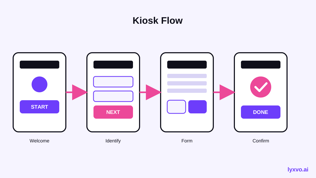
Keep the prototype honest. Use large tap targets, high contrast text, and a visible back or cancel action on every screen. Include the error and timeout screens, because those are where most usability failures happen. If you want to test language support, design the same flow in two languages so you can compare comprehension.
Use AI to generate variations quickly
An AI design agent helps you move from a plan to a set of screens fast, so you can test two or three layouts instead of one. You can generate a first draft of the kiosk screens with AI app design tools, then adjust text size, spacing and color directly in the editor. Whatever you produce, keep the copy short and plain, and check it with a real person before trusting it.
Write the test script and the measures
A usability test needs a consistent script so results can be compared across participants. Introduce the session, explain that you are testing the kiosk and not the participant, then give each task in turn. Do not help unless the participant is stuck for a long time, and record where help was needed.
Measure things you can count:
| Measure | What it tells you |
|---|---|
| Task completion (yes or no, without help) | Whether the flow works at all |
| Time on task | Where people hesitate |
| Errors and backtracks | Confusing labels or layouts |
| Help requests | Missing guidance |
| Confidence rating (1 to 5, after each task) | How safe people feel |
| Privacy concerns voiced | Screens that expose information |
Five to eight participants per user group usually reveals the most serious problems in a round of testing. Run a second round after you fix the first findings.
Run the sessions and record what happens
Sit beside the participant, not across a desk. Watch where their eyes go and where their finger hovers. Ask them to think aloud. When they say "I think I press this," write it down, because that sentence tells you what the label means to them.
Record the session with consent if you can, and take notes in a shared table with one row per task and participant. Tag each observation as a problem, a near miss, or a strength, so you can sort them later.
Analyse and prioritise the problems
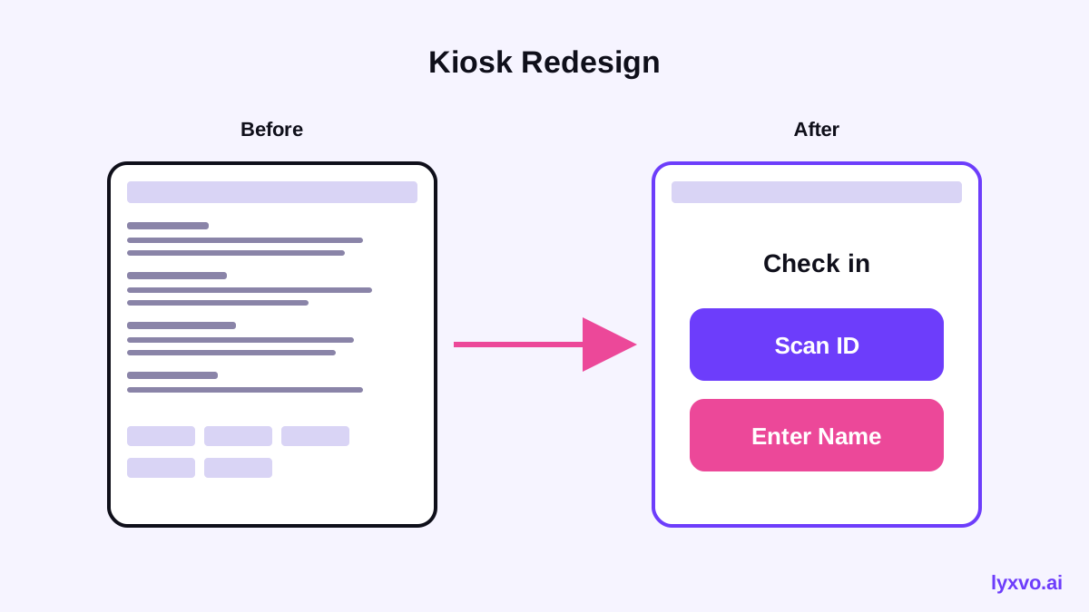
Group observations into themes such as wording, layout, timing, accessibility, and privacy. Then rank each problem by how many participants hit it and how badly it blocked them. A problem that stops a patient from checking in outranks a cosmetic issue, even if the cosmetic one annoyed more people.
A simple severity scale
- Critical: the patient cannot finish the task or exposes private data
- Serious: the patient finishes only after long confusion or help
- Minor: the patient finishes, but with hesitation
- Cosmetic: the issue is noticed but does not affect the outcome
Make the fixes and test again
Change the prototype to address the critical and serious findings first. Simplify labels, enlarge buttons, add a clear next step on every screen, and shorten the form. Then run the same tasks with new participants. Compare completion rates and time on task between rounds, so the improvement is measured, not assumed.
How to do this in Lyxvo AI
Lyxvo AI's design agent can plan and design complete app and website screens for iOS, Android and web. In the Lyxvo design studio you can start from a description of your kiosk flow and receive a first set of linked screens, then edit text, colors and images directly with the Canva-style editor. Use the platform option for app-style screens, or the AI app design page to see how interface screens are produced.
When the screens are ready, export them as PNG at real size for your test deck, or as HTML if you want a clickable web prototype to share with a remote participant. Real-time collaboration lets clinic staff and designers review the same screens together and leave comments before the next test round. Plans and limits are listed on pricing, and the docs explain the export options in more detail.
Note: Lyxvo AI designs the screens. It does not replace testing with real patients and staff, and every screen should be reviewed for accuracy, accessibility and privacy before use in a clinic.
A short checklist before your first session
- Tasks match real visit goals, written as scenarios
- Participants reflect your real patients, including accessibility needs
- Every kiosk state is designed, including errors and timeouts
- Text is short, high contrast and readable from a standing position
- A privacy check confirms no personal data is visible to passers-by
- Note-taking sheet and severity scale are ready
- Consent is recorded and participants can stop at any time
A well-run prototype test is the cheapest way to make a clinic kiosk that patients can use alone. Plan the tasks carefully, test with the people who will actually use it, and keep improving the flow until the critical problems are gone.
Try it in Lyxvo AI
Describe it in your own words and the design agent starts on the right flow. Free to start.
Related tool: Free design templates you can edit in minutes