AI UX Copywriting for Error States in Checkout
AI UX copywriting for error states in checkout means writing the short messages that appear when a payment fails, a card is declined, or a field is invalid, so the shopper knows what happened and what to do next. Good error copy keeps people moving toward purchase instead of abandoning their cart.
Checkout is the most fragile part of any online store. A vague message like "Something went wrong" can make a shopper think their money is at risk and leave. Clear error copy does three things: it says what happened, it says what to do, and it reassures the person that their information and cart are safe.
AI can help you draft many variants quickly, but the final copy still needs a human review for accuracy, tone and legal wording. This guide covers the principles, a reusable structure, sample copy, a checklist, and a workflow you can run in Lyxvo AI.
Why checkout error copy matters
An error state is a moment of doubt. The shopper has already decided to buy, and now something blocks them. Their next question is almost always "Was I charged? Did I lose my order? Is this my fault?" Your copy should answer those questions before they are asked.
Weak copy usually shows up in four ways:
- Blame language ("Invalid input", "You entered wrong data")
- Technical jargon ("Error 402", "Gateway timeout")
- No next step (the message states the problem and stops)
- Alarm without help (red text, no explanation)
Rewriting these into calm, specific, action-oriented sentences is one of the cheapest conversion fixes you can make.
The four-part structure for error messages
Most effective checkout errors follow the same pattern. Use it as a template, then adapt the words to your brand.
- What happened, in plain language, without blame.
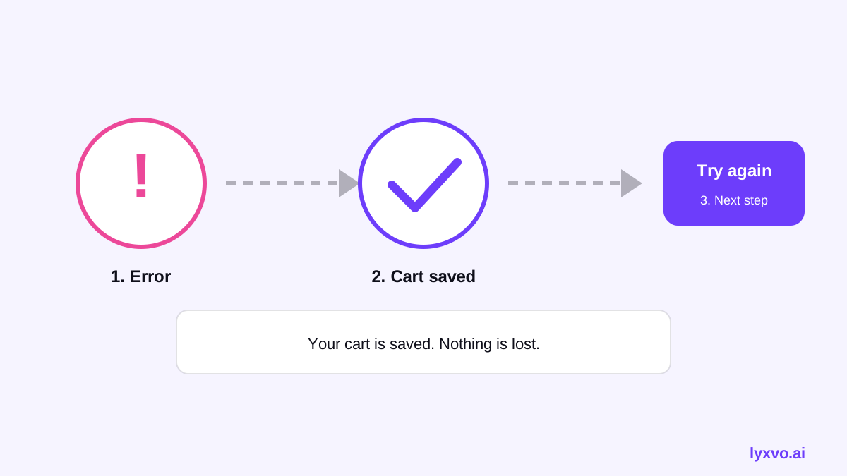
- What it means for the shopper (is their money safe, is the cart saved?).
- What to do next, as one clear action.
- Where to get help, if the action fails.
Keep each message under about 25 words where you can. Shoppers scan these; they do not read them.
Example rewrites
| Situation | Weak copy | Better copy |
|---|---|---|
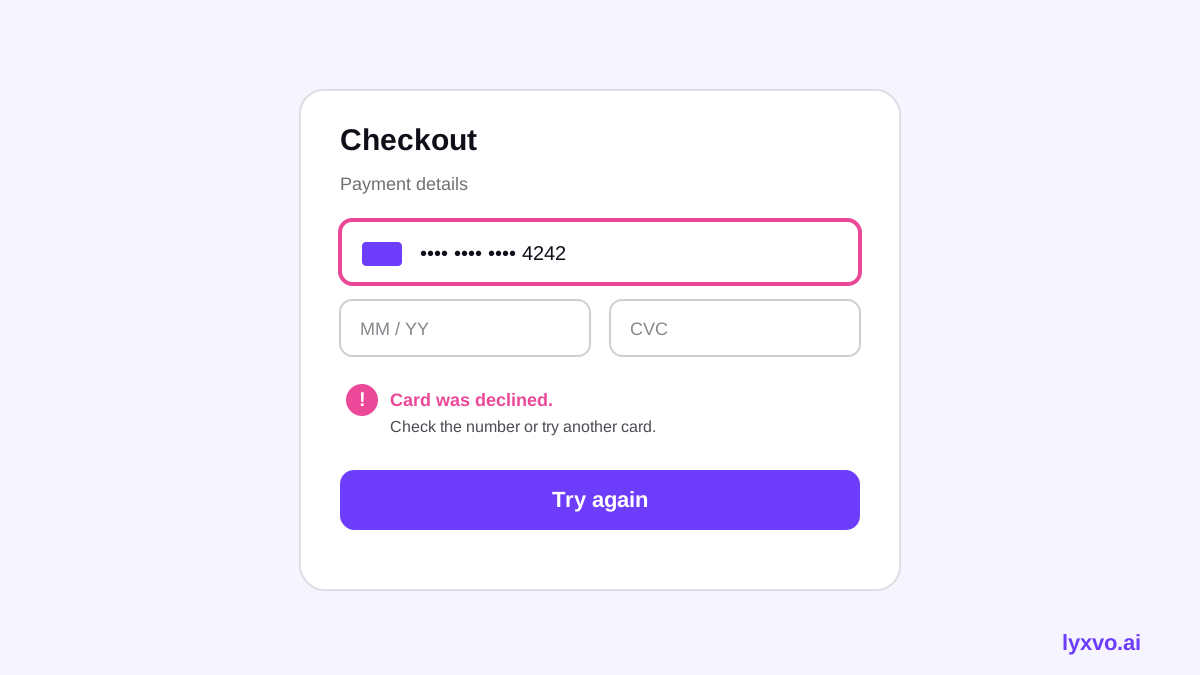
| Card declined | "Payment error." | "Your bank declined this card. You haven't been charged. Try another card or payment method." |
| Invalid postal code | "Invalid input." | "Check your postal code. It should be 5 digits." |
| Expired session | "Session expired (401)." | "Your session timed out to keep your details safe. Your cart is still saved. Sign in to continue." |
| Out of stock at checkout | "Unavailable." | "One item sold out while you were checking out. Remove it or choose a similar item to continue." |
| Network failure | "Request failed." | "We couldn't reach our payment service. Your card hasn't been charged. Try again in a moment." |
Notice that only accurate reassurance should be used. Saying "You haven't been charged" is only correct if your system confirms it. Never promise what your payment flow cannot guarantee.
Tone and style rules
- Use "you" and active voice. "Check your card number" beats "Card number must be checked."
- Avoid blame. Describe the situation, not the person.
- No error codes in the visible text. Log them for support; show plain language.
- Match your brand voice but keep the clarity of a utility message. Playful jokes in error states often feel flippant.
- Localize properly. Translate meaning, not just words, and check that the message still fits the layout.
- Accessibility: do not rely on color alone; pair red text with an icon and text, and announce errors to screen readers.
Using AI to draft checkout error copy
AI is useful for generating options fast: five tones for one message, the same message in three lengths, or a list of every field-level error your form can produce. A practical workflow:
- List every error your checkout can show: payment declined, expired card, invalid field, address not found, out-of-stock item, timeout, shipping not available.
- For each one, write the facts you know for certain (for example, whether the cart is saved).
- Ask an AI tool for three short variants following the four-part structure, and specify your brand voice and word limit.
- Remove any claim you cannot verify, check legal and payment wording with the right team, and test with real users.
Checklist before you ship
- [ ] Every error has a plain-language message
- [ ] Each message says what to do next
- [ ] Reassurance about money and cart is accurate
- [ ] No technical codes shown to shoppers
- [ ] Copy is under about 25 words
- [ ] Messages are translated and fit the layout
- [ ] Errors are announced to assistive technology
- [ ] Support contact is available for repeated failures
How to do this in Lyxvo AI
You can mock up a checkout screen with its error states in Lyxvo AI's design agent, then edit the copy directly in the editor. Describe your checkout screen and the error states you need, and the agent can produce the screen layouts for web or mobile. Open the editor to rewrite any message, change colors and icons, and check spacing for longer translated text. The Magic Resize and translate tools can help you test the same layout across sizes and languages.
To design the screen itself, start with the AI UX design tool or the AI app design page, then open the web studio or app studio. Lyxvo AI produces the design; you should still review the final wording with your product, legal and support teams before publishing.
Testing your error copy
Writing good copy is only half the job. Test it:
- Trigger each error on staging and read it aloud. Does it make sense without context?
- Run a quick comprehension check with a few people unfamiliar with your product: what happened, and what would they do?
- Watch real drop-off in analytics at each checkout step and compare before and after changes.
- Review support tickets that mention payment or checkout confusion; they point directly to unclear copy.
Common mistakes to avoid
- Showing the same generic message for every failure
- Promising refunds, safety or cart retention you cannot guarantee
- Hiding the error until the shopper submits the whole form again
- Using all-caps or alarming red for minor validation issues
- Forgetting that mobile screens need shorter copy
Keep improving
Treat error copy as a living part of your interface. Revisit it when your payment providers change, when you add new shipping or payment options, and when support tickets reveal new confusion. For more on building the surrounding screens, see the AI website design page, and browse free design templates to start a checkout layout quickly. Pricing details are on the pricing page, and more guides are in the blog.
Try it in Lyxvo AI
Describe it in your own words and the design agent starts on the right flow. Free to start.
Related tool: AI UI design generator for apps and websites
Whole apps and websites are designed with the Lyxvo Engine, rented separately from the design plans; every account can try 2 pages free.