AI UX Heuristic Review for Ecommerce Homepage: A Practical Guide

An AI UX heuristic review for an ecommerce homepage uses a structured set of usability principles to find friction before shoppers do. Done well, it gives you a prioritized list of fixes you can act on the same day. This guide walks through the checklist, how to score issues, and how to turn findings into revised screens.
What a heuristic review checks
A heuristic review compares a screen against established usability principles, most commonly the ten heuristics first written by Jakob Nielsen. For an ecommerce homepage, the principles that matter most are:
- Visibility of system status: shoppers can tell where they are, what is loading, and what happened after a click.
- Match between system and the real world: labels use the words customers use, not internal jargon.
- User control and freedom: it is easy to back out of a category, filter or cart action.
- Consistency and standards: buttons, prices and product cards look and behave the same everywhere.
- Error prevention: the site avoids mistakes such as ambiguous size selectors or unclear shipping costs.
- Recognition rather than recall: options are visible, not hidden behind memory or menus.
- Flexibility and efficiency: returning shoppers can reach their usual products quickly.
- Aesthetic and minimalist design: no clutter competing with the main call to action.
- Help users recognize, diagnose and recover from errors: messages are plain and point to a fix.
- Help and documentation: answers to shipping, returns and sizing are easy to find.
AI helps by reading the homepage quickly and flagging where a screen breaks one of these rules. It does not replace a person who knows your customers, so treat its output as a strong first draft.
Step 1: Define the homepage goal
Before you review anything, write one sentence describing what a successful homepage visit looks like. For example: "A first-time visitor finds a product category within 10 seconds and reaches a product page." Every issue you log should be judged against that goal. A homepage that pushes a seasonal sale but hides the search bar has a clear priority problem.
Step 2: Capture the screens
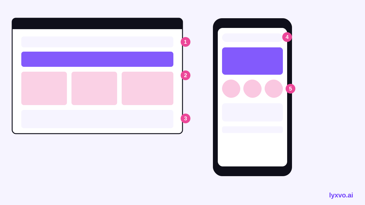
You need the homepage at the sizes shoppers actually use. Capture at least:
- Desktop (wide view)
- Mobile portrait
- The fold area, where the first screen ends
- The full scrolling page, so the review covers the sections below the fold
Label each capture with its breakpoint. Mobile often reveals the largest problems, because navigation collapses and product cards stack.
Step 3: Run the AI heuristic pass
Give the captures to an AI reviewer with a fixed prompt. Ask it to name the heuristic each issue breaks, quote the element involved, explain the likely impact on a shopper, and suggest one fix. Keep the prompt narrow: one page, one goal, and the ten heuristics above. Narrow prompts produce specific findings; vague prompts produce generic advice like "make it more modern."
A checklist to verify every finding
- Can you point to the exact element on the screenshot?
- Does the issue connect to the homepage goal from Step 1?
- Would a real shopper plausibly hit this problem?
- Is the suggested fix something your team can build?
Discard findings that fail two or more of these checks.
Step 4: Score severity
Not every issue deserves the same urgency. Use a simple four-level scale:
| Severity | Meaning | Example |
|---|---|---|
| 4 - Critical | Blocks the path to purchase | Add-to-cart button hidden on mobile |
| 3 - Major | Causes real hesitation or errors | Size guide link tucked in footer |
| 2 - Minor | Slows the shopper down | Inconsistent price formatting |
| 1 - Cosmetic | Polish only | Slightly uneven card spacing |
Fix all level 4 issues first, then level 3. Batch level 1 issues into a later design pass. Record frequency too: an issue seen on every product tile matters more than one seen once in a banner.
Step 5: Turn findings into fixed screens
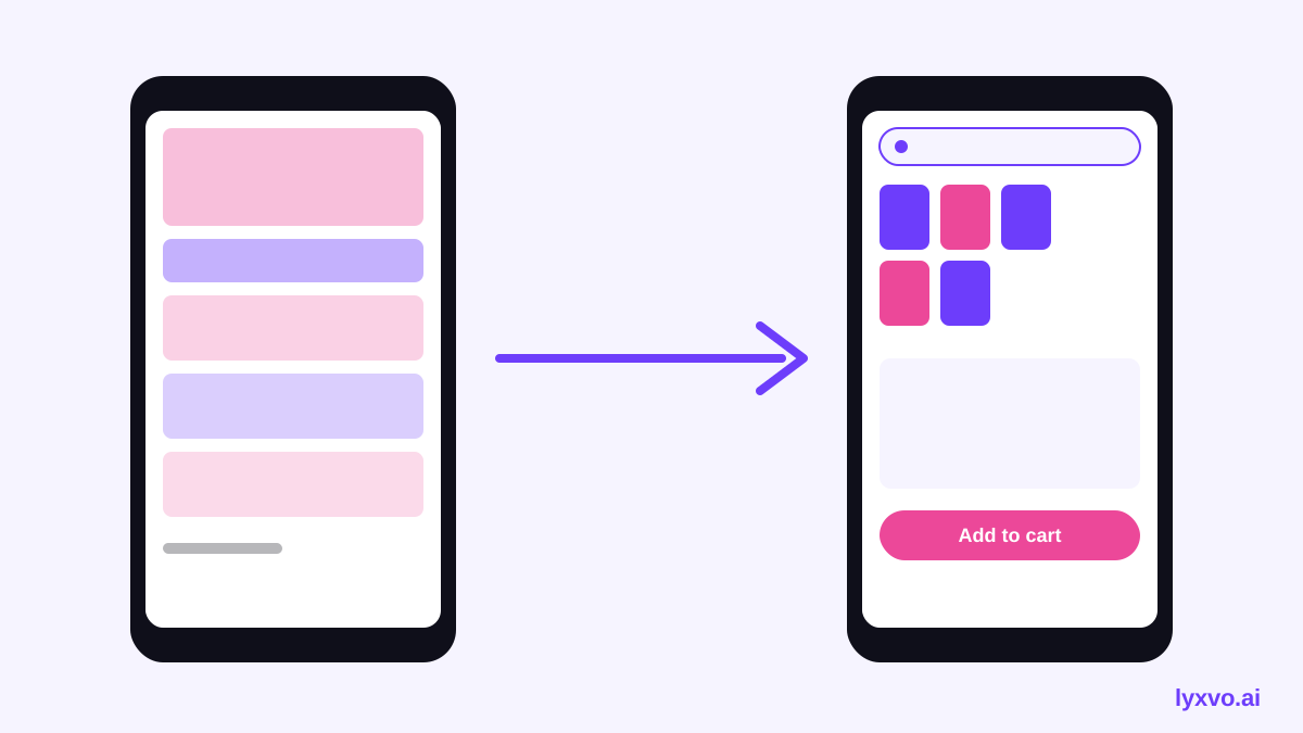
A review is only useful if it becomes a revised design. Take your top five to ten issues and sketch the corrected homepage. Keep changes small enough to test. For instance, if the review finds that the main category navigation is unclear on mobile, redesign only the header and first product row, then review again.
How to do this in Lyxvo AI
Lyxvo AI's design agent can plan and produce app and website screens for iOS, Android and web. You can start a design from the AI website design tool or the AI UI design generator. Describe the revision in plain terms, for example: "Move the search bar above the fold on mobile, group categories into five labeled tiles, and make the add-to-cart button the only primary action on each product card." Then refine any element directly in the Canva-style editor by editing text, photos and colors. When the revised screen is ready, you can export it as PNG at real size or as HTML for a developer to review. For multi-page changes, the Lyxvo Engine handles whole sites, and every account can try two pages free. Pricing details are on the pricing page. If you need quick mockups of promotional blocks on the homepage, the AI social media post generator and free design templates can supply banner assets at exact sizes.
Step 6: Validate with real shoppers
AI review shortens the search for problems, but it cannot tell you how a real person behaves. After revising, run a short test: give five to eight people a shopping task such as "find a winter jacket under your budget" and watch where they hesitate. Compare the result against your Step 1 goal. Keep whatever measurably reduced friction and repeat the cycle.
Common mistakes to avoid
- Reviewing only desktop. Mobile is where many ecommerce visits happen, so review it first.
- Accepting every suggestion. Filter by severity and by your homepage goal.
- Mixing redesign with review. Log findings before you start changing screens.
- Ignoring trust signals. Shipping, returns and secure checkout cues belong on the homepage, not only in the footer.
- Skipping the rerun. A fix can create a new problem, so review again after each release.
Quick checklist
- [ ] Homepage goal written in one sentence
- [ ] Desktop, mobile and full-scroll captures labeled
- [ ] AI pass run with the ten heuristics
- [ ] Each finding verified against the screenshot
- [ ] Severity scored from 1 to 4
- [ ] Top issues revised and exported
- [ ] Tested with real shoppers and reviewed again
A steady cycle of review, prioritize, fix and retest will do more for your conversion path than a single large redesign. Start with one homepage, one goal and the five most severe findings.
Try it in Lyxvo AI
Describe it in your own words and the design agent starts on the right flow. Free to start.
Related tool: AI UI design generator for apps and websites
Whole apps and websites are designed with the Lyxvo Engine, rented separately from the design plans; every account can try 2 pages free.