AI Wireframe Annotations for Developer Handoff

AI wireframe annotations for developer handoff are the notes that turn a sketch into something an engineer can build without guessing. A wireframe shows layout; annotations explain spacing, states, behavior and content so the build matches what you meant.
Why annotations matter more than the wireframe
A wireframe answers *where* things go. Developers still need to know *how* they behave: what happens on tap, which fields are required, what the empty state looks like, and which numbers are fixed. When those answers are missing, engineers fill the gaps themselves, and the result drifts from the design.
Good annotations remove most of the back-and-forth. They also give you a record you can point to during review, so disagreements are settled against written intent rather than memory.
What to annotate
Not every screen needs every note. Focus on the information that changes how code gets written.
- Layout and spacing: margins, padding, grid columns, and the rule for how elements stack or wrap.
- Sizes and tokens: type sizes, color roles (for example "primary button background"), and corner radii, referenced by name where you have a design system.
- States: default, hover, pressed, focused, disabled, loading, error and empty. Missing states are the most common source of rework.
- Behavior: what each control does, validation rules, navigation targets and transitions.
- Content rules: character limits, truncation behavior, date and currency formats, and what happens with very long or missing text.
- Assets: which icons and images are needed, and in which sizes.
- Edge cases: first-time user, offline, permission denied, and very large data sets.
A practical annotation format
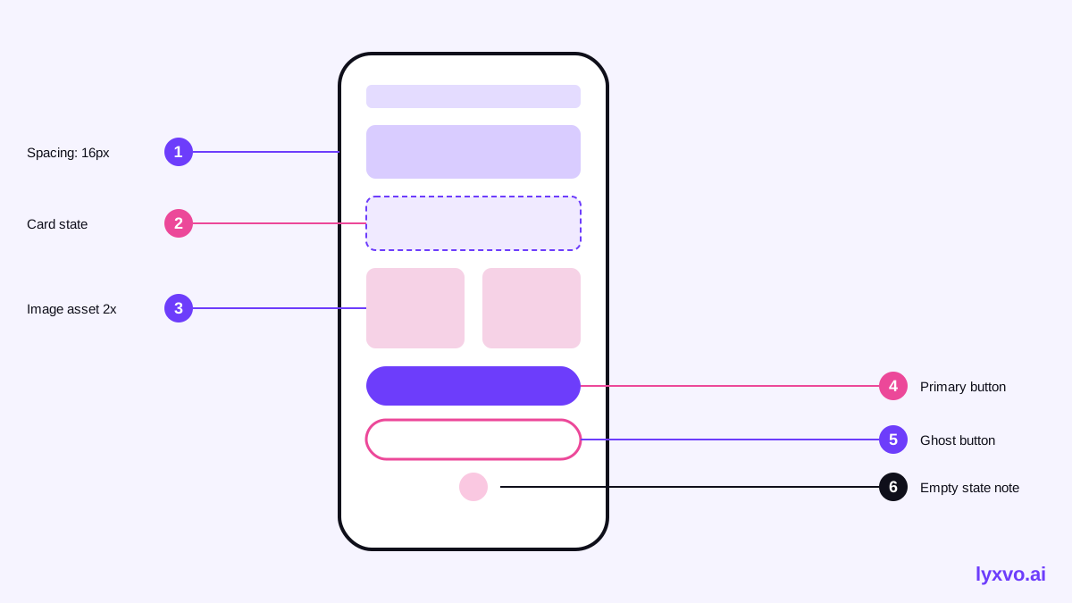
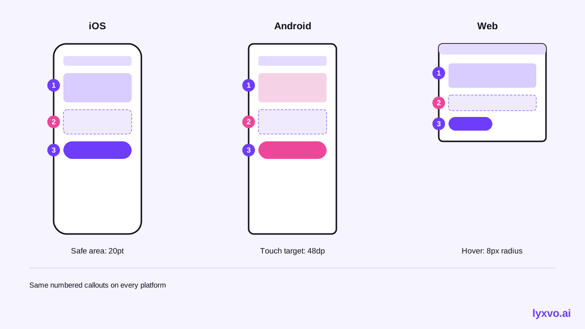
Use the same structure on every screen so engineers learn to scan it. Number each callout on the wireframe and keep the note short.
| Callout | Type | Example note |
|---|---|---|
| 1 | Layout | Cards: 2 columns on web, 1 on mobile below 600 px, 16 px gap |
| 2 | State | Empty state shows illustration and "Add your first item" button |
| 3 | Behavior | Submit disabled until all required fields are valid |
| 4 | Content | Title truncates at 2 lines with ellipsis |
| 5 | Asset | Icon: 24 px outline, export as SVG |
Keep notes factual and testable. "Feels lighter" is not an annotation; "Section background uses the neutral-50 token" is.
Step-by-step: writing annotations with AI
AI helps most with the repetitive part: describing every element consistently and proposing the states you might forget. Your job is to check each claim against product decisions.
- Finish the layout first. Annotate only a screen whose structure is settled.
- Generate the screen. Use the AI UI design generator or the AI app design tool to produce the base screens for iOS, Android or web.
- List every interactive element. Buttons, inputs, toggles, links, and any gesture.
- Write one note per element using the table format above.
- Add states. For each interactive element, record default, disabled, loading and error at minimum.
- Add an edge-case pass. Ask what happens with no data, one item, a hundred items, and a failed request.
- Review with an engineer. Ask them to point out anything they cannot implement from the notes alone.
- Export and attach. Share the annotated screens alongside the handoff package.
How to do it in Lyxvo AI
In Lyxvo AI, you can start from a prompt and generate the screen with the design agent, which plans the layout before drawing it. Then open the result in the Canva-style editor to adjust text, colors and spacing directly, and add numbered callouts as text elements next to the components they describe. For a single screen, use the studio app view or the web view to pick the right canvas.
When the screens are ready, export PNG at real size for review, or use the Figma export (SVG and tokens) if your engineers work from Figma. For Flutter or Compose teams, the HTML, Flutter and Kotlin Jetpack Compose exports give developers a head start on structure, which you still need to verify against your annotations. Collaboration is real time, so an engineer can comment on callouts while you edit.
Common mistakes to avoid
- Annotating unfinished layouts. Every change invalidates the notes beside it.
- Describing appearance without rules. "Looks good on mobile" is not buildable; give breakpoints and behavior.
- Skipping states. Empty, error and loading states account for much of the real work.
- Mixing decisions and suggestions. Mark open questions clearly so nobody builds an assumption as a requirement.
- Forgetting content. Real copy often breaks layouts; test with long strings.
Handoff checklist
- [ ] Every interactive element has a behavior note
- [ ] Default, disabled, loading, error and empty states are shown
- [ ] Spacing and sizes reference tokens or explicit values
- [ ] Breakpoints or platform rules are stated
- [ ] Content limits and truncation are defined
- [ ] Assets are listed with sizes and formats
- [ ] Open questions are marked as open
- [ ] An engineer has reviewed the notes
Where to go next
If you are preparing a broader set of screens, the AI website design and AI logo generator pages cover the rest of the brand and layout work. Plans and limits are on the pricing page, and the blog has more guides on design workflows. Before you commit to a plan, check the current details on the pricing page, since limits and features can change.
Try it in Lyxvo AI
Describe it in your own words and the design agent starts on the right flow. Free to start.
Related tool: Free design templates you can edit in minutes