App Icon for Pet Adoption App with Paw Motif: A Practical Design Guide
An app icon for a pet adoption app with a paw motif should be recognizable at a glance, friendly, and clear even at the smallest home-screen size. This guide walks you through the design decisions, the technical sizes you need, and how to build the full icon set in Lyxvo AI.
Why a paw motif works for a pet adoption app
A paw is one of the most instantly readable symbols for animals. People understand it in any language and at very small sizes, which matters because your icon will often appear as a tiny square between dozens of other apps. For an adoption app, the paw does a second job: it signals warmth and care, not just pets in general.
The risk is that a paw alone can look like a generic pet-store or veterinary icon. Your goal is to make the paw feel like *adoption*: a sense of home, belonging, or a new beginning.
Core design principles for the icon
- One central idea. Use a single paw, or a paw combined with one meaningful element such as a heart or a house. Avoid stacking three or four symbols.
- Bold silhouette. The shape should read clearly in black and white. If it only works with fine detail, simplify it.
- Limited palette. Two or three colors is enough. Warm tones (coral, amber, teal) feel welcoming; very pale colors often disappear on light home screens.
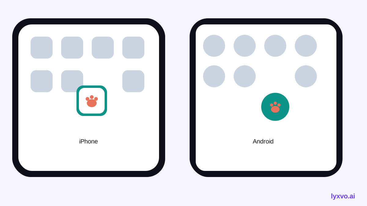
- Safe margins. Keep the main shape well inside the icon area so that the platform's corner masking does not cut into it.
- No text. Lettering becomes unreadable at small sizes. The name of your app appears below the icon anyway.
- Background contrast. Choose a background that separates clearly from the paw, and check that the icon still stands out on both light and dark wallpapers.
Concept ideas to test
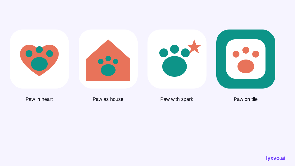
- Paw in a heart. A paw print inside a rounded heart. Clear message of love and care.
- Paw forming a house. Negative space in the paw's pads suggests a roof or doorway, linking pets with a home.
- Paw with a spark. A small highlight or star in one toe to suggest a new beginning.
- Paw on a rounded tile. Simple, friendly, and very scalable, good for a clean first version.
Technical sizes you need
You do not design one icon; you produce a set. The required sizes depend on the platform.
| Platform | Typical sizes to prepare | Notes |
|---|---|---|
| iOS | 1024 x 1024 master, plus device sizes | Submit the 1024 px version without transparency; the system applies corner masking |
| Android | Adaptive icon layers, plus legacy launcher sizes | Keep the key shape inside the central safe zone of the foreground layer |
| Web | Favicon and touch icons in several sizes | Used for browser tabs and home-screen shortcuts |
Check the current platform guidelines for the exact sizes and safe-zone rules before you export, since these requirements can change over time.
How to create the icon set in Lyxvo AI
Lyxvo AI can generate the icon concept and export the full set of sizes in one workflow. Here is a practical path:
- Open the app icon generator to start an icon-focused project.
- Describe the idea in plain language, for example: "A friendly paw print inside a rounded home shape, warm coral and teal, flat style, no text, bold silhouette."
- Generate several variations, then keep the two or three that read clearly when you shrink them.
- Use the Canva-style editor to adjust colors, nudge the paw's position, and fine-tune the background so the paw sits well inside the safe area.
- Check the icon at small sizes (for example, 60 px) and in dark mode. Simplify further if any detail disappears.
- Export the full set of icon sizes. For a brand that spans several products, you can also start from a logo generator session so the icon matches the wordmark and color system.
If you are designing the whole app at the same time, the AI app design tool can carry the same colors and style into your app screens, and you can open the app design studio to work on the screens directly.
Choosing color for an adoption audience
Color affects trust and emotion. For a pet adoption app, a few directions tend to work well:
- Warm coral or orange feels friendly and energetic, suits a cheerful brand.
- Teal or green feels calm and trustworthy, suits a more reassuring brand.
- Soft yellow adds optimism, but use a darker outline or background so it does not wash out.
Test your choice against the colors used by the icons around it on a typical screen. Your icon should be distinct, not a near-copy of a common pet-store style.
Common mistakes to avoid
- Too much detail. Tiny toe lines and fur textures vanish at small sizes.
- Photos or realistic animals. They rarely scale well and look less like an app icon.
- Clipped corners. Designing too close to the edge causes the paw to be cut off by the mask.
- Generic paw clip art. A stock-looking paw makes the app feel less distinct; add one meaningful twist.
- Ignoring the name. Make sure the paw concept fits the app name and the adoption message.
A quick checklist before you publish
- [ ] The paw is recognizable at 60 px and in black and white.
- [ ] Only one main idea, no text inside the icon.
- [ ] The main shape sits inside the safe area on both platforms.
- [ ] The icon stands out on light and dark home screens.
- [ ] All required iOS, Android and web sizes are exported.
- [ ] The style matches your app screens and your brand.
Planning the rest of your brand
Once the icon is settled, reuse its paw shape and colors across your social posts and marketing. The social media post generator and the free design templates library can help you keep adoption announcements visually consistent with the app. For a store listing or event flyer, the flyer maker can carry the same identity into print-ready formats.
You can start with the free Lyxvo Lite plan, which has a daily usage limit, and review plan options on the pricing page. For more background on design workflows, see the Lyxvo AI blog.
Final thoughts
A strong app icon for a pet adoption app with a paw motif is simple, warm, and built around one clear idea. Sketch several concepts, test them at small sizes, export the full platform set, and keep the style consistent with the rest of your app and brand. With that approach, the paw becomes a clear signal of care from the moment someone sees your icon on their screen.
Try it in Lyxvo AI
Describe it in your own words and the design agent starts on the right flow. Free to start.
Related tool: AI app icon generator with every size in one zip