App Icon for a Second-Hand Bookstore Inventory Scanner: A Practical Guide
An app icon for a second-hand bookstore inventory scanner has to say two things at a glance: that it is about books, and that it scans. The best icons do this with one simple symbol, a strong color, and no text.
Why the icon matters for an inventory scanner
People usually meet a scanner app on a home screen or in the App Store among dozens of similar tools. A second-hand bookseller using it between shelves wants to find it in one tap. A good icon makes that easy, and it also tells the user what the app does before they open it.
For this kind of app, the icon should work at very small sizes, look right on both light and dark backgrounds, and avoid details that disappear when scaled down. A cluttered icon with a tiny book, a barcode, and a title will look like a blur on a phone.
Concept ideas that work
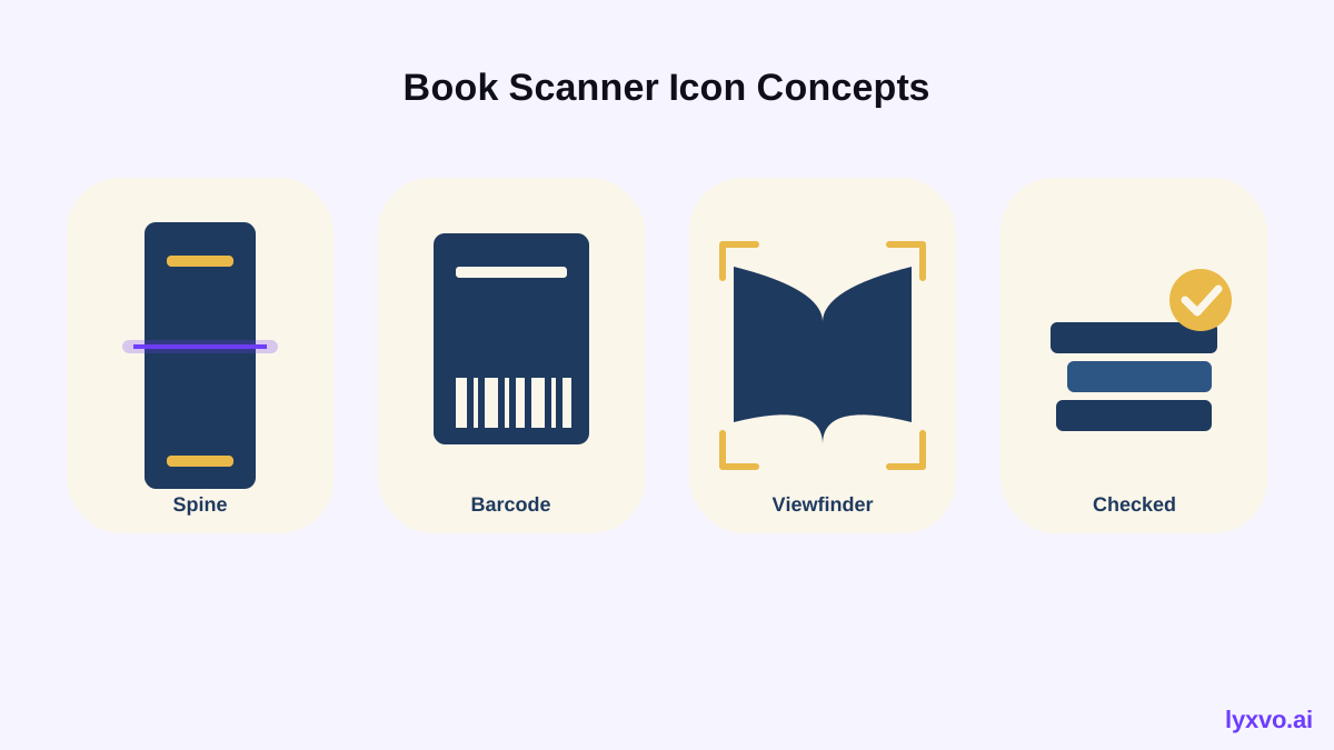
Start with one central idea. These directions suit a second-hand bookstore scanner well:
- Spine and scan line: a stylized book spine with a thin horizontal scan line crossing it.
- Barcode on a book cover: a simple rectangle (the cover) with a few bold barcode bars in the corner.
- Open book with a viewfinder: the corners of a scanner frame around an open book.
- Stack of books with a checkmark: suggests a counted, checked inventory.
Avoid putting the bookstore name or a text label in the icon. Users rarely read it at icon size, and it limits translation later.
Choose colors and shapes carefully
Use two or three colors at most. Warm, paper-like tones (cream, deep ink blue, a muted red or ochre) suit a second-hand book theme and feel more personal than neon tech colors. Keep shapes bold and simple so the silhouette reads clearly at 29 pixels.
Icon sizes you need
You will need the full range of sizes for iOS, Android, and the web, not just one square image. The main sizes are:
| Platform | Sizes to prepare | Notes |
|---|---|---|
| iOS | 1024 x 1024 (App Store), plus device sizes such as 180, 120, 87, 80, 60, 40 | Square, no transparency, no rounded corners in the file |
| Android | 512 x 512 (Play Store), adaptive icon layers, plus launcher sizes (48 to 192 dp equivalents) | Keep the key symbol inside the safe zone |
| Web | 192 x 192 and 512 x 512 for manifest, favicon sizes, Apple touch icon 180 x 180 | Good to include for a web version of the inventory tool |
Check the current requirements in each store's developer documentation before submitting, since guidelines change over time.
Step-by-step: make the icon in Lyxvo AI
The design agent in Lyxvo AI can plan and generate the icon, then produce the full set of app icon and brand sizes for iOS, Android, and web.
- Open the studio. Go to Lyxvo AI and start with the logo format at /design/?format=logo. Logo and brand kits include the Android, iOS, and web icon sizes.
- Describe the app in plain language. For example: "App icon for a second-hand bookstore inventory scanner. Symbol: a book spine with a scan line. Colors: cream background, deep ink blue, one warm red accent. Flat style, no text, readable at small sizes."
- Review the concepts. Ask for two or three variations and compare them at small size. Keep the one with the clearest silhouette.
- Refine in the editor. Use the Canva-style editor to adjust colors, shift the scan line, or change the spacing. You can edit colors and shapes directly.
- Generate all sizes. Export the full icon set. The output includes the App Store size and the Android and web icon sizes.
- Export the formats you need. Use PNG at real size for store uploads, or SVG through the Figma export if your team works in Figma.
If you are also building the app screens, you can design them with AI app design and keep the icon colors consistent across the whole project.
Test before you publish
Before submitting, check these points:
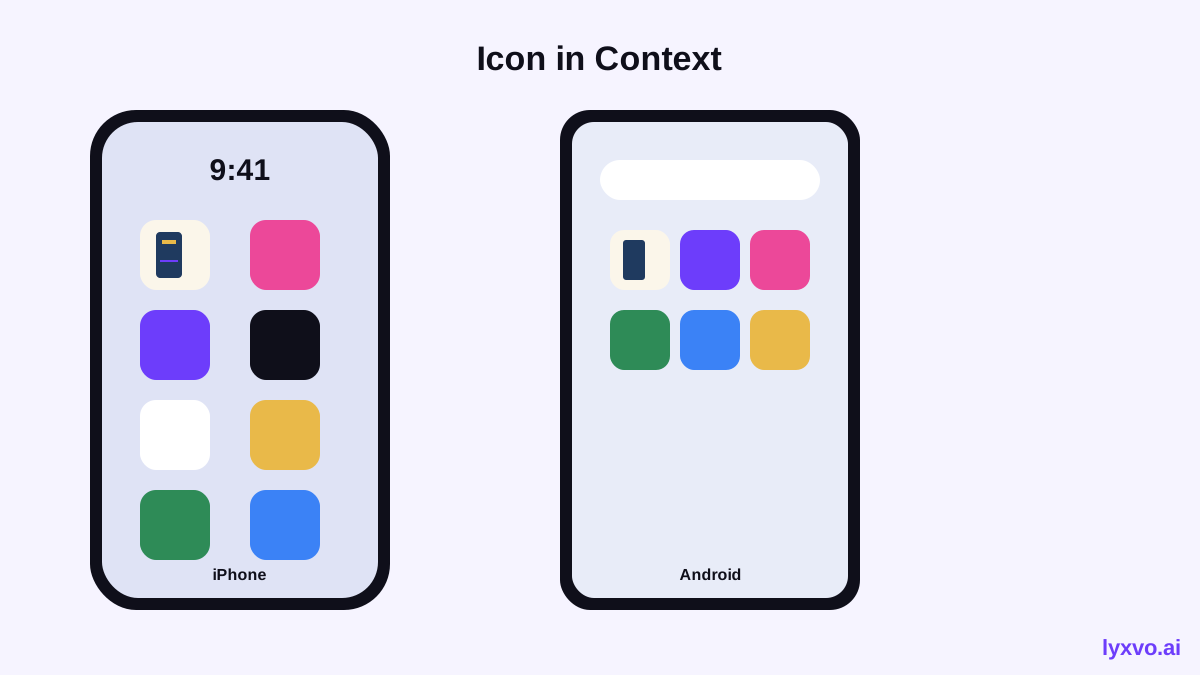
- [ ] The icon reads clearly at 29 px and 40 px.
- [ ] It works on a light wallpaper and a dark wallpaper.
- [ ] There is no text or fine detail that disappears at small size.
- [ ] It is not visually too similar to a well-known app in your category.
- [ ] The 1024 px master has no transparency and no pre-rounded corners.
- [ ] Android adaptive layers keep the main symbol inside the safe zone.
Print the icon at a small size and look at it from arm's length. If you can identify it as "books and scanning" in a second, it works.
Consistency with the rest of your brand
The app icon should match the bookstore's other materials. If the store uses a logo or business cards, reuse the same colors and symbol style. Consistent branding helps staff and customers recognize the tool as part of the same business.
Note: Pricing and plan limits for Lyxvo AI are listed on the pricing page. Lyxvo Lite gives a daily limit for starting out for free.
Summary
A good second-hand bookstore inventory scanner icon uses one clear symbol, two or three warm colors, and no text. Design it at the master size first, check it at small sizes, and export the full set for iOS, Android, and web. Lyxvo AI can plan and generate the concepts and the full size set, so you can test a few directions quickly and pick the one that reads best on a phone.
Try it in Lyxvo AI
Describe it in your own words and the design agent starts on the right flow. Free to start.
Related tool: AI app icon generator with every size in one zip