How to Create a Digital Invitation for Hybrid Conference Attendees
A digital invitation for hybrid conference attendees has to work for two audiences at once: people joining in the room and people joining online. The best invitations give each group a clear, specific path to attend, so nobody has to guess how to join.
Why hybrid invitations need a different approach
A standard event invitation usually answers one question: where and when. A hybrid invitation has to answer more. Attendees need to know whether they are coming in person or joining remotely, which platform the online session uses, what time zone applies, and where to find the link or the venue address.
That extra information is what makes hybrid invitations harder to design. If you bury it in long paragraphs, people will miss it. The goal is to make the two paths obvious at a glance.
Step 1: Decide what each attendee needs to know
Before you open a design tool, write down the facts every invitation must include. Keep the list short and accurate.
- Event name and the session or conference theme
- Date, start time, and time zone (show two time zones if your audience is international)
- In-person venue, address, and check-in instructions
- Online platform, join link or registration page, and any access code
- Registration deadline and a contact for help
- Accessibility options, such as captioning or sign language, if offered
If the online and in-person details differ, label them separately so no one mixes them up.
Step 2: Choose the right format and size
Most hybrid invitations go out in more than one place: email, social posts, messaging apps, and a printed or on-screen card at the venue. Each channel has its own shape.
| Channel | Recommended format | Why it works |
|---|---|---|
| Email header or web banner | Wide landscape image | Shows the event title and dates clearly |
| Instagram or LinkedIn post | Square or portrait post | Fits feeds and reads well on mobile |
| Instagram or WhatsApp story | Vertical 9:16 | Fills the full phone screen |
| Slide or on-screen display | 16:9 slide | Matches projectors and video calls |
| Printed venue card | Portrait print at high resolution | Stays sharp for check-in tables |
Check the current size guidance for each platform before you publish, since platform specs change over time.
Step 3: Write for scanning, not reading
People skim invitations. Use a clear hierarchy:
- The event name in the largest text
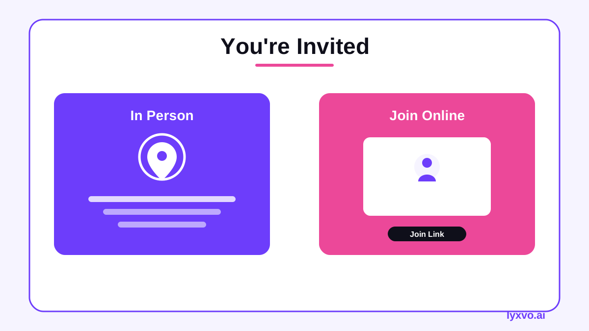
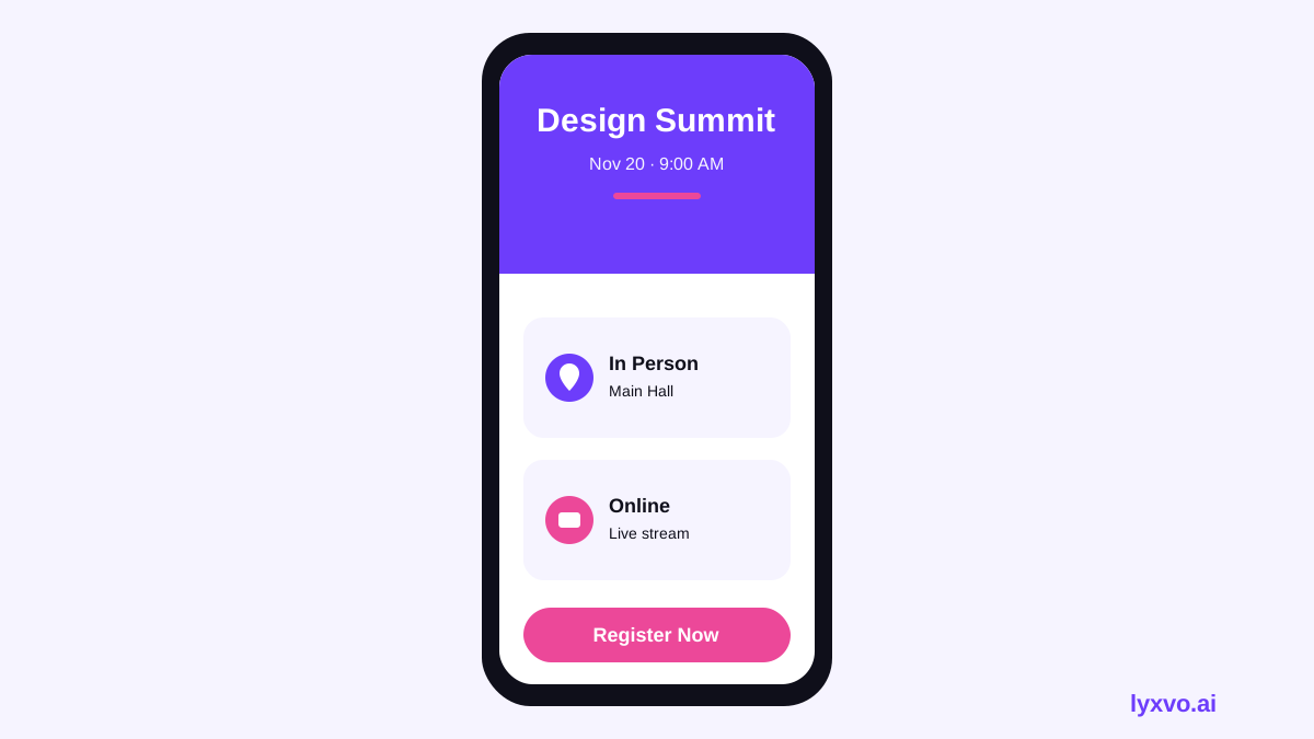
- The two attendance paths as separate blocks, labeled "In person" and "Online"
- Date and time with the time zone
- One call to action, such as "Register by [date]"
Keep each block to one or two lines. If you need a longer explanation, link to a full agenda page rather than adding more text to the card.
Step 4: Build the design
A hybrid invitation works best with a simple layout: one strong headline, a divider or color block that separates the two paths, and icons or short labels for the venue and the online link. Use consistent brand colors and a readable font size on mobile.
Checklist before you send
- Dates and times checked for every time zone shown
- Online link tested and working
- In-person address spelled correctly and matched to the map
- Registration deadline stated clearly
- Same key facts in every version (email, social, and print)
- Alt text added to every image for accessibility
How to make it in Lyxvo AI
Lyxvo AI is an agentic design tool that can plan and design the invitation with you, then let you edit it directly. A practical workflow looks like this:
- Open the AI invitation maker and describe your event, including the in-person and online details.
- Review the layout the design agent proposes, then edit text, photos, and colors in the Canva-style editor.
- Use Magic Resize to adapt the same invitation for other formats, such as an email banner or a social post.
- For social posts at exact sizes, start from the AI social media post generator or the Instagram story studio.
- For a slide version to show on screen during the event, use the AI presentation maker.
- Export as PNG at real size for sharing, or as a print-ready file for venue cards.
If you want to browse starting points first, the free design templates page has layouts you can adapt. Lyxvo AI offers a free plan to start, and you can compare options on the pricing page.
Common mistakes to avoid
- Unclear join path. If someone cannot tell how to attend online, they will not register. Always label the link.
- One time zone only. Show the time zone for your main audience and add a second if attendees are international.
- Too much text on the image. Put long details on a landing page and link to it.
- Outdated details. Recheck the agenda and links the day you send, not only when you draft the invitation.
- Missing accessibility information. State captioning or interpretation options when they exist.
Final check and send
Send a test version to a colleague who has never seen the event details. Ask them to tell you, within ten seconds, how to attend in person and how to join online. If they can answer both, the invitation is ready.
Once your design is final, publish it to each channel with the sizes you prepared, and update the same details in your reminder messages so that everyone sees consistent information.
Try it in Lyxvo AI
Describe it in your own words and the design agent starts on the right flow. Free to start.
Related tool: AI invitation maker for weddings, birthdays and events