Logo for Mobile Phone Repair Kiosk in Mall: A Practical Design Guide
A logo for a mobile phone repair kiosk in a mall has to work from across a corridor, on a tiny sign, and on a shopping bag, all at once. This guide shows how to plan, design and export that logo with Lyxvo AI, step by step.
Why a mall kiosk needs a different logo
A kiosk is a small, busy, temporary-feeling presence. Shoppers pass at walking speed, often glance for a second or two, and decide quickly whether you look trustworthy. Your logo has to do three jobs:
- Be readable at distance. Shoppers should recognise it without stepping closer.
- Signal repair and phones. A simple device or tool cue tells people what you do before they read a word.
- Reproduce everywhere. It will appear on a fascia, a counter banner, receipts, a loyalty card and a social profile.
Many kiosks also share a mall with larger chains. A clear, distinct mark helps you stand out without shouting.
Step 1: Define the message before the shape
Write down three things before you open any design tool:
- Your core promise, such as fast screen repair, same-day service or honest prices.
- Your tone, for example friendly and local, or precise and technical.
- Your colours, chosen for contrast on a mall sign and for your existing brand if you have one.
This short brief becomes your prompt, and it keeps the design focused.
Step 2: Choose a simple concept
The strongest kiosk logos are usually simple. Common, workable concepts include:
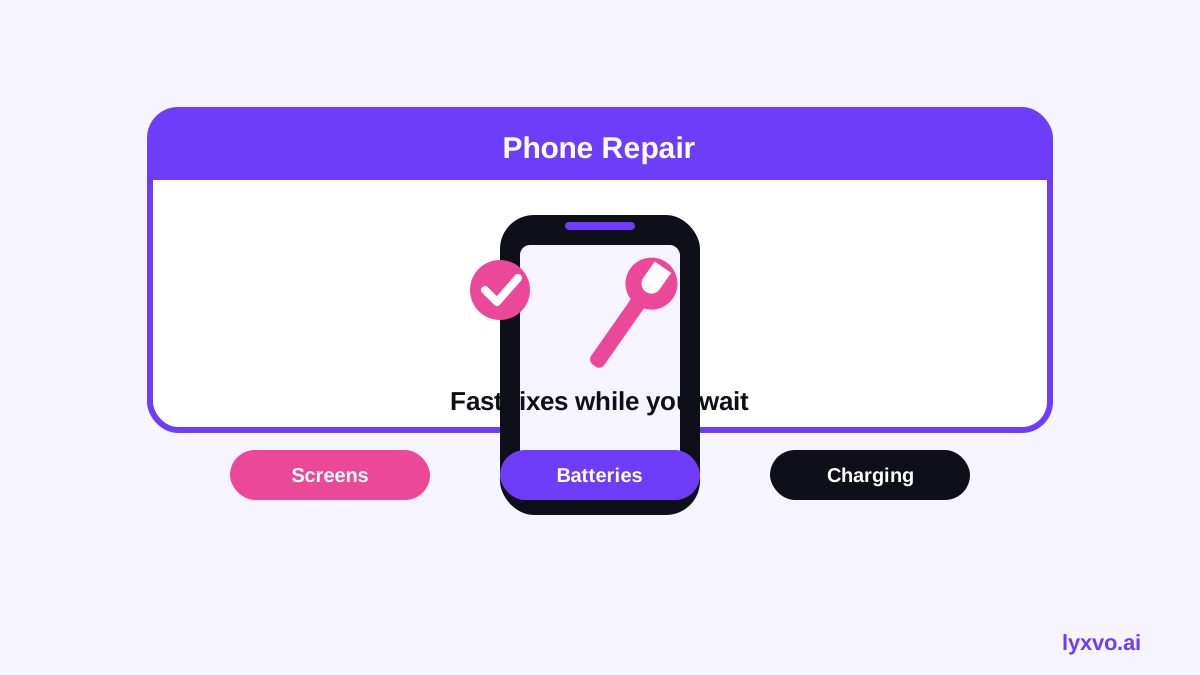
- A phone silhouette with a small repair mark, such as a spark, a wrench or a screwdriver.
- A monogram of your business initial inside a rounded shape that suggests a screen.
- A wordmark with one distinctive letter treatment, paired with a small icon you can use alone.
Test every concept at 32 pixels wide. If the idea disappears, simplify it.
Step 3: Set up the design
Checklist before you design:
- [ ] One primary colour and one accent colour, with strong contrast on both light and dark backgrounds
- [ ] A font that is legible at small sizes
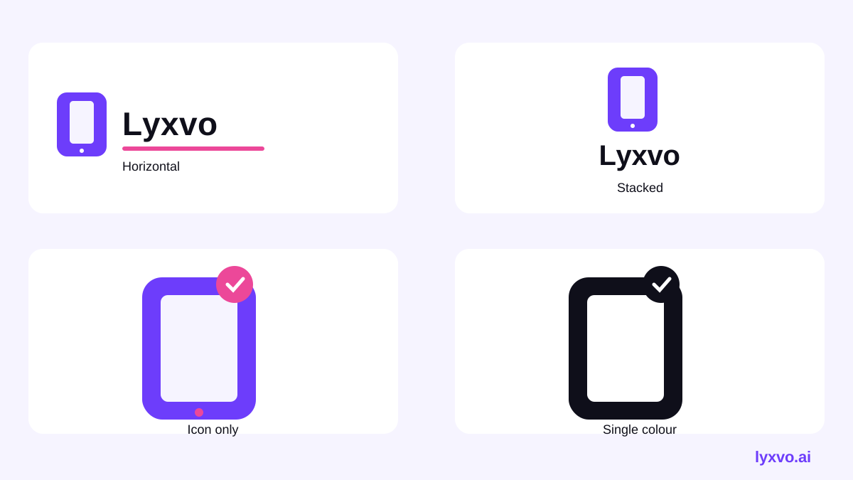
- [ ] A horizontal version, a stacked version and an icon-only version
- [ ] A plain single-colour version for stamps, receipts and black-and-white printing
You can start a logo in the Lyxvo AI logo studio, or explore options with the AI logo generator. Generate several directions, then refine the best one in the Canva-style editor by changing text, colours and shapes directly.
Step 4: Plan the sizes you actually need
A kiosk logo travels through many sizes. Plan for them from the start:
| Use | Typical format | What to check |
|---|---|---|
| Fascia or hanging sign | Large vector or high-resolution PNG | Edges stay crisp at distance |
| Counter banner and flyers | Print-ready, 300 dpi | Colours match your print brief |
| Receipts and stamps | Single-colour version | Lines don't fill in when small |
| Social profile picture | Square icon | Recognisable inside a circle crop |
| App or loyalty icon | Icon sizes for each platform | Symbol still clear at tiny size |
Lyxvo AI can build a brand kit with the icon sizes for Android, iOS and the web, so the app or loyalty icon is covered too. You can also use the app icon generator if you only need app icons.
Step 5: Check it in real conditions
Before you print, run three quick tests:
- Distance test. Print the logo at fascia size and view it from 5 metres.
- Greyscale test. Convert it to black and white. Is it still clear?
- Context test. Place it on a mock-up of your shopfront, bag and receipt.
If you need to rework layout for a different size, Magic Resize helps adapt the design without rebuilding it from scratch.
Step 6: Support the logo with kiosk materials
The logo rarely appears alone. Plan the supporting pieces at the same time:
- Flyer or price list for device-repair prices, using the AI flyer maker
- Business card for customers to take away, using the AI business card maker
- Poster for a launch or promotion, using the AI poster maker
- Social post to announce your kiosk, using the Instagram post studio
Keeping colours and type consistent across these pieces makes the kiosk look established even on its first day.
How to do it in Lyxvo AI
- Open the logo studio and describe your brief: business type, promise, tone and colours.
- Review the generated directions and pick the one that reads best at small size.
- Edit text, colours and photos directly in the editor.
- Create the brand kit so you have horizontal, stacked and icon-only versions.
- Export the files you need: PNG at real size for signs and screens, SVG for scalable print work. Check the docs for the export options available on your plan, and see pricing for plan limits.
Common mistakes to avoid
- Too much detail. Tiny tools, thin lines and gradients disappear at distance.
- Clashing colours. Light colours can vanish against bright mall lighting.
- No single-colour version. You will need one for receipts and stamps.
- Name too long for the icon. Keep the icon-only version short and punchy.
Final checklist
- [ ] Clear concept that suggests phones or repair
- [ ] Readable at 32 pixels and from 5 metres
- [ ] Horizontal, stacked and icon-only versions
- [ ] Single-colour version for print and stamps
- [ ] Full icon set for app, loyalty and social profiles
- [ ] Supporting flyer, card and sign designs match the logo
A good logo for a mall kiosk is simple, legible and consistent across every surface. Start with a clear brief, test at small sizes, and build the full kit so your kiosk looks as reliable as the service it offers.
Try it in Lyxvo AI
Describe it in your own words and the design agent starts on the right flow. Free to start.
Related tool: AI logo generator with a complete brand kit