Logo Ideas from Business Name and Industry
Logo ideas from business name and industry are easiest to find when you treat the name and the work as two clues that point to the same visual story. This guide shows you how to extract those clues, turn them into concepts, and test them before you commit.
Start with the words in your business name
Your name already contains visual hints. Break it into parts and write down what each one suggests.
- Literal words: a name like "Blue Harbor" points to water, color, or a boat.
- Sounds and syllables: a short, punchy name suits a bold wordmark; a long name often works better as initials or a monogram.
- Meaning behind the name: if the name refers to a place, a founder, or a value like "Clear" or "Swift," that concept can drive the mark even if no object appears.
Write at least ten words or phrases from the name. Do not judge them yet. You will narrow them later.
Translate your industry into visual language
Every industry has a shared visual vocabulary. Customers recognize it quickly, so using it helps your logo communicate what you do in a split second.
| Industry | Common visual cues | Typical color tendencies |
|---|---|---|
| Food and drink | Utensils, leaves, steam, bowls | Warm reds, oranges, greens |
| Technology | Abstract nodes, arrows, geometric forms | Blues, teals, clean neutrals |
| Health and wellness | Circles, leaves, soft curves | Greens, soft blues, whites |
| Finance | Shields, columns, steady lines | Navy, deep green, gold accents |
| Creative services | Brush strokes, shapes, playful lines | Bold multi-color or high contrast |
| Local trades | Tools, bold icons, strong silhouettes | Strong primary colors, dark tones |
These are starting points, not rules. A surprising choice can be memorable, but it should still make sense to your audience.
Combine name and industry into concepts
Once you have name clues and industry cues, combine them in one of four proven ways:
- Literal combination: an icon that shows the industry object next to the name's first letter.
- Metaphor: one image that carries the idea, such as a growing sprout for a new business in a stable industry.
- Letter-based mark: the first letter or initials shaped with an industry detail, like a letter formed by a fork or a path.
- Wordmark-only: the name set in a typeface that reflects the brand personality, with no icon.
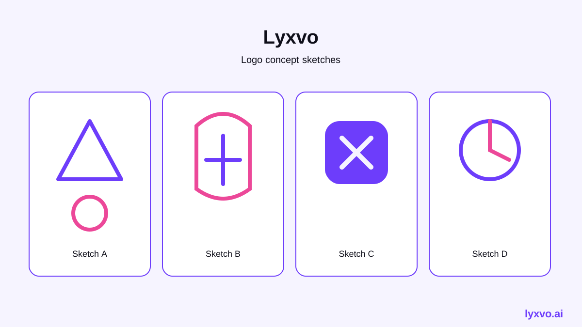
For each combination, sketch three quick versions on paper. Speed matters more than polish at this stage.
Check your ideas before you choose
A good logo idea passes a few simple tests:
- Does it still make sense in one second?
- Does it work in one color, in black and white, and at a very small size?
- Does it avoid looking like a common stock symbol for your industry?
- Can you say what it means in one sentence?
- Does the name stay readable next to the mark?
Test every candidate at 32 pixels wide and on a dark background. Many logos that look good large fail at small sizes.
Create logo ideas in Lyxvo AI
Lyxvo AI's design agent can generate logo concepts from your business name and industry, then let you refine them in an editor. You describe the business, the agent plans the directions, and you edit text, colors, and shapes directly, similar to a Canva-style editor. Start at the AI logo generator or open the logo studio directly at /design/?format=logo.
Once you have a mark you like, Lyxvo can produce a brand kit with the icon sizes you need for Android, iOS and web. You can export to PNG at real size, SVG, or hand off to Figma with tokens. For a broader look at visual style and layouts, see free design templates.
Plan the final logo before you finish
Before you lock a design, prepare the variants you will need in daily life:
- Full-color version on light and dark backgrounds
- Single-color version
- Icon-only version for avatars and app icons
- Horizontal and stacked layouts
If you will show the logo on posts, pair it with a social media post generator layout so it sits correctly at exact platform sizes.
Common mistakes to avoid
- Using five or more colors when two or three will do
- Adding too much detail that disappears at small sizes
- Choosing a trendy effect like heavy gradients that will age quickly
- Copying a competitor's shape instead of building from your own name
- Skipping the test on dark backgrounds and print
Final checklist
- [ ] Ten or more name-based ideas written down
- [ ] Industry cues matched to your audience
- [ ] Three concepts sketched, then narrowed to one
- [ ] Tested at 32 px, in one color, and on dark backgrounds
- [ ] Variants saved for print, web and social
With a clear name, a simple industry cue, and a few honest tests, your logo idea will feel obvious to your customers. Try building yours with AI logo generator and refine it until it feels like the brand you already are.
Try it in Lyxvo AI
Describe it in your own words and the design agent starts on the right flow. Free to start.
Related tool: AI logo generator with a complete brand kit