Logo That Works as Embroidered Patch for Uniforms

A logo that works as embroidered patch for uniforms has to survive thread, needles and washing, not just look good on a screen. The good news is that a few clear rules, applied early, will make almost any brand mark stitch cleanly.
Embroidery is one of the oldest decorative techniques, and its limits are still the same today: thread is thicker than a pixel, every line costs stitches, and fine detail disappears at small sizes. Uniforms add more pressure, because patches get washed, stretched and worn for years. This guide shows what to change in a logo so it translates well into a patch.
Why most logos fail as embroidery
A logo designed for a website or a poster often uses gradients, hairline strokes, photographic textures and tiny text. None of these translate to thread. Embroidery machines build a design from stitches with a minimum width, and every extra color means another thread change, which raises cost and production time.
The most common problems are:
- Gradients and soft shadows, which have to be simplified into flat color blocks
- Thin lines and small text, which fill in or break
- Too many colors, which multiply thread changes
- Dense detail, which turns the patch into a stiff, puckered mess
Size and stitch rules to plan for
Before you design, agree on the physical size of the patch and the stitch rules with your embroidery supplier. Exact limits vary by factory, so treat the numbers below as a starting point to confirm, not a universal standard.
| Element | Practical guideline |
|---|---|
| Overall patch size | Plan for a common size such as 2 to 4 inches wide; confirm with your supplier |
| Smallest line | Keep strokes thick enough to be stitched as a solid line |
| Smallest text | Avoid fine text; use bold letters and only a few words |
| Colors | Limit to 2 to 4 flat colors to keep thread changes low |
| Gradients | Replace with flat color blocks or stitch-style shading |
Ask your embroidery supplier for their minimum stroke width and the maximum number of colors before you lock the design.
Design rules that make a logo stitch-friendly
Follow these rules when you turn a logo into a patch:
- Simplify the shape. Reduce the mark to its essential silhouette. Bold, closed shapes embroider better than thin outlines.
- Use flat, solid color. Each color should be a single, clean area.
- Thicken every line. If a stroke would look thin on fabric, make it heavier.
- Cut the text down. Use a short name or initials in a bold typeface. Long taglines belong on a different item.
- Add a border. A simple merrow-style border around the edge gives the patch a finished look and hides small misalignments.
- Test at real size. Print or preview the design at the exact patch dimensions. Problems that seem fine on a large screen often vanish or clog at 3 cm.
Choosing colors for thread and uniform fabric
Color works differently in thread than on screen. Pick colors that are distinct from each other in value, not only in hue, so the patch still reads when the fabric or the image is slightly off. Check contrast against the uniform color too: a navy patch on a navy shirt needs a light border to stand out.
If your uniform comes in several colors, consider a patch with a neutral base and a small accent, so one design fits many garments.
How to create a patch-ready logo in Lyxvo AI
Lyxvo AI can generate logo concepts and brand kits, then you can refine them for embroidery. A practical workflow:
- Open the AI logo generator or start in the design studio.
- Describe the organization, the mood and the constraints, and ask for a simple, bold mark with few colors.
- Use the Canva-style editor to flatten colors, thicken lines and shorten any text.
- Check the mark at the exact patch size you need, then export as PNG at real size or as SVG to send to your embroidery digitizer.
- If you also need a full brand set, generate the matching icon sizes from the same design so the patch, badges and digital assets stay consistent.
Lyxvo AI exports PNG at real size and SVG, so you can hand the vector file to a digitizer who will convert it into stitch data.
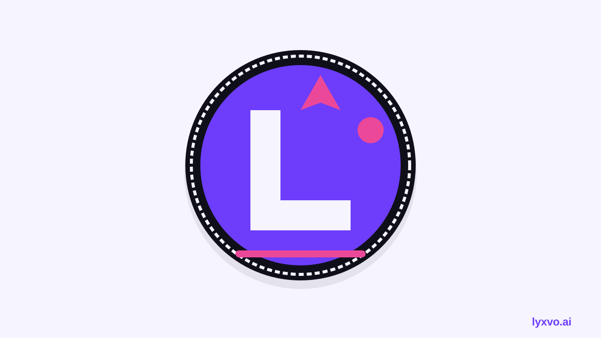
Checklist before you order
- The logo is flat, with no gradients or shadows
- Lines are thick enough for stitching
- Text is short and bold, or removed
- Colors are limited and distinct
- The design has been checked at actual patch size
- You have a vector file (SVG) for the digitizer
- A border or outline is included if the edge is busy
Common mistakes to avoid
- Ordering from a screen mockup without a physical proof
- Keeping a tiny tagline that will never read
- Choosing thread colors that merge into the uniform
- Designing at huge size and forgetting that the patch will be small
Test before full production
Always approve a sample patch. Wash it, check the edges, and see how it looks on the actual uniform fabric in normal light. This one step catches most problems before they become expensive.
For more examples of bold, simple marks, see the AI logo generator and the app icon generator for icon-style shapes that often translate well to small patches. If you are preparing a complete uniform brand, the free design templates can help you lay out the rest of the identity.
Try it in Lyxvo AI
Describe it in your own words and the design agent starts on the right flow. Free to start.
Related tool: AI logo generator with a complete brand kit