How to Turn a Whiteboard Photo into App Screens
You can turn a whiteboard photo into app screens by cleaning up the image, reading each sketch as a screen with components, and rebuilding it as editable designs. This guide walks through that process from whiteboard to wireframe to finished UI.
Why a whiteboard sketch is a good starting point
Whiteboard sessions are where product ideas get shaped quickly. A few boxes, arrows and labels can describe a login flow, a checkout or a dashboard. The problem is that a photo of a whiteboard is not a usable design file: it has glare, uneven lighting, and no real text, colors or spacing.
The goal is not to copy the sketch pixel for pixel. The goal is to keep the structure (what is on each screen and how the screens connect) and rebuild it as clean, consistent UI.
Step 1: Take a usable photo
A good input makes everything easier. Before you upload anything, check the following:
- Shoot straight on, not at an angle, so rectangles stay rectangular.
- Avoid glare from lights or windows; move around until the marker lines are readable.
- Fill the frame with the board and crop out the room.
- Photograph each screen separately if the board holds several flows.
Step 2: Read each sketch as a screen
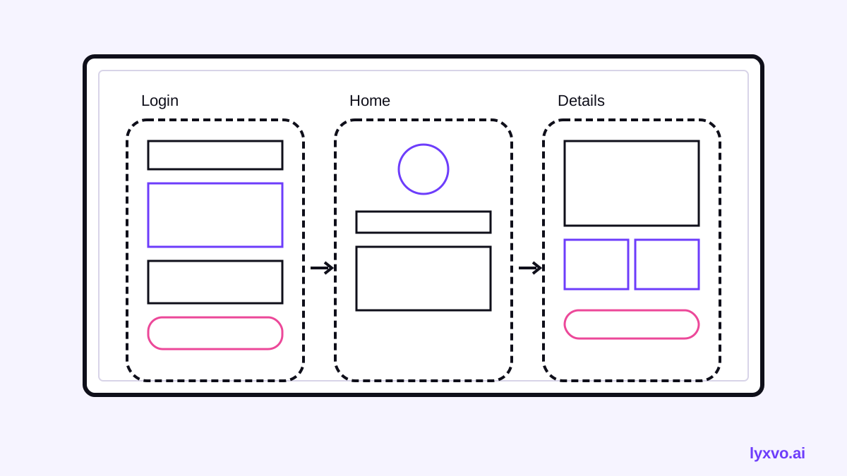
Go through the board and write a short list for every frame. For each one, note:
- Screen name (for example, Sign in, Home feed, Order summary).
- Main content (headline, image, list, form, cards).
- Actions (buttons, links, toggles) and where they lead.
- Navigation (tab bar, back arrow, menu).
This list becomes your design brief. It is far more reliable than trying to match the drawing shape by shape.
Step 3: Decide the platform and sizes
Before designing, choose the target platform. The same sketch can become an iOS screen, an Android screen or a responsive web page, and each has different conventions for navigation, spacing and safe areas. Pick one platform first, then adapt it later if you need the others.
| Sketch element | Typical app equivalent |
|---|---|
| Box at the bottom with three icons | Tab bar navigation |
| Arrow pointing left in a corner | Back button in the header |
| Rectangle with an X | Image placeholder |
| Scribbled lines | Text blocks or list rows |
| Circle with a plus | Floating action button |
Step 4: Rebuild the screens as editable designs
Now rebuild each screen with real components. Keep the layout close to the sketch, but make it consistent: one type scale, one spacing rhythm, one set of colors, and buttons that look like buttons. Keep your labels from the whiteboard, and tidy them into clear, short copy.
A few practical habits help:
- Build a small set of reusable components first (header, button, card, input) and reuse them on every screen.
- Check tap targets and text sizes against the platform guidelines.
- Name each frame after the screen name from your list so the flow is easy to follow.
- Draw the connections between screens so a reviewer can click through the idea.
Step 5: Review the flow with your team
Share the screens and walk through the user path out loud: sign up, complete the main task, see the result. Look for missing states the whiteboard never showed, such as empty lists, errors and loading. Add those screens before you hand anything to developers.
How to do it in Lyxvo AI
Lyxvo AI's design agent can plan and design app screens for iOS, Android and web. In practice you can describe your whiteboard flow in text, list the screens and their content from Step 2, and ask the agent to produce each screen as a complete design. You can then refine text, photos and colors directly in the Canva-style editor, and use real-time collaboration with your team.
When the screens are ready, you can export them as PNG at real size, or to Figma as SVG and tokens, HTML, Flutter, or Kotlin Jetpack Compose code. If you also need an app icon, the app icon generator covers the sizes. For a web version of the same flow, see the AI website design page, and for the UI workflow as a whole, the AI UI design generator page is a good reference. You can also start from a web layout in the studio or an app layout in the studio.
Note: Lyxvo AI designs screens, not working back ends. Confirm features like login or payments with your developers before building them.
Common mistakes to avoid
- Copying every scribble. Keep the structure, not the accidental details.
- Skipping states. Empty, loading and error screens are often missing from whiteboards.
- Mixing platforms. Pick iOS, Android or web conventions and stay consistent.
- Unreadable text. Retype labels so they are clear and legible.
- No clear flow. Connect screens so the user journey is obvious.
Checklist before you hand off
- [ ] Every whiteboard screen has a matching design frame
- [ ] Navigation and back paths are connected
- [ ] Empty, loading and error states are included
- [ ] Text is readable and consistent
- [ ] Components are reused, not redrawn
- [ ] The flow was walked through with the team
With a clean photo, a clear screen list and a consistent set of components, a whiteboard sketch becomes a reviewable set of app screens in a fraction of the time it would take to start from nothing.
Try it in Lyxvo AI
Describe it in your own words and the design agent starts on the right flow. Free to start.
Related tool: AI app designer for complete iOS and Android apps
Whole apps and websites are designed with the Lyxvo Engine, rented separately from the design plans; every account can try 2 pages free.