UI Generator for Ecommerce Checkout Redesign: How to Compare Your Options
A UI generator for ecommerce checkout redesign turns a brief into checkout screens you can test, refine and hand to developers. This guide shows what to compare before choosing one, and how to run a checkout redesign from brief to exported screens in Lyxvo AI.
Why checkout is worth a dedicated redesign
The checkout is the one place in an online store where every visitor is asking the same question: is this safe, clear and quick? Small friction there, such as an unexpected field, a confusing shipping choice or a payment step that loads slowly, is easy to notice and easy to fix. That makes checkout a good candidate for a focused redesign rather than a full rebuild of the store.
A UI generator can speed up the exploration phase. Instead of opening a blank file, you describe the flow, generate several layouts, and compare them side by side. The final decisions still belong to you, your data and your testing.
What a checkout UI generator needs to produce
Before comparing tools, write down the screens a checkout actually contains. Most stores need at least:
- A cart review screen with quantities, line items and totals
- Contact and shipping address entry
- Delivery method selection
- Payment method selection and card or wallet entry
- An order review and confirmation step
- Mobile versions of each of the above
Any generator you evaluate should handle these screens, not only a single hero or landing page. Ask whether it can produce a connected set of screens for mobile and desktop, and whether those screens can be edited without starting over.
A comparison checklist
Use this checklist to score each option against your own brief.
| Criterion | What to look for | Why it matters for checkout |
|---|---|---|
| Flow coverage | All checkout steps, not one screen | A redesign is judged across the whole path |
| Mobile output | Native-feeling mobile layouts | Most checkouts are completed on phones |
| Editing | Change text, fields, colors directly | You will adjust copy and order quickly |
| Export | Production-ready formats | Developers need usable assets or code |
| Consistency | Same components across screens | Inconsistent steps cause drop-off |
| Accessibility checks | Clear contrast, tappable targets | Errors and small buttons slow payment |
| Collaboration | Shared review with your team | Stakeholders need to comment on the flow |
Score each tool on the same brief. A generator that looks impressive on one screen can break down across a five-step flow.
How to judge generated checkout designs
Generated screens are a starting point, so review them against checkout-specific criteria:
- Is the total always visible? Shoppers should see the running total without hunting for it.
- Are required fields kept to the minimum? Remove any field you do not need for fulfilment or payment.
- Is the next action obvious? One primary button per step, with clear labels.
- Does the design show trust signals? Secure payment cues, return policy links and delivery dates should sit close to the payment step.
- Does the mobile layout keep the keyboard and button apart? Check that the pay button is not hidden behind the keyboard.
- Is the error state designed? Show what an invalid card or address looks like, not only the happy path.
Ask the same questions of every option you test. Consistent review criteria make the comparison fair.
Step-by-step: redesign a checkout in Lyxvo AI
Lyxvo AI includes a design agent that plans and then produces complete app and website screens for iOS, Android and web. Here is a practical way to run a checkout redesign with it.
1. Write the brief
Include your product type, the steps your checkout has today, the payment methods you accept, your brand colors and the main problems you have seen. For example: "Five-step mobile checkout for a homewares store, guest checkout required, three payment options, brand colors are deep green and cream."
2. Generate the flow
Start with the web or app option depending on where most of your orders happen. Open the UI design generator or the app design tool and describe the checkout screens. You can also start directly in the studio with /design/?platform=app for mobile or /design/?platform=web for desktop.
3. Compare variations
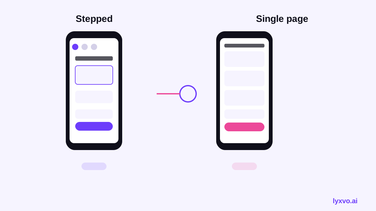
Generate at least two layout directions, for example one with a single-page checkout and one with a stepped flow. Place them side by side and score each with the checklist above.
4. Refine in the editor
Use the Canva-style editor to change text, photos and colors directly. Tighten field labels, rewrite the button copy and check that the total stays visible on every step.
5. Add a logo and brand consistency
If your checkout needs a refreshed mark or brand kit, you can create one with the AI logo generator so the header and buttons stay on brand.
6. Export for review and build
Export to Figma (SVG and tokens), PNG at real size, HTML, Flutter or Kotlin Jetpack Compose, depending on how your team builds. Share with stakeholders through real-time collaboration so comments land on the same file.
Comparing outputs: what changes between tools
When you compare generators, look at the practical result rather than the demo. Check whether the connected screens share one component system, whether the mobile layout is genuinely designed for thumbs, and whether the exported files are editable enough for your team. Two tools may produce similar first screens but differ sharply once you ask for the payment step, the error state and the confirmation page.
Testing the redesign before you launch
A generated design is a hypothesis. Before you change your live checkout:
- Run an A/B test or a staged rollout where possible.
- Track the metrics you already use for checkout completion, such as abandonment at each step.
- Test on real devices, including small Android screens and iPhones.
- Walk through the full path with a test card and a test address, including a failed payment.
The design tool helps you move quickly through options, but your own analytics decide which option wins.
Common mistakes to avoid
- Redesigning the visual style without fixing the number of steps or fields
- Hiding shipping costs until the final step
- Using low-contrast grey text for important information such as totals or errors
- Placing the primary button where it is covered by the keyboard on mobile
- Forgetting the empty cart, the out-of-stock state and the order confirmation screen
Summary
The best UI generator for a checkout redesign is the one that produces a connected, editable, mobile-first flow you can test and export. Score each option on the same brief, review the outputs against checkout-specific criteria, and validate the winner with real customer data. You can explore a full checkout flow in Lyxvo AI, starting with the free tier and moving to a plan that fits your team when you are ready.
Try it in Lyxvo AI
Describe it in your own words and the design agent starts on the right flow. Free to start.
Related tool: AI UI design generator for apps and websites
Whole apps and websites are designed with the Lyxvo Engine, rented separately from the design plans; every account can try 2 pages free.