UI Generator for Elderly-Friendly Large Button Screens
A UI generator for elderly-friendly large button screens helps you create app and website screens where every tap target, label and color is sized for older users from the start. This guide explains the design rules that matter, gives you a checklist to apply, and shows how to build these screens in Lyxvo AI.
Why large buttons matter for older users
Many older adults have reduced fine motor control, weaker vision, or tremors. Small icons, thin text and tightly packed controls become sources of frustration: people tap the wrong thing, miss targets, or give up. Designing for them is mostly about removing precision requirements, not about making screens look childish.
The good news is that the core principles are simple and easy to apply consistently. A UI generator is useful here because it can produce many screen variations quickly, so you can test layouts against the same rules instead of redrawing every element by hand.
Core design rules for elderly-friendly screens
Start with a few measurable rules and apply them to every screen:
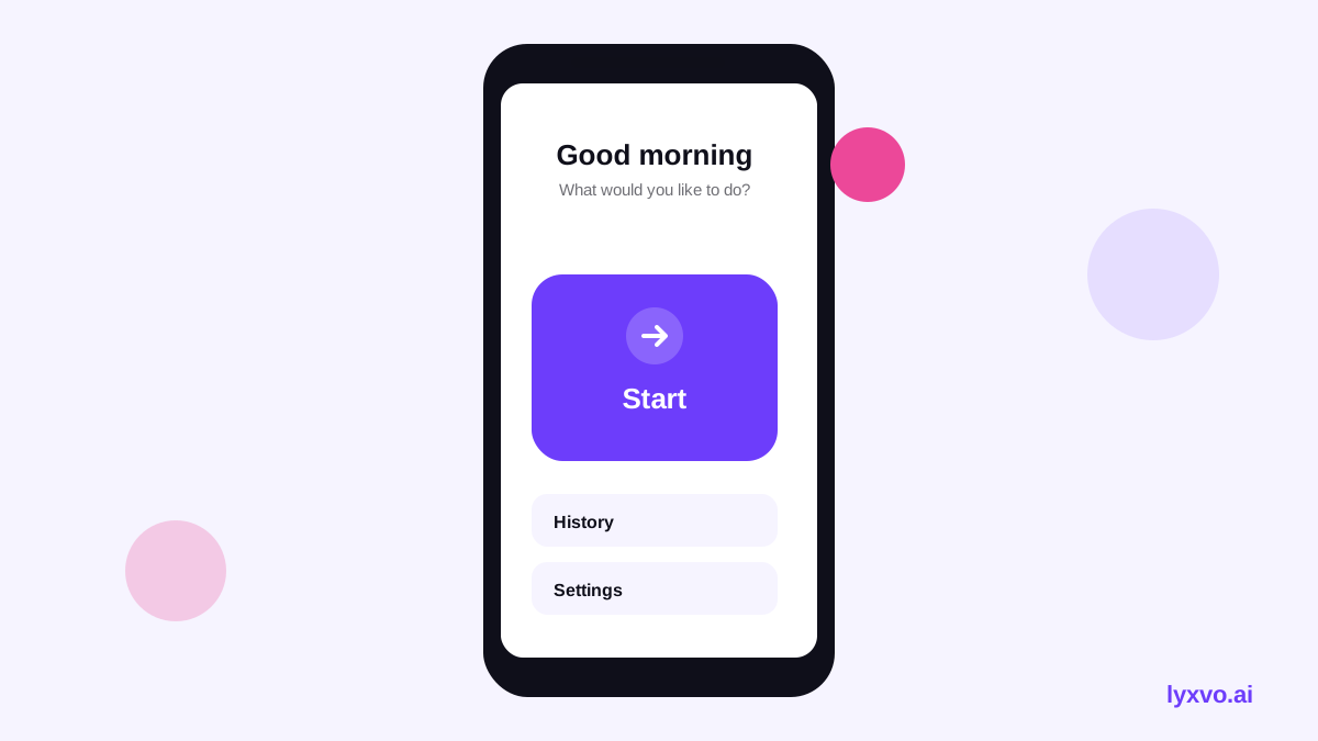
- Large tap targets. Make interactive elements at least 48 x 48 pt on mobile (Apple's and Google's guidelines both recommend roughly this size). For key actions such as "Call" or "Pay", go bigger, around 60 pt or more.
- Generous spacing. Leave clear space between buttons so a slightly off tap does not hit a neighbor.
- Large, readable text. Use body text of at least 18 pt on mobile and let the layout adapt when users increase system font size.
- High contrast. Aim for strong contrast between text and background. Avoid light gray text on white and avoid meaning carried by color alone.
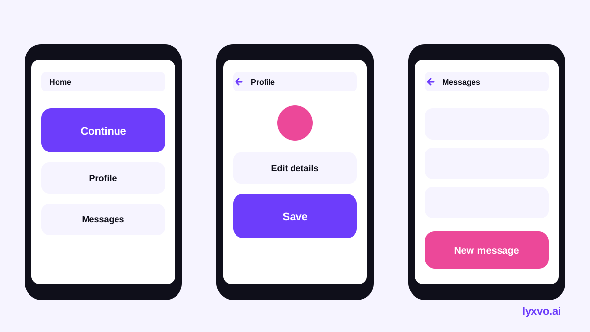
- One primary action per screen. Show one clear main button and keep secondary actions visually quieter.
- Text labels with icons. An icon beside a plain-language label ("Medicine reminder") is easier to understand than an icon alone.
- Simple navigation. Use a shallow structure, consistent back buttons, and avoid hidden gestures such as swipes that are the only way to act.
- Forgiving interactions. Avoid timed actions, confirm destructive steps, and make undo available.
These sizes are practical starting points drawn from common platform guidance. Test with real users of the age group you serve, because needs vary a lot.
A quick reference table
| Element | Recommended minimum | Notes |
|---|---|---|
| Tap target | 48 x 48 pt | Go to 60 pt+ for primary actions |
| Spacing between targets | 8 pt or more | More is better for large fingers or tremor |
| Body text | 18 pt or more | Support system text scaling |
| Button label | 20 pt or more, bold | One or two words where possible |
| Contrast | Strong text-to-background | Check with a contrast checker |
| Primary buttons per screen | 1 | Keep secondary actions quieter |
Checklist before you ship a screen
- Is every tappable element at least 48 pt, with the main action larger?
- Is there space between buttons so a near-miss does not trigger the wrong one?
- Is body text 18 pt or larger and does it still fit when system text is enlarged?
- Does every icon have a plain-language label?
- Is there only one obvious primary action on the screen?
- Does the screen still make sense in grayscale?
- Can the user undo or cancel anything that is hard to reverse?
- Have you tested it on a real device, held the way the user will hold it?
Step-by-step: generating elderly-friendly screens in Lyxvo AI
Lyxvo AI includes a design agent that can create complete app and website screens for iOS, Android and web. Here is a practical workflow:
- Open the studio for app screens. Go to the app design tool or open the studio at /design/?platform=app to start a new app design.
- Describe the audience and the rules in your brief. For example: "A medicine reminder app for adults 70+. Large tap targets of at least 48 pt, body text 18 pt or larger, high contrast, one primary button per screen, icons always paired with text labels, no timed actions." Stating constraints up front keeps the generated screens consistent.
- Ask for the specific screens you need. Typical sets include Home (one big "Take my medicine" button), Reminders list, Add reminder, Confirm, and Help/Call a family member.
- Review each screen against the checklist above. Use the Canva-style editor to adjust text size, button dimensions and colors directly.
- Test contrast and grayscale. Check the colors you chose and adjust any that rely only on hue.
- Export for development. You can export PNG at real size for review, or HTML, Flutter or Kotlin Jetpack Compose code, or send the design to Figma as SVG and tokens.
- Share for feedback. Real-time collaboration lets a family member, caregiver or accessibility tester comment alongside you.
For print materials aimed at the same audience, such as a large-type flyer for a community clinic, the flyer maker and the studio at /design/?format=flyer follow the same logic: big headings, high contrast and generous margins.
Designing for websites too
The same rules work on the web. Make links and buttons large, keep forms to one question at a time where possible, and avoid tiny dropdowns. If you are building a site for an audience that includes older visitors, the website design tool can produce the layouts, and the free AI live chat can answer common questions in plain language, by text or voice, so visitors are not stuck searching small menus.
Common mistakes to avoid
- Making everything big but cluttered. Large buttons packed tightly still cause mis-taps. Size and spacing both matter.
- Using thin, light fonts. Weight and contrast matter as much as point size.
- Relying on color for status. Pair color with a word or icon.
- Hiding actions in gestures or small corner icons. Keep primary actions visible.
- Skipping real testing. Generated layouts are a strong starting point, but only people who use the product can confirm it works.
Where to go next
Start by generating one core screen with the rules above, run it through the checklist, and then build out the rest of the flow. Once the patterns feel right, reuse them across screens so the whole product stays predictable. You can explore the AI UI design generator and review plan options on the pricing page. For more guidance on the tools, see the documentation.
Try it in Lyxvo AI
Describe it in your own words and the design agent starts on the right flow. Free to start.
Related tool: AI UI design generator for apps and websites
Whole apps and websites are designed with the Lyxvo Engine, rented separately from the design plans; every account can try 2 pages free.