UX Flow for an Ecommerce Returns Portal on Mobile

A good UX flow for an ecommerce returns portal on mobile lets a customer find an order, pick items, choose a reason, and get a return label in a few taps, without calling support. Most returns happen on a phone, so every step has to work on a small screen with one thumb. This guide walks through the screens, the decision points, the edge cases, and a checklist you can apply to your own store.
Why the mobile returns flow matters
Returns are a moment of friction. The customer already has a product they don't want, and every extra screen or unclear label adds to that frustration. A mobile returns portal that is quick and predictable protects your relationship with the buyer and reduces support tickets.
The goal is simple: the shortest path from "I want to return this" to "I have a label and a clear next step."
The core flow, screen by screen
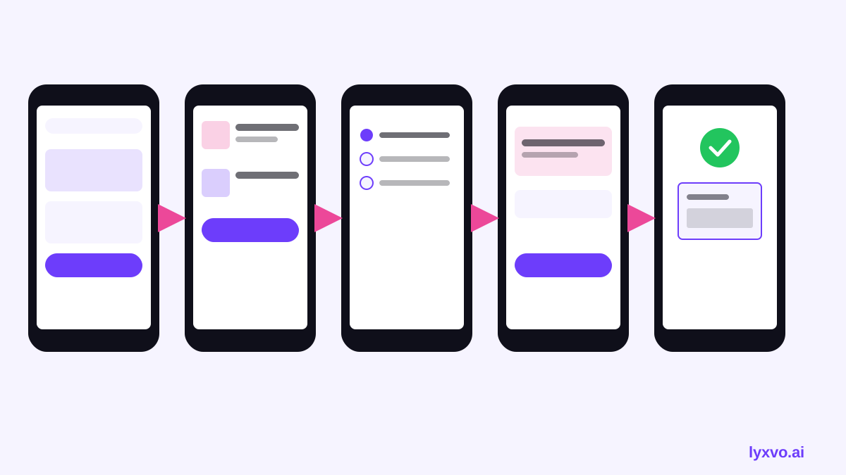
A typical mobile returns flow has six steps. Keep each one to a single decision where you can.
- Entry point. Place "Return or exchange" in the order history and in the order confirmation email. Don't bury it in a footer link.
- Find the order. Pre-fill orders for a logged-in customer. For guests, ask for order number plus email, and say exactly where to find the order number.
- Select items. Show each product with a thumbnail, size, and quantity stepper. Disable items that are outside the return window, and say why.
- Pick a reason. Use a short list of 4 to 6 reasons, such as wrong size, damaged, not as described, changed mind. Add an optional text field only after a reason is chosen.
- Choose a resolution. Offer refund, exchange, or store credit. Show the expected timing for each option in plain words.
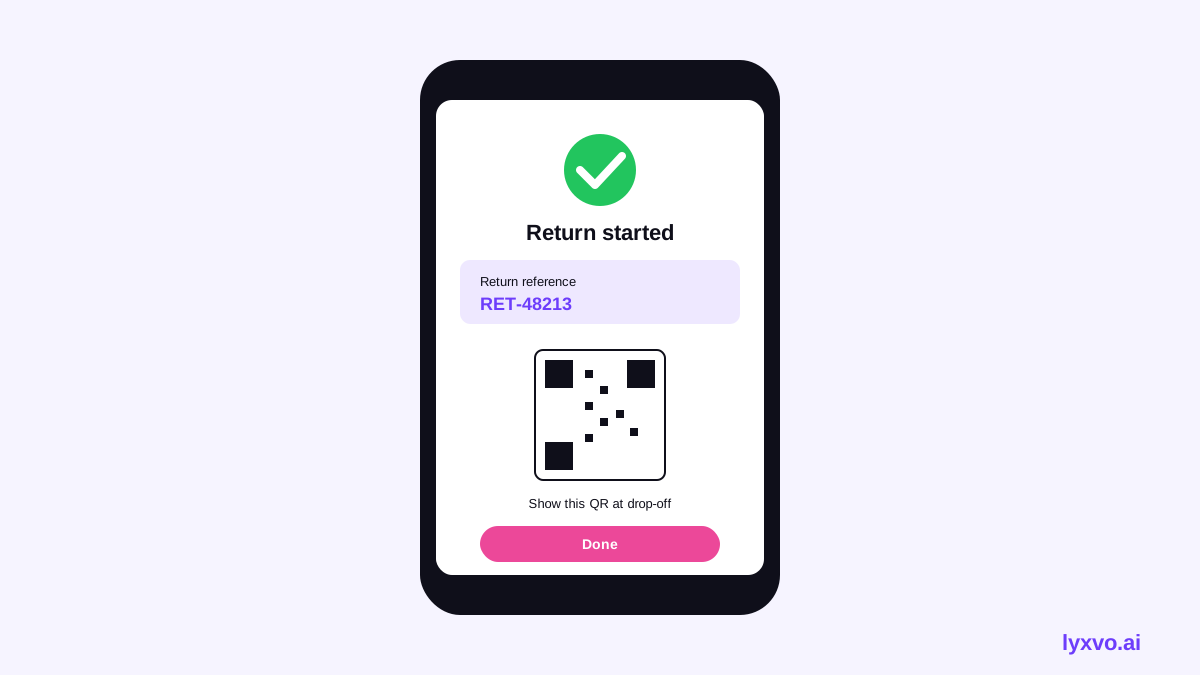
- Confirm and get the label. Display the return method (drop-off point, pickup, or printed label), the deadline, and a reference number. Send the same details by email and by SMS if you use it.
Decision points to design for
- Eligible vs. not eligible. Explain ineligibility on the item itself, not after the customer has filled in the whole form.
- Partial returns. Let customers return one item from a multi-item order without cancelling the rest.
- Exchanges with a different size. Show stock availability before the customer submits.
- Free vs. paid return shipping. State the cost before the label is created.
Key states every screen needs
Many returns flows look good with perfect data and break with real data. Design these states explicitly:
- Empty: no returnable orders. Offer a link to the help center or to recent orders.
- Loading: show progress for lookups and label generation, and never leave a blank screen.
- Error: an order number that doesn't match. Say what to check, and offer a way out.
- Expired window: explain the deadline and give a support contact.
- Success: the reference number, the next step, and a way to save or share the label.
Mobile-specific UX rules
- Keep primary buttons in the bottom third of the screen, within thumb reach.
- Use full-width inputs with large tap targets (at least 44 px high).
- Use the right keyboard type: numeric for order numbers, email for email.
- Show one question per screen when the flow is long, and a progress indicator such as "Step 2 of 4."
- Let users go back without losing their selections.
- Make the label printable or downloadable as a PDF, and also show a QR code for drop-off points.
Copy that reduces returns calls
Small wording changes prevent confusion:
| Instead of | Write |
|---|---|
| Invalid input | Order numbers are 10 digits. Check your confirmation email. |
| Not eligible | This item was delivered more than 30 days ago. Contact us about exceptions. |
| Submit | Create my return label |
| Processing | Creating your label. This takes a few seconds. |
Use the exact return window and deadline from your own policy. Don't copy numbers from examples.
A quick checklist before you launch
- [ ] Return entry point is visible in order history and emails
- [ ] Guest lookup explains where to find the order number
- [ ] Ineligible items explain why on the item
- [ ] Partial returns and exchanges work
- [ ] Return costs and refund timing are shown before confirmation
- [ ] Every screen has empty, loading, error, and success states
- [ ] Primary buttons are reachable with one thumb
- [ ] Label is downloadable and includes a reference number
- [ ] Tested on small and large phones, light and dark mode
How to design this flow in Lyxvo AI
You can sketch the mobile returns portal in Lyxvo AI's design agent. Open the AI UI design generator or the AI app design tool, choose a mobile app layout, and describe the flow: order lookup, item selection, reason, resolution, and confirmation. The agent plans the screens, and you can then refine text, colors, and images in the Canva-style editor.
To start a screen directly, use the app studio. Once the screens are set, you can export to Figma (SVG and tokens) to hand off to your development team, or export PNG at real size for review. Lyxvo Lite gives you a daily limit to start free, and the pricing page lists the plans.
Test the flow with real customers
Design is only a hypothesis until someone completes the task. Run a short usability test with 5 to 8 people who have returned something online. Give them a realistic scenario, such as "You bought the wrong size, return it." Watch where they hesitate, where they tap the wrong thing, and where they ask for help. Fix the most common stumble first, then retest.
Track a few simple measures after launch: completion rate of the returns flow, number of returns-related support contacts, and the share of returns started on mobile that finish successfully.
Summary
A strong mobile returns portal is short, clear, and honest about cost and timing. Build the flow around six steps, design every state, and keep buttons within thumb reach. Use the checklist above before launch, and test with real customers. For the visual screens and handoff, Lyxvo AI can help you move from plan to working design.
Try it in Lyxvo AI
Describe it in your own words and the design agent starts on the right flow. Free to start.
Related tool: AI UI design generator for apps and websites
Whole apps and websites are designed with the Lyxvo Engine, rented separately from the design plans; every account can try 2 pages free.