UX Wireframes for Nonprofit Volunteer Signup
UX wireframes for nonprofit volunteer signup determine whether a supporter who lands on your page becomes an active volunteer or leaves halfway through a form. A good wireframe shows the structure, order and content of every screen before any visual design begins, so you can test the flow cheaply.
Why volunteer signup needs careful wireframing
Volunteers are usually motivated but busy. They may arrive from a social post, an event table or an email, on a phone, with a few minutes to spare. Every extra field, unclear step or vague promise of what they will do is a reason to close the tab.
Wireframes are low-fidelity sketches of layout, content and flow. They let your team agree on what each screen must do before anyone argues about colors or fonts. For a volunteer signup, the goal is simple: make it obvious what the role is, what is asked of the person, and what happens next.
Map the flow before you draw screens
Start with a flow, not a layout. Write the steps a volunteer takes from first click to first shift:
- Discover: the volunteer lands on the opportunities page or a campaign page.
- Choose: they pick a role, cause area or time commitment.
- Register: they provide contact details and consent.
- Qualify: they answer only the questions you truly need (age, background checks if required, availability).
- Confirm: they see a summary and a success message.
- Onboard: they receive an email or message with the next step, such as an orientation invite.
Each step should have one job. If a step is doing two jobs, split it.
Keep the number of fields small
Ask for name, email and one way to reach them at the first step. Move optional details, such as skills or preferred shifts, to a later screen or to the onboarding email. Every field should answer the question: "Do we need this to place or contact this person right now?"
Screen-by-screen wireframe checklist
Use this checklist for each screen you sketch.
- Clear headline that names the action, for example "Sign up to help at the food drive".
- One primary button with a verb, such as "Reserve my spot" rather than "Submit".
- Progress indicator if the flow has more than two steps.
- Inline help text that explains why you ask for something sensitive.
- Visible privacy note near the contact fields, with a link to your policy.
- Error states sketched for missing fields and invalid emails.
- Mobile layout with single-column fields and a thumb-friendly button at the bottom.
- Accessible labels for every input, not placeholder text alone.
- Exit path such as "Save and finish later" or "Browse other roles".
A worked example: a food bank signup
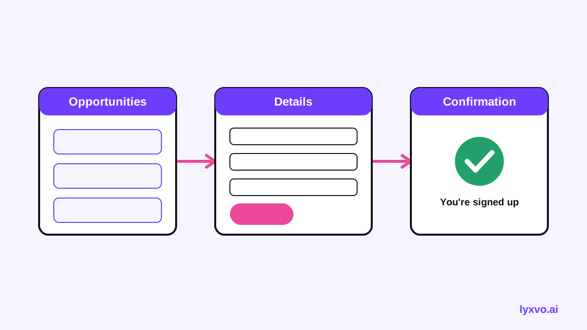
Suppose a local food bank wants volunteers for weekend packing shifts. A simple three-screen wireframe might look like this:
- Screen 1, Opportunities: A short intro, three role cards (packing, driving, greeting), each showing date, time and location. Each card has a "Pick this role" button.
- Screen 2, Details: Name, email, phone (optional), and a single question about availability (weekday or weekend checkboxes). A line says the food bank will only use contact details for shift reminders.
- Screen 3, Confirmation: "You're signed up for Saturday packing, 9:00 to 12:00." Below it, what happens next, a calendar download link and a button to share the opportunity.
The three screens remove everything not needed for placement. Background checks or youth-protection forms can appear later, once the volunteer is shortlisted, so they do not block the first step.
Common wireframe mistakes to avoid
- Burying the role. If the volunteer cannot tell what they will do within seconds, they will not continue.
- Asking for everything upfront. Long forms feel like a commitment before the volunteer has said yes.
- Hiding the time commitment. State hours, location and frequency on the first screen.
- Vague success messages. "Thanks" alone leaves people unsure whether they are signed up.
- Ignoring mobile. Many supporters will open your link on a phone at an event.
Test your wireframes with real volunteers
Before building, show the sketches to three or four current or recent volunteers. Ask them to think aloud as they move through the flow. Watch where they hesitate, what they misread and what they ask. Adjust the wireframes, then test again. Two short rounds usually reveal most problems.
Note: Test with the people you actually serve or recruit. Their language often differs from internal jargon such as "volunteer engagement pipeline".
How to build these wireframes in Lyxvo AI
Lyxvo AI's design agent can create app and website screens for iOS, Android and web. For a volunteer signup, you can describe the flow in plain language, including the roles, fields and steps, and the agent plans and designs the screens. You then edit text, images and colors directly in the Canva-style editor, and use real-time collaboration so your team can comment together.
To start, open the app design studio or the website design studio, or read the UI design generator guide and the AI website design page. Once the layout is approved, you can export to Figma (SVG and tokens), PNG at real size, or HTML, so your developers can continue from the same screens.
Final checklist before you hand off
- The flow has no more than three or four screens for a first signup.
- Each screen has one main action and one clear headline.
- Fields are limited to what you need for the first contact.
- Privacy and consent are visible where data is collected.
- Mobile layouts are checked, not assumed.
- At least three volunteers have walked through the flow.
- Success messages explain the next step.
With a tested wireframe, your volunteer signup becomes a clear path from interest to first shift, and your design and development work can start from a flow you already trust.
Try it in Lyxvo AI
Describe it in your own words and the design agent starts on the right flow. Free to start.
Related tool: AI UI design generator for apps and websites
Whole apps and websites are designed with the Lyxvo Engine, rented separately from the design plans; every account can try 2 pages free.