Wireframe to Clickable Prototype for Cafe Ordering
A wireframe to clickable prototype for cafe ordering lets you test the whole customer journey, from menu to paid order, before a single line of code is written. This guide walks through the process step by step, with a checklist you can reuse for any small food business.
Why a clickable prototype beats a static wireframe
A wireframe shows layout. A clickable prototype shows behavior: whether a customer can find the oat-milk option, add two drinks, change the pickup time and understand the total without asking a barista. For a cafe, that difference matters because ordering happens in seconds, often on a phone, often while the customer is standing in line.
A prototype lets you catch problems early, such as a checkout button hidden below the fold or a size selector that people misread. Fixing these on screens costs minutes. Fixing them after development costs days.
Step 1: Map the ordering flow on paper
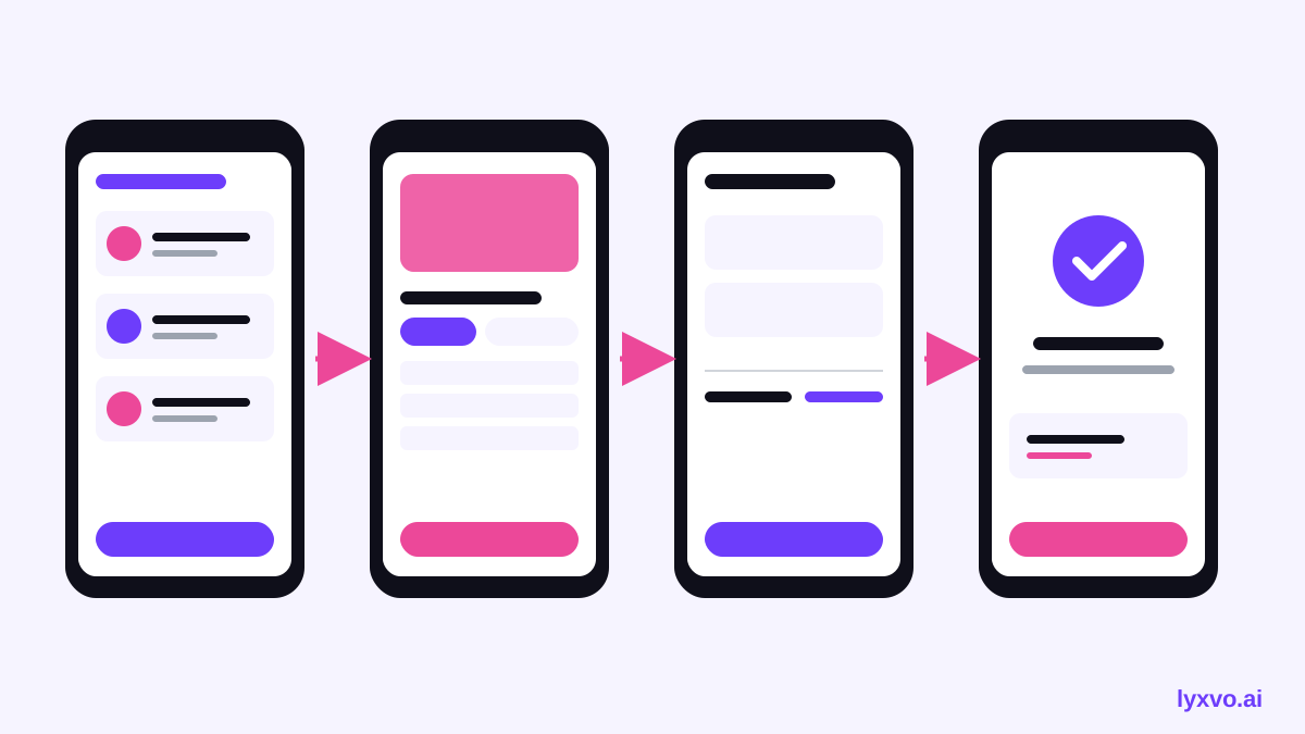
Before drawing any screen, write the flow as a short list. Most cafe orders follow the same path:
- Browse the menu by category
- Open an item and choose options (size, milk, extra shot)
- Review the cart
- Choose pickup or dine-in, and a time
- Pay
- See an order confirmation with a number
Keep the flow to six to eight screens. Every extra screen is a place for a customer to give up. Note which steps need to work offline or on slow Wi-Fi, because cafes are often noisy and connections vary.
Step 2: Turn the wireframe into real screens
Start from your rough wireframe and add the details a customer needs:
- Menu: photos or clear icons, prices visible, a search or category bar
- Item page: required options marked, the price updating as options change
- Cart: quantity controls, a remove button, a subtotal and any tax line
- Checkout: pickup time, payment buttons, and a clear "Place order" button
- Confirmation: order number, estimated wait, and a way to reorder
If you want a fast start, Lyxvo AI's app design tool can generate complete app screens for iOS, Android or web from a text description of your cafe. You can then edit text, photos and colors directly in the Canva-style editor, so the screens match your brand rather than a generic template.
Tip: Use your real menu items and real prices in the prototype. Placeholder text such as "Lorem ipsum latte" hides the usability issues you need to find.
Step 3: Add the links that make it clickable
A prototype is useful only when the screens connect. For each screen, define:
- Which element is tappable (a menu card, an "Add" button, a back arrow)
- Where it leads
- What changes state (cart count goes up, total updates)
Keep a simple table so the team can check the flow:
| Screen | Tap action | Goes to |
|---|---|---|
| Menu | Tap item card | Item page |
| Item page | Tap "Add to cart" | Cart |
| Cart | Tap "Checkout" | Checkout |
| Checkout | Tap "Place order" | Confirmation |
| Confirmation | Tap "Order again" | Menu |
Review the table with a barista or manager. They will spot ordering rules the designer missed, such as oat milk not being available for cold brew.
Step 4: Design for the cafe context
Some details are specific to cafes and easy to forget:
- Speed: the path from opening the app to paying should take as few taps as possible. Offer "Reorder last drink" where it fits.
- Modifiers: group options clearly (size, milk, sweetener) and show the extra cost next to each one.
- Pickup clarity: show the pickup counter name or number, and whether the order is ready now or in about ten minutes.
- Accessibility: use large tap targets, readable text sizes and high contrast, since customers may be holding coffee or a child.
- Languages: if your customers speak several languages, plan space for longer labels.
Step 5: Test the prototype with real people
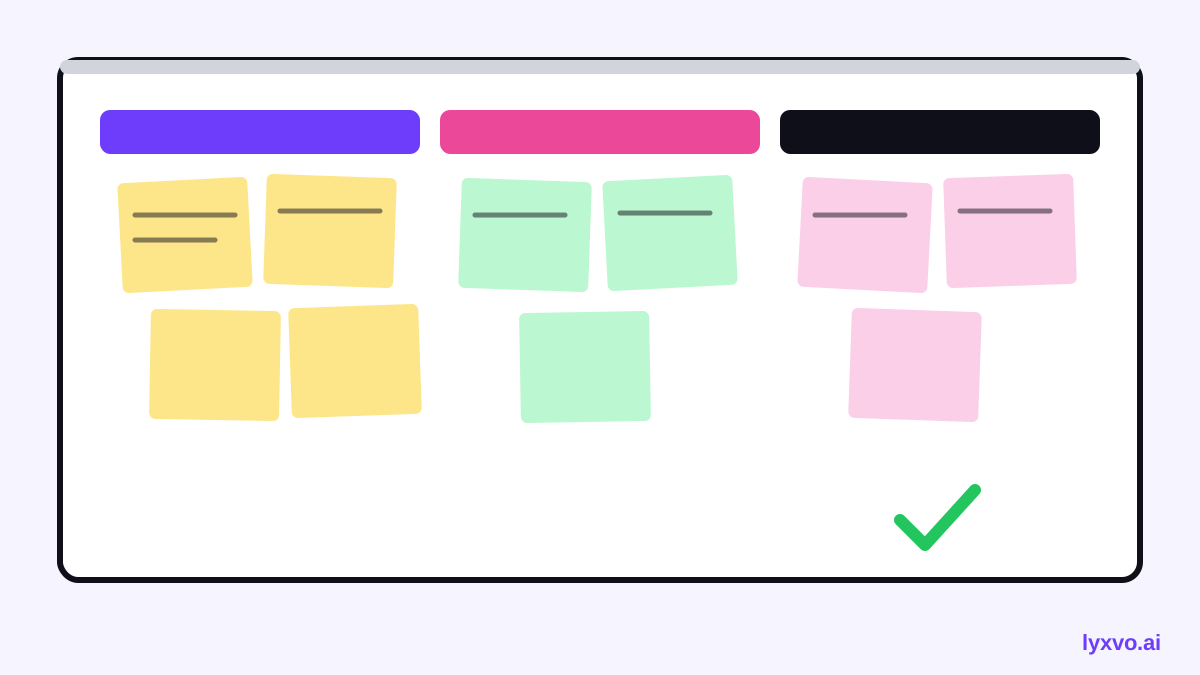
Give five to eight regular customers and a few new ones a task, such as "Order an iced latte with oat milk and pick it up at 9:30." Watch silently and note where they hesitate, tap the wrong thing or ask a question.
Change the design, then test again with fresh people. Two short rounds usually reveal most of the problems. Record the common mistakes, not individual opinions.
Step 6: Hand off to the builder
When the flow works, package the prototype for your developer or agency. Include:
- The flow map and the link table from Step 3
- Final screens for each device size you need
- Notes on what the test revealed and what you changed
- The brand kit: colors, fonts and logo files
For the logo and icon set, the AI logo generator and app icon generator can produce the files your developer needs. Lyxvo AI exports to PNG at real size, HTML, Flutter and Kotlin Jetpack Compose, so the screens can move into code with less rework. If you plan to build a full multi-page ordering site, note that whole apps and websites use the Lyxvo Engine, which is rented separately; every account can try two pages free.
Checklist before you share the prototype
- [ ] Flow is six to eight screens or fewer
- [ ] Real menu items, prices and options
- [ ] Every tappable element links somewhere
- [ ] Cart and total update correctly
- [ ] Pickup time and order number are clear
- [ ] Tested with at least five real customers
- [ ] Handoff notes and assets are packaged
Next steps
Start with the flow map today, then build the first screens in the app design tool or the web design tool. If you also need printed menus or table cards, the menu maker can match the same colors and fonts. Plans and limits are listed on the pricing page, and the documentation covers linking screens step by step. Tool features and limits may change, so check the current details before you plan a launch.
Try it in Lyxvo AI
Describe it in your own words and the design agent starts on the right flow. Free to start.
Related tool: Free design templates you can edit in minutes