YouTube Thumbnail Sizes and Safe Zone for Mobile Viewers

A YouTube thumbnail size of 1280 x 720 pixels is the standard you should design to, but the part that decides whether people tap is the safe zone: the area that stays readable on a phone screen. This guide explains the dimensions, the mobile safe zone, and a simple workflow to build thumbnails that work on small screens.
Why thumbnail size matters on mobile
Most YouTube viewing now happens on phones, where a thumbnail is often shown at a few centimeters wide. A design that looks sharp on a desktop monitor can turn into a blur of color and tiny text on a handheld screen. Designing for the mobile view first is the safest approach.
YouTube also overlays information on thumbnails, such as the video duration in the corner and, in some layouts, progress indicators. Those elements can cover parts of your image, so your key content should sit in the middle.
Note: Platform layouts and recommended specs can change over time. Check YouTube Studio's current guidance before publishing, since the details below reflect the commonly used standard as of this writing.
The standard YouTube thumbnail size
The usual specification for a custom thumbnail is:
| Property | Recommended value |
|---|---|
| Dimensions | 1280 x 720 pixels |
| Aspect ratio | 16:9 |
| File format | JPG, PNG, or GIF |
| Maximum file size | 2 MB |
Design at 1280 x 720 so the image stays crisp when YouTube scales it down. A 16:9 frame also matches the video player, so nothing is cropped unexpectedly.
Understanding the mobile safe zone
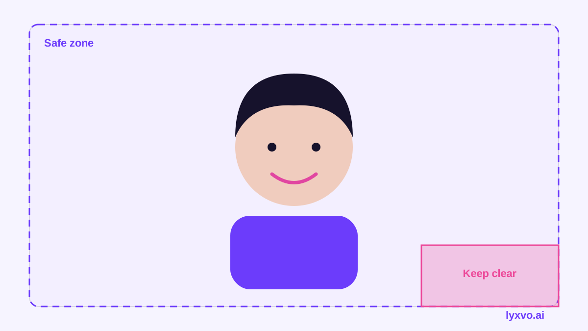
The safe zone is the central region of your thumbnail where text and faces remain visible across devices and layouts. A practical rule is to keep all critical content inside a centered area with margins on each side, and to avoid placing anything important in the bottom-right corner, where the duration label often appears.
A workable checklist:
- Keep your main subject roughly in the center third of the frame.
- Leave a clear margin around the edges so nothing important is cut off.
- Keep the bottom-right corner free of key text or faces.
- Place short headline text in the upper or middle area.
- Test the thumbnail at phone size before you upload it.
Design rules that work at small sizes
Mobile readability depends on contrast and simplicity more than on detail.
Use large, short text
Aim for two to four words in a bold, high-contrast font. Long sentences disappear at phone scale. If a word can't be read from arm's length on a phone, it is too small.
Keep one clear focal point
Choose one subject, such as a face with a readable expression or a single product. Crowded collages compete for attention and become noise on a small screen.
Pick high-contrast colors
Put bright text on a dark background or the reverse. Test that the thumbnail still reads in grayscale: if the subject and background merge into one tone, change the colors.
Keep faces large and expressive
Faces work well on thumbnails when they fill a good portion of the frame and show a clear emotion that matches the video.
How to make a mobile-ready thumbnail in Lyxvo AI
Lyxvo AI's studio includes a YouTube thumbnail format, so you can start at the correct size instead of guessing. Open the YouTube thumbnail maker or go straight to the thumbnail studio.
- Describe the video. Give the design agent the topic, the tone, and the headline you want, and it plans the layout.
- Review the composition. Check that the main subject sits in the center and that text is placed away from the bottom-right corner.
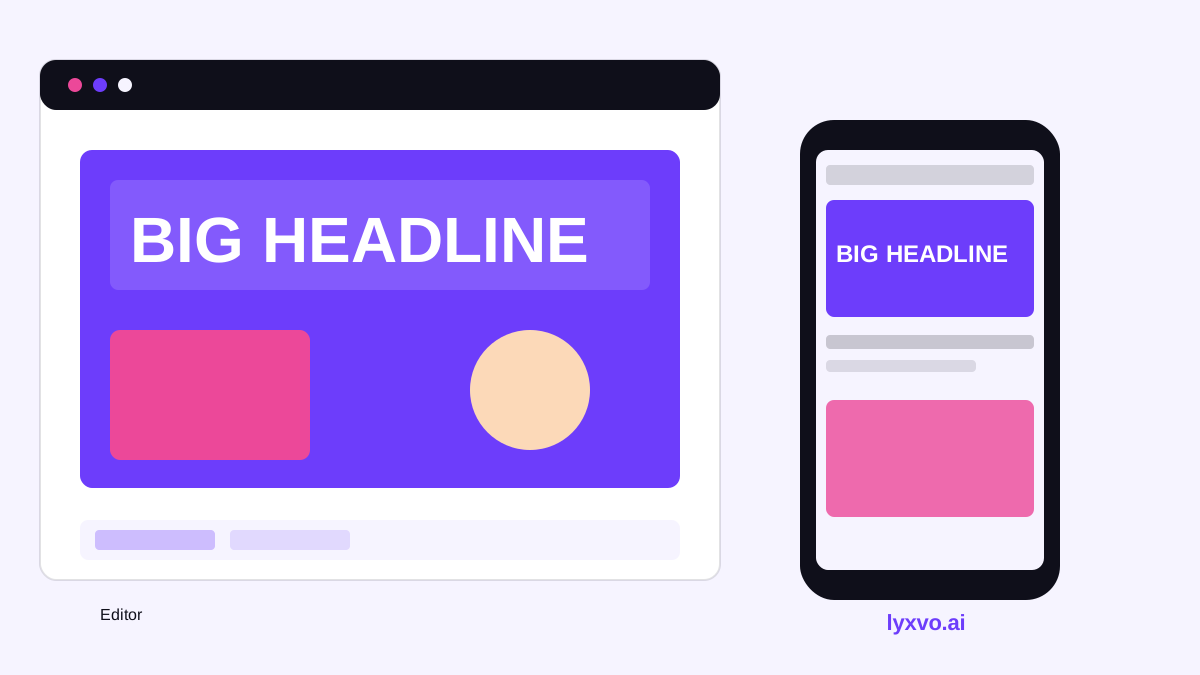
- Edit directly. Use the Canva-style editor to change text, swap photos, and adjust colors without starting over.
- Test at phone size. Shrink the preview and confirm the headline and face are still readable.
- Export. Download a PNG at the real 1280 x 720 size, ready to upload.
If you already have a design for another platform, Magic Resize can help adapt it, but always review the safe zone again after resizing, because composition that works in a square may not work in a wide frame.
Common mistakes to avoid
- Text in the corners. The duration label can cover it.
- Tiny captions. Anything below a readable size on a phone is wasted.
- Low-resolution uploads. Export at full size instead of uploading a screenshot.
- Ignoring file size. Keep the file under 2 MB by exporting an optimized PNG or JPG.
- Mismatched content. A thumbnail that promises something the video doesn't deliver hurts long-term viewer trust.
A quick testing routine
Before you publish, open the thumbnail on your phone at the size it would appear in a feed, then ask three questions: Can I read the headline in under a second? Is the subject clear? Does it still look good in black and white? If the answer to any is no, adjust the contrast, enlarge the text, or simplify the layout.
For more formats and templates, browse free design templates or see how the AI thumbnail and social design tools handle other sizes. You can also start a free plan with Lyxvo Lite and review the pricing when you need more daily designs.
Try it in Lyxvo AI
Describe it in your own words and the design agent starts on the right flow. Free to start.
Related tool: AI YouTube thumbnail maker